Working with Dashboard Data
Overview
Liaison Analytics presents data via a suite of dashboards that include interactive, visual representations of data (i.e., visualizations). Dashboards also include tools that allow you to display specific information and perform more detailed analysis to better understand trends and draw conclusions about correlations and causality. This includes the ability to export and download the raw underlying data for use outside of Liaison Analytics. The following sections outline the tools available for the dashboards.
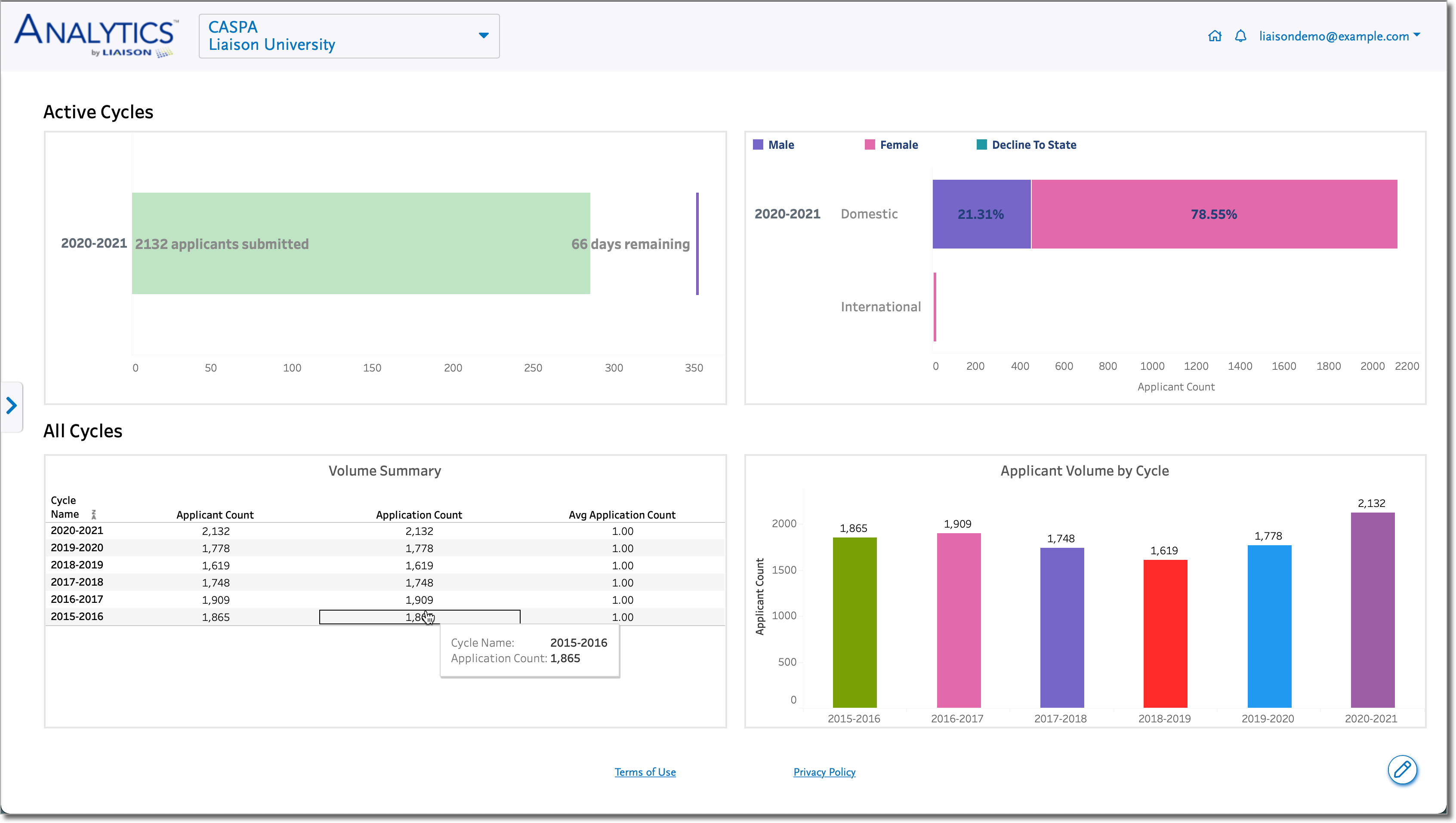
Landing Page
After you log in to Liaison Analytics, the landing page displays a dashboard that provides an overview of key applicant metrics.
CAS Switcher
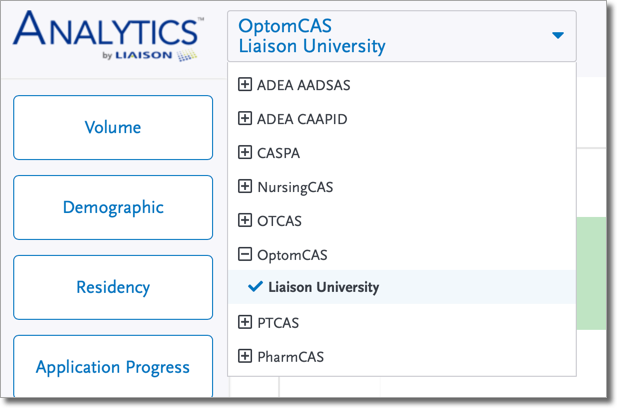
If you are using Liaison Analytics for multiple CASs, use the CAS Switcher on the left side of the top menu bar to switch between CASs.
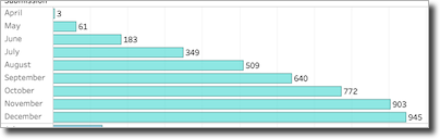
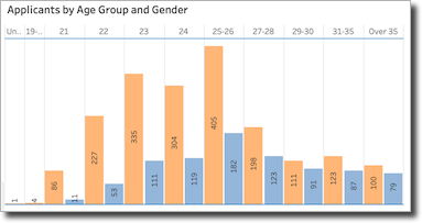
Data Labels
Labels are numeric or descriptive values displayed next to or on top of sections of the visualizations. They are relevant to the specific section of the visualization (i.e., a bar in a bar chart, a line in a line chart, a state on a map, etc.) and represent the underlying value or a related description. Examples of data labels are as follows:
Using Filters
Filters allow you to refine and segment your data. Liaison Analytics includes a list of standard filters which may vary by dashboard and may be accompanied by additional dashboard-specific filters, where applicable. By default, multi-select filters (i.e., where multiple values can be active at a time) are set to include all available values for your organization, and single-select filters (i.e., where only one value can be active at a time) are set to a suggested or most logical value given the context of the dashboard.
Key Filters and Related Terms
Note: depending on your user role and CAS, this list may not be exhaustive.
|
Filter |
Description |
Mapping to Applicant Portal Field |
Related Terms that May Appear in Dashboards |
|---|---|---|---|
|
Applicant Status and Application Status |
The Applicant Status filter is generally available for Association Users. It refers to an applicant's furthest application status, regardless of the number of applications they have. For example, if Aimee Applicant has 2 applications in the Received status and 2 in the Complete status, her applicant status would be Complete. The Application Status filter is generally available for Organization-level Users. It refers to the status of each application an applicant has submitted. Note: this filter's counting logic will vary between dashboards counting applicants and dashboards counting applications. For example, suppose Aimee Applicant has 4 applications with the following statuses:
If you were viewing a dashboard that counts applicants and you filtered by the Received status, Aimee would be counted once because she is one applicant with at least one application in this status. The same is true if you filtered based on the Complete status. However, if you were viewing a dashboard that counts applications and you filtered by the Received status, Aimee would be counted twice because she has two applications in this status. The same is true if you filtered based on the Complete status. |
Application statuses include:
*The In Progress status does not appear in Liaison Analytics because it indicates that an application is still in progress and has not yet been submitted. |
|
|
As of Month/Day |
The As of Month and As of Day filters are used together. When you use these filters, the data is filtered according to the first occurrence of the chosen month and day in each cycle. Note that if a cycle is longer than 365 days, the same month can display more than once in the duration of the cycle. |
N/A |
N/A |
|
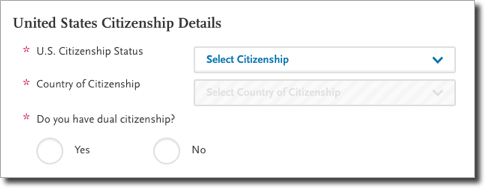
Citizenship Status |
Applicant US Citizenship status. |
Applicants complete this question in the Personal Information > Citizenship section of the application:
|
N/A |
|
Cycle Name/Application Year |
Application cycle. This filter includes all cycles available from the CAS 3.x platform but does not include cycles from the CAS 2.x platform. |
N/A |
N/A |
|
Decision Code |
Standard CAS-wide codes used for categorization and reporting of applicants. |
N/A |
N/A |
|
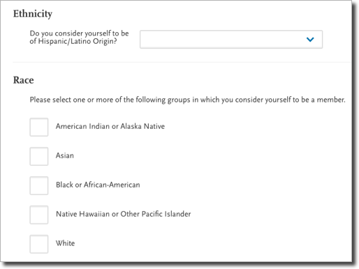
Ethnicity and Race |
Applicant race and ethnicity. |
Applicants complete this question in the Personal Information > Race & Ethnicity section of the application:
|
N/A |
|
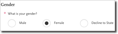
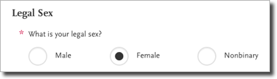
Legal Sex |
This filter generally includes options for Female, Male, Did not Report, and any CAS-specific custom values that applicants may select in the application (e.g., non-binary). |
Applicants complete this question in the Personal Information > Biographic Information section of the application (note that the question title may vary): Example 1:
Example 2:
|
N/A |
|
Program Attributes (also referred to as Program Details in the CAS Configuration Portal) |
Each CAS defines a set of program attributes (i.e., characteristics) that schools can configure for their programs. These attributes define programs in regards to the degree earned or the type of course (e.g., online, in-person, etc.). |
N/A |
N/A |
|
Program Name |
This filter allows you to filter data by a specified program(s). |
N/A |
N/A |
|
Start Term |
The start term selected by an applicant. |
N/A |
N/A |
Displaying Unknown Values
Some filters (and even data visualizations) include values that indicate a lack of data. For example, if an applicant withholds information, a filter may include values such as Did not Report, Declined to State, Unknown, etc.
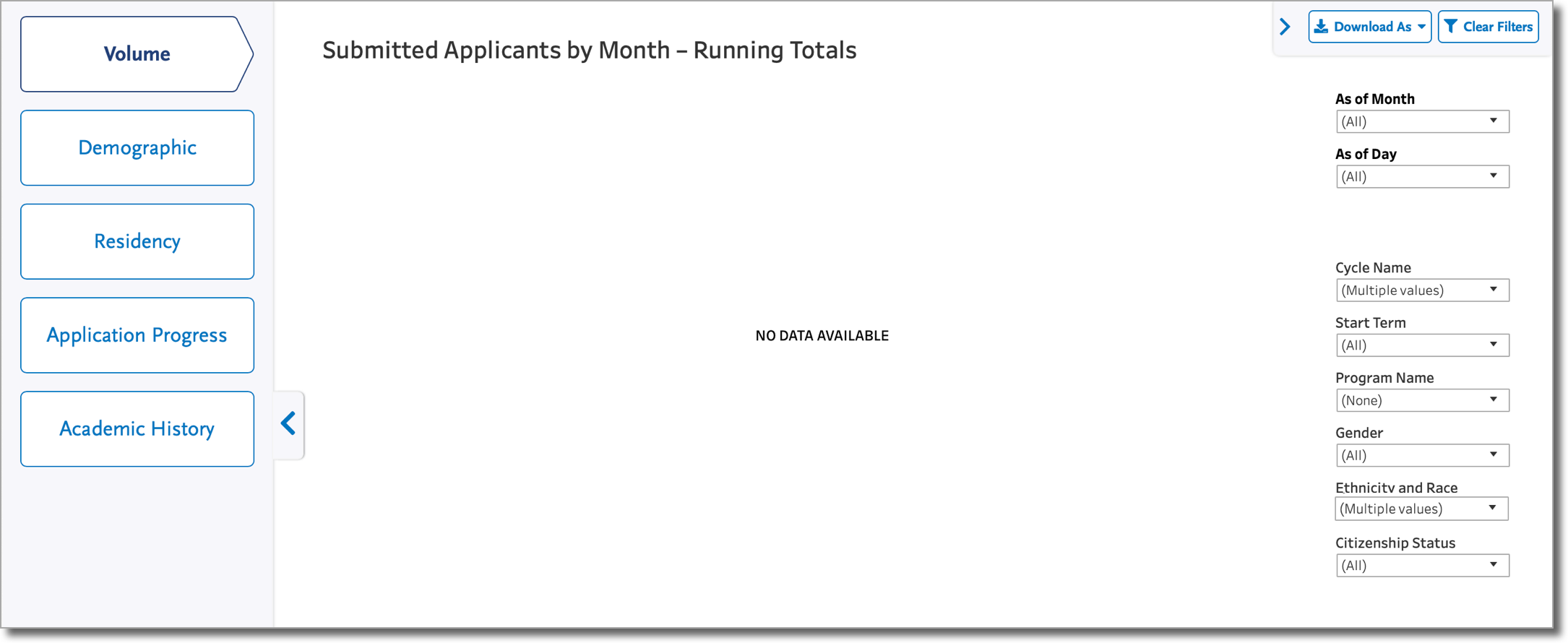
No Data Available
When you apply filters that do not produce any corresponding data—for example, there isn't enough data at the beginning of a cycle because applicants have not yet submitted and supplied the necessary data to populate the dashboard—a NO DATA AVAILABLE message displays.
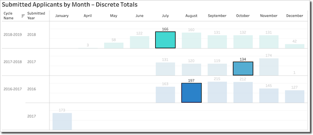
Selecting Data
You can click on any part of the visualization to isolate it, or use the Ctrl button on a PC (or Command button on a Mac) to select and isolate multiple parts of the visualization:
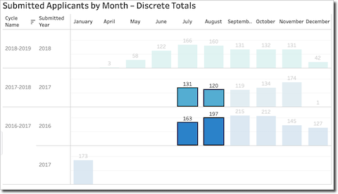
Additionally, you can use your mouse to click-and-drag to select multiple parts of the visualization (i.e., using a lasso):
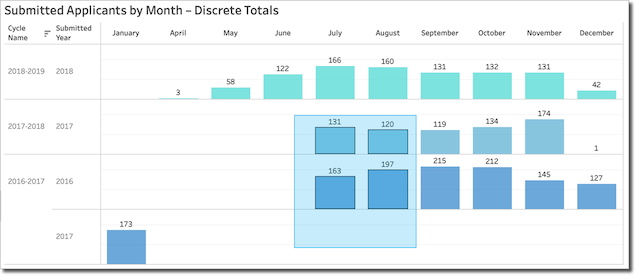
The data becomes selected when you release the mouse button:
Using Guided Analytics
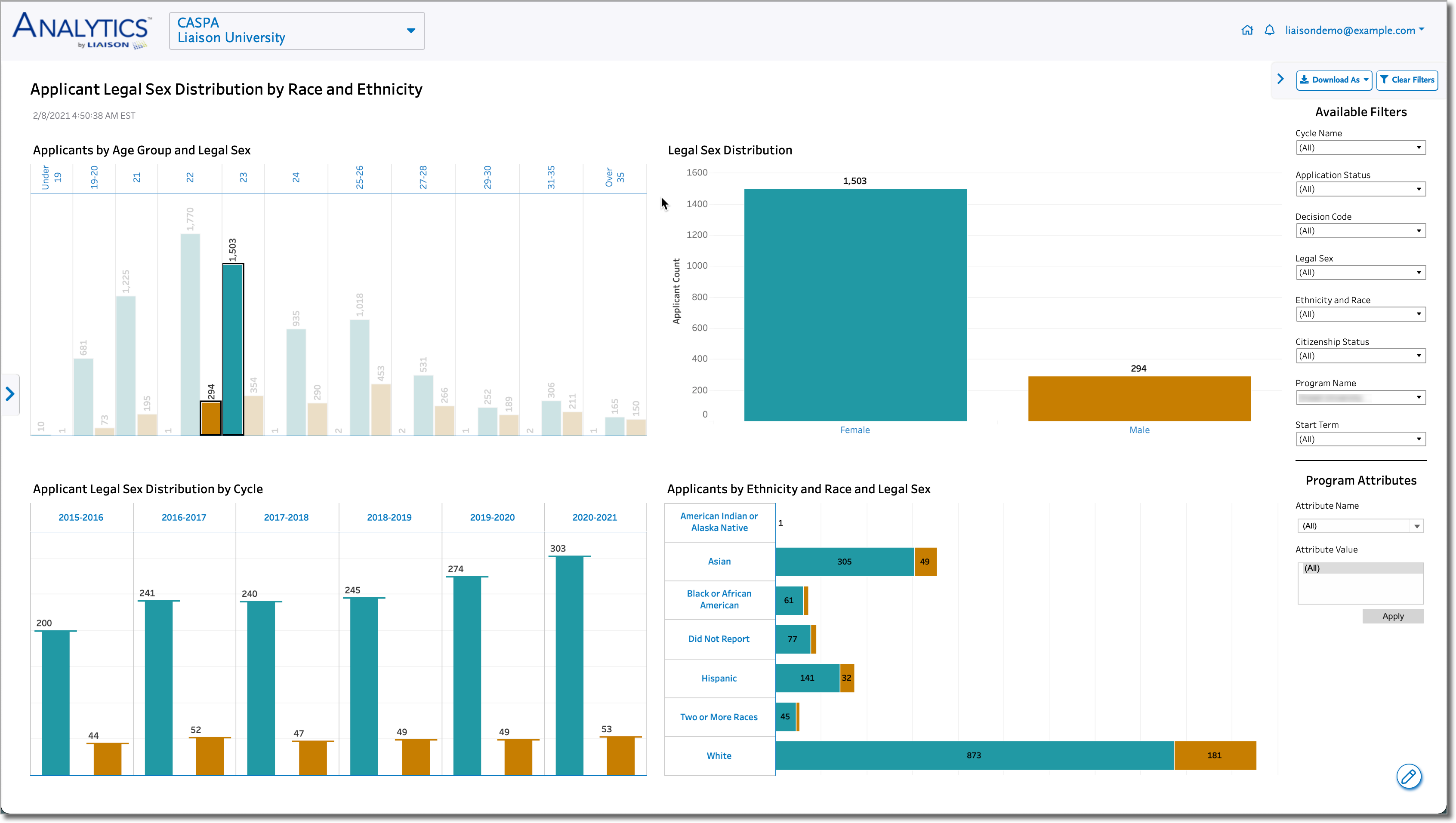
In some dashboards, like Demographic Dashboards, you can isolate a part of a visualization, causing the data in any other visualizations to filter and adjust accordingly. For example, in the Applicant Legal Sex Distribution by Race and Ethnicity dashboard, when you isolate data in the Applicants by Age Group and Legal Sex visualization, the data that appears in the other visualizations corresponds with your initial selection.
Once you've selected data, you can use the Tooltip Actions described below.
Viewing Tooltips
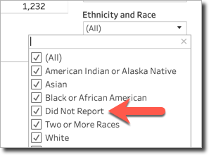
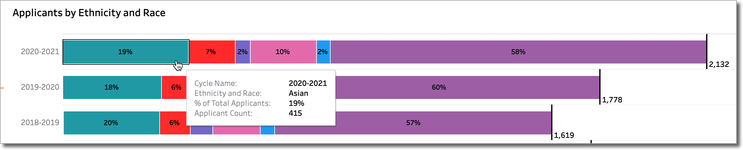
Tooltips are text or graphical labels that appear when you hover your mouse over or click on an element of a visualization; they contain additional information about the element. For example, in the Applicants by Ethnicity and Race visualization in the Age Group, Race and Ethnicity dashboard, when you hover over the teal portion of the visualization, the tooltip provides additional information including the cycle name, ethnicity and race, percent of total applicants, and applicant count:
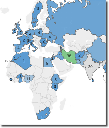
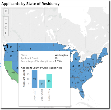
Some tooltips include embedded visualizations that are particularly useful when there are more than two dimension of interest. For example, in the Applicants by State of Residency dashboard, when you hover over the state of Washington, the tooltip displays a visualization that includes a breakdown of the applicants by application cycle:
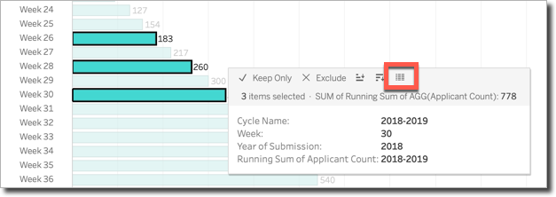
Using Tooltip Actions
If you select one or more sections of a visualization on a dashboard, the top of the tooltip will expand to include a set of actions you can perform on the data:
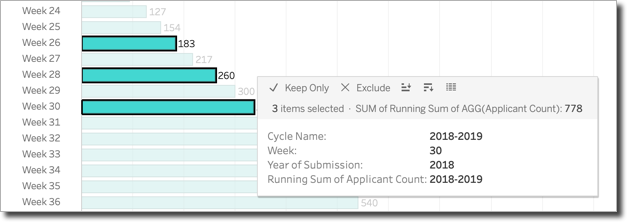
Using tooltip actions, you can:
- Keep Only the selected data and remove everything else from the view.
- Exclude the selected data and keep everything else in the view.
- Sort the data in ascending or descending order (in the example above, you can sort from earliest week to latest week or vice versa).
- View the data, as described in the next section.
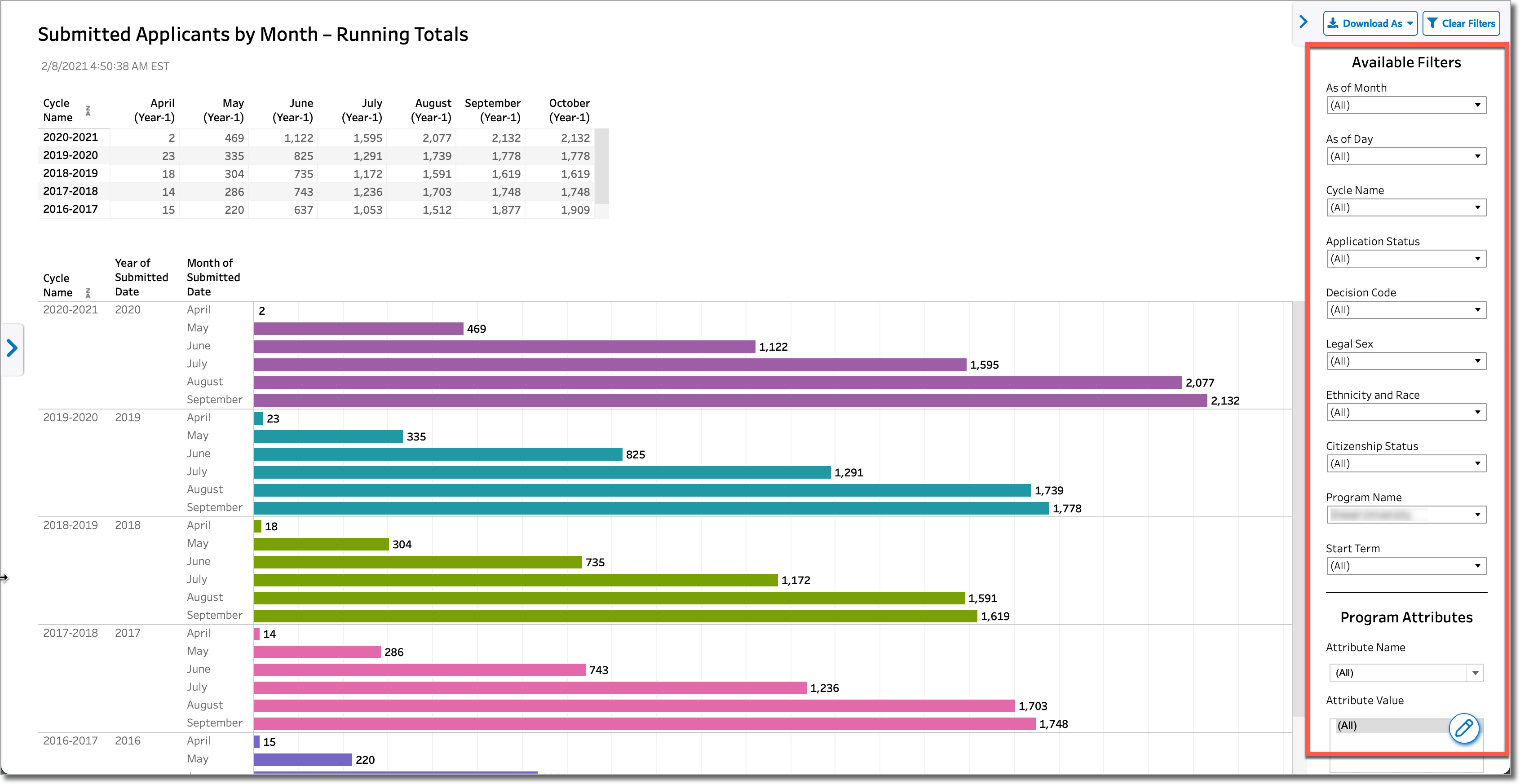
Viewing and Downloading Full Data Sets
Using the View Tooltip Action
Using the View tooltip action, you can view the data for any isolated part of the visualization:
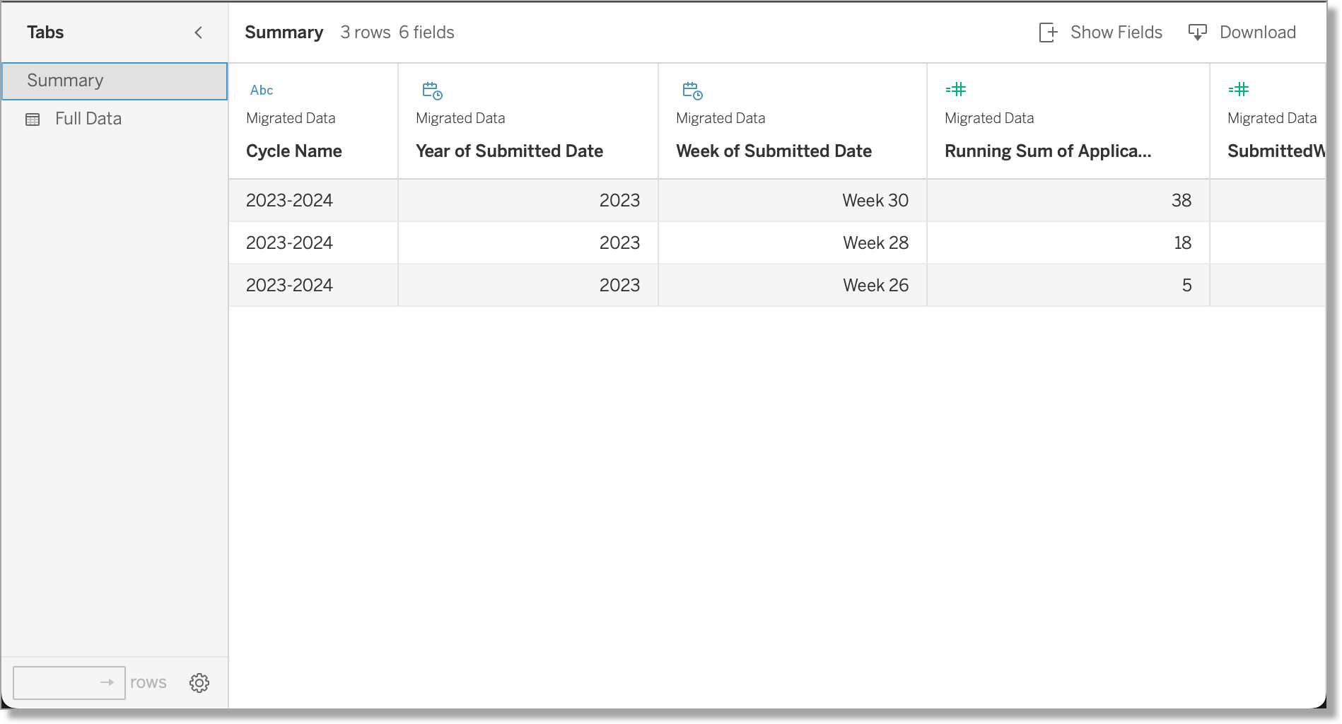
When you click the View button, a new window opens with two tabs:
- Summary Tab: this tab displays a summary of only the isolated parts of the visualization (it does not include the complete data set):
- Full Data: this tab displays the complete data set:
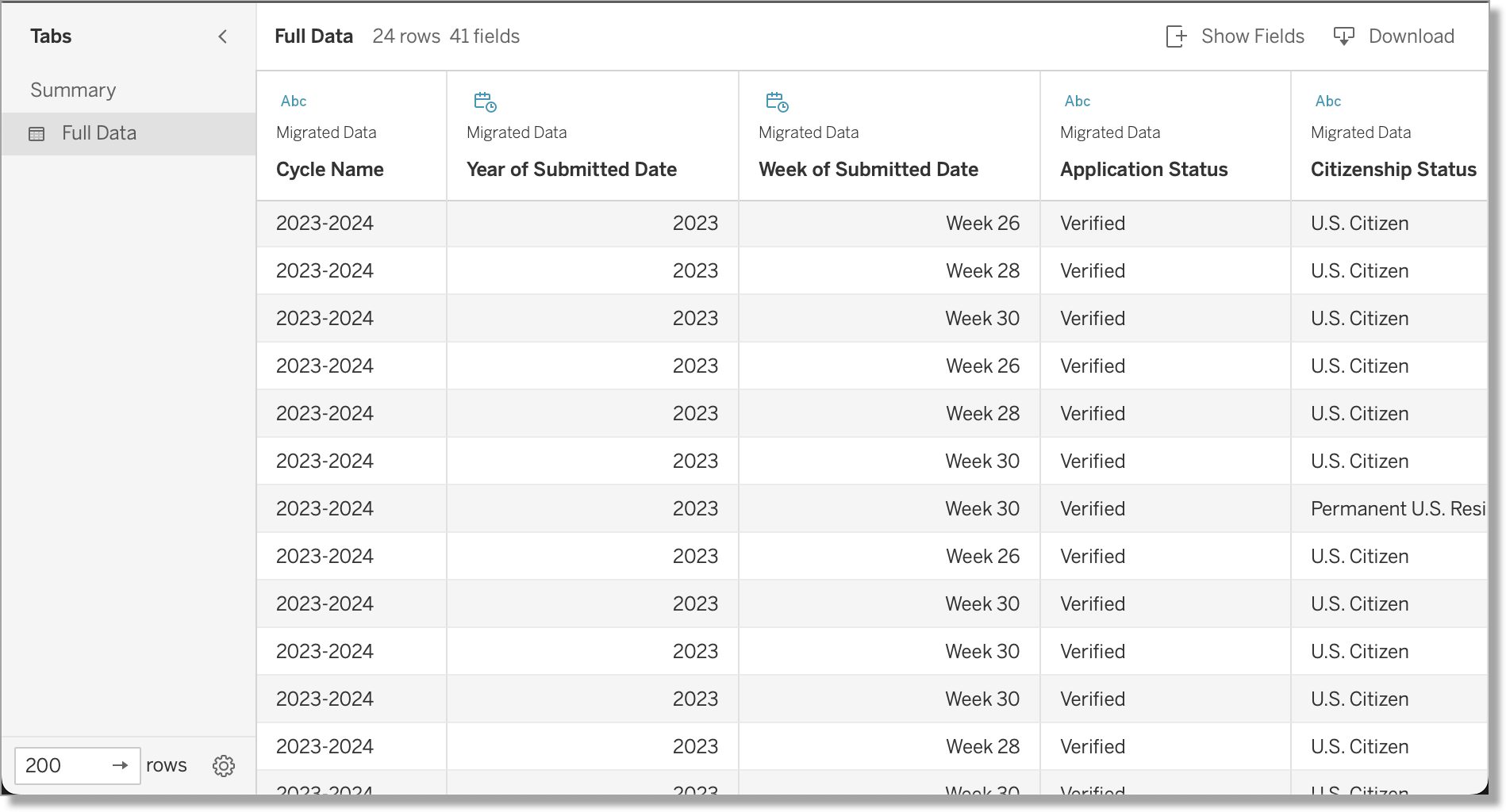
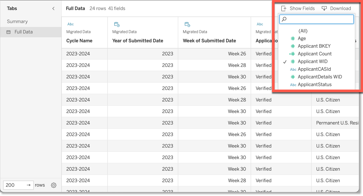
When downloading data, use the Show Fields button to select the specific data points you want in the output file. Note that some fields do not contain applicant data but serve as the foundation for generating the dashboard's visualizations (i.e., Unique Identifier, Decoded Week/Month/Year, MINDATE, etc.). You can disregard these columns.
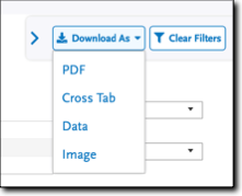
Using the Download As Button
In addition to downloading data via the tooltip, you can use the Download As button in the top right corner of a dashboard to download the data in the following formats:
- Cross Tab
- Data
- Image
Similar to the View tooltip action described above, any data you isolated in the visualization appears in the Summary Tab, while the Full Data tab contains the complete data set.
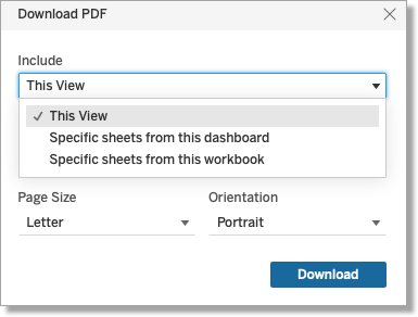
Downloading Data as a PDF
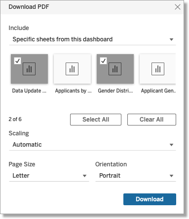
When downloading data in PDF format, you can use the Include drop-down to specify which data you want to appear in your PDF.
This feature can be especially helpful when a dashboard includes multiple visualizations and you want to specify which visualizations to include in the PDF. For example, the Applicant Legal Sex Distribution by Race and Ethnicity dashboard includes multiple visualizations. When you select the Specific sheets from this dashboard option, you can select the visualizations you want to include in the PDF.
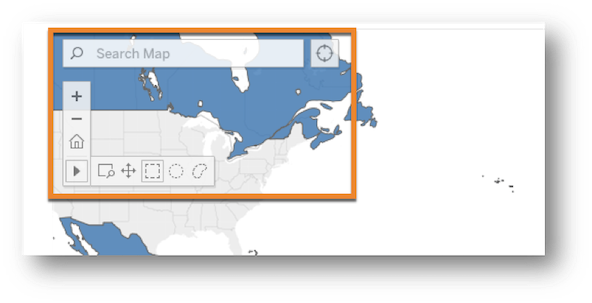
Navigating Maps
Some dashboards visualize data through geographic maps. Click on the map to reveal a toolbar that lets you:
- Search the map or use the button to the right of the search box to focus on current location.
- Zoom in and zoom out.
- Use the Home button to revert to the map’s default view (note: this does not clear any filters).
Click the toolbar arrow to view additional tools that allow you to:
- Magnify areas of the map.
- Drag the map to obtain a different view. For example, you can drag a world map so that North and South America are on the left side of the screen and Europe is on the right, or a you can drag North and South America to the right so that Asia and Australia are on the left.
- Use shapes to quickly select geographic regions.