Volume Dashboards
Overview
Volume Dashboards provide you with a visual representation of the number of submitted applicants (i.e., applicants who have paid for and submitted their application to at least one program). These dashboards provide a holistic view of applicant activity and are generated as running totals or as discrete measures. Running totals are the summation of unique applicants throughout the cycle, while discrete measures identify the number of unique applicants in a given time period in the cycle.
Notes:
- Generally, running totals and discrete totals should not be compared. Running totals include unique applicants in the given cycle, whereas discrete totals include unique applicants in the given time period. For example, assume Aimee Applicant submits one application in September, one in October, and two in November, and that all three months are in the same cycle. Aimee is counted once in the September "bucket" of the Submitted Applicants by Month – Running Totals dashboard because this is when she first becomes a unique submitted applicant in the cycle. However, Aimee is counted in all three of the September, October, and November buckets of the Submitted Applicants by Month – Discrete Totals dashboard because she was a unique applicant in each of these months.
- The data that appears in these dashboards may be impacted by annual program deadline changes. For example, a program may set a deadline for the upcoming cycle which is different from the deadline for the current (or previous) cycle.
- The reporting timeframe for Volume Dashboards begins with the start of the application cycle and includes data that was received within the given timeframe. For example, if your cycle begins in September but you don't start receiving applications until October, the visualizations appear starting with October.
- If the last application submission to an organization is prior to the month the cycle ends, the last month to display on a dashboard is the month of the final submission.
Working with and Downloading Data
As you review the following dashboards, refer to the Working with Dashboard Data page for specific information on:
- Using filters to narrow your data.
- Viewing tooltips to better understand your data.
- Viewing and downloading the raw data so you can work with it outside of Liaison Analytics.
Volume Dashboard Example Scenarios
Natural Disaster
Andrea, the Admissions Director, takes a look at the Submitted Applicants by Month – Running Totals dashboard for the 2017 cycle. She immediately notices that the number of submitted applicants in the month of September is down from what it was last year. She can see that the August numbers are on par, but a dip begins in September. Andrea wants to take a closer look at this month to see when the numbers are dropping. She opens the Submitted Applicants by Week – Running Totals dashboard and sees that the third week in September has the largest variance from the same week last cycle. She then attributes this variance to the fact that a high volume of applicants come from the state of Mississippi, where severe flooding occurred after a tropical storm. She considers providing these applicants with an extended due date to accommodate the disruption. She will take up her proposal at the next Admissions Committee meeting.
College Fair
Andrea takes a look at the Submitted Applicants by Month – Discrete Totals dashboard for the 2017 cycle. She notices that the number of submitted applicants in the month of July is up by 3,000 applicants from what it was last year. She then opens the Submitted Applicants by Week – Running Totals dashboard and sees that the second week in July has the largest variance from the same week last cycle. She remembers that they added an additional set of college fairs in the last week of June and thinks this may have had an impact on the increase of submissions. She plans to monitor the total number of applicants for the month and the cycle to see if this increases their overall total for the year, or if applicants were just submitting earlier. Depending on the outcome, she may decide to permanently add this additional week of college fairs to their admissions outreach plan.
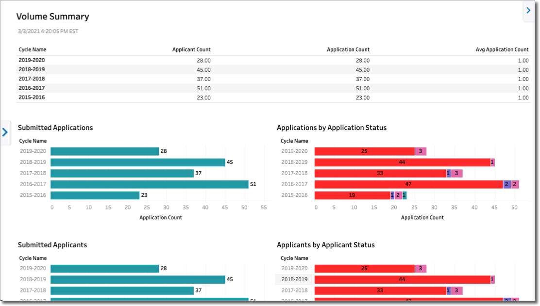
Volume Summary
This dashboard provides summaries of both applicant and application counts across all cycles. Additionally, the dashboard provides organization-level users with a ranking of programs according to the volume of applicants, while association users can see a ranking of organizations according to the volume of applicants. Using this dashboard, you can better understand submission trends across cycles.
Submitted Applicants by Month – Running Totals
This dashboard provides a running total of submitted applicants by month of submission. For example, the running total for September includes the number of submitted applicants in that month plus all submitted applicants from the previous months since the start of the application cycle. The data is presented via two visualizations: tabular (the top of the dashboard) and bar chart (bottom of the dashboard).
Using this dashboard, you can:
- Analyze how your applicant pool is growing month-by-month within each cycle.
- Easily compare how many applicants you have in this year (or a given month) versus previous years (or given months) and determine any variances.
- Use the data trends to plan accordingly for increases or decreases in applicants.
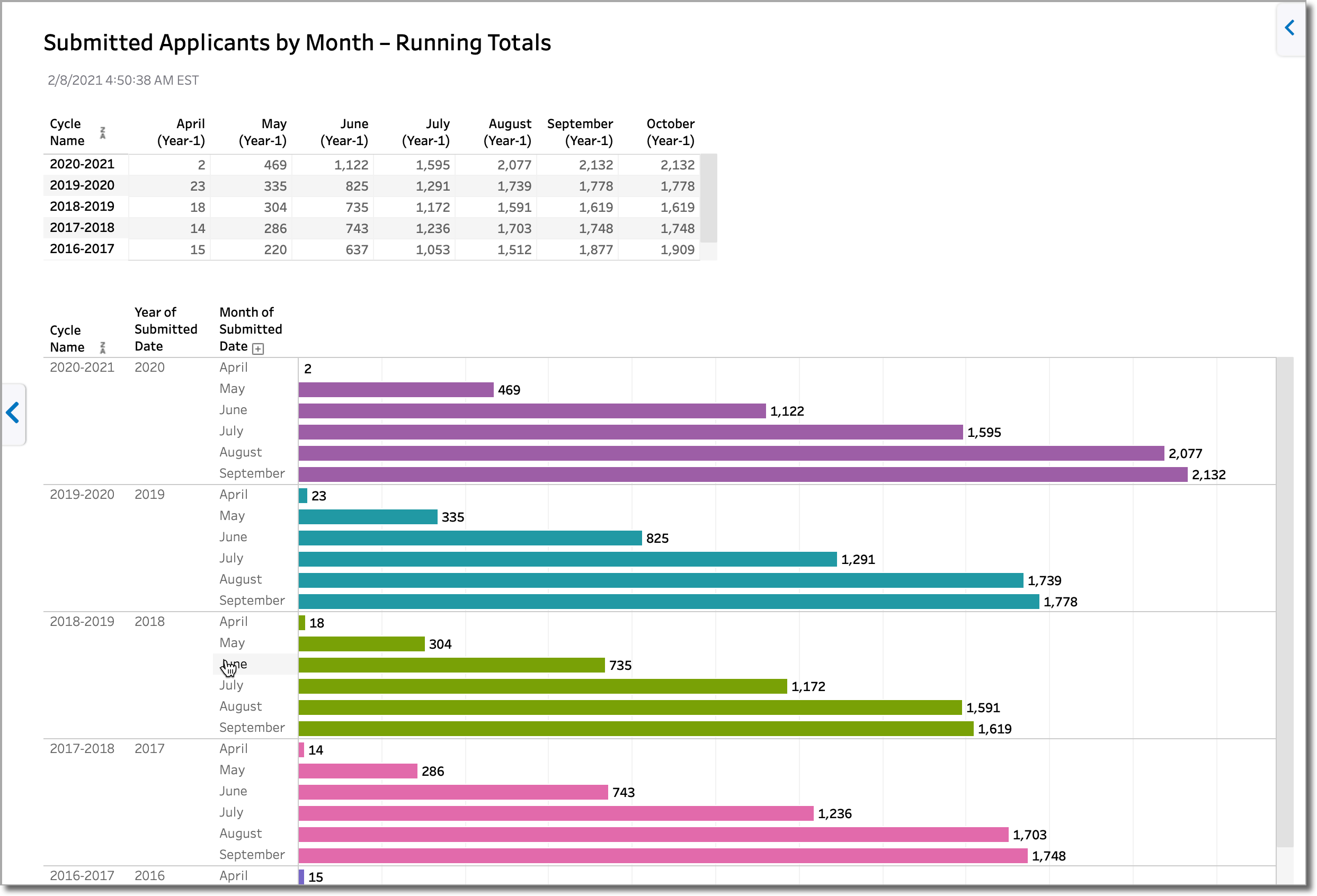
Note: to accommodate application cycles greater than 365 days, the tabular section of the dashboard includes the year number under the month labels (e.g. Year-1, Year-2, etc.).
Submitted Applicants by Week – Running Totals
This dashboard provides a running total of submitted applicants by week of submission. It’s similar to the Submitted Applicants by Month – Running Totals dashboard, except that each block represents a weekly cumulative total of submitted applicants. There are 52 weeks in each calendar year, with each one running from Monday–Sunday (to view the date range for a week, hover over a bar to reveal the tooltip).
Also similar to the Submitted Applicants by Month dashboard, you can compare applicants across cycles, spot trends, and plan accordingly for increases or decreases in applicants, but within a shorter timeframe. For example, you can use this dashboard to pinpoint a particular week each year and determine if applicant volumes tended to drop or rise across cycles.
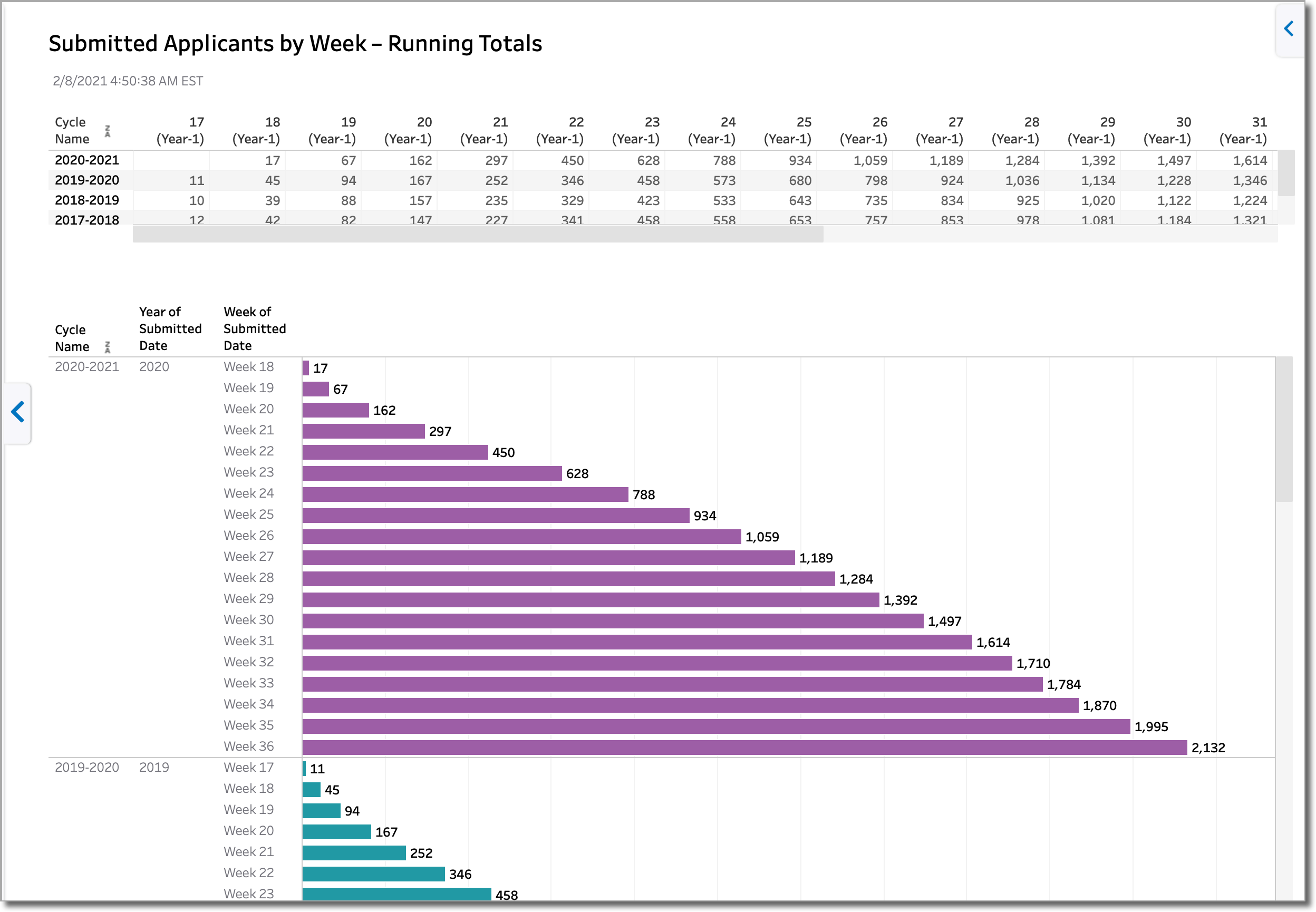
Note: to accommodate application cycles greater than 365 days, the tabular section of the dashboard includes the year number under the week labels (e.g. Year-1, Year-2, etc.).
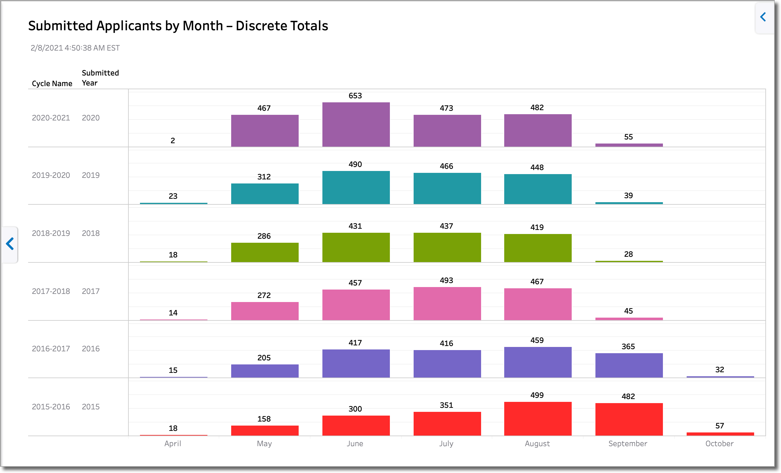
Submitted Applicants by Month – Discrete Totals
This dashboard provides the discrete total of submitted applicants by month of submission (i.e., the counts for each month do not include the counts from the previous months). The dashboard is useful in determining applicant submission behavior trends, like the months with the highest number of submitted applicants. You can use this information to help you plan your admission activities. For example, are applicants all submitting at the end of a cycle, or are they submitting regularly throughout the cycle? If the data indicates that applicants tend to wait until the end of the cycle to submit, you could use this information to adjust your communication schedule or support hours.
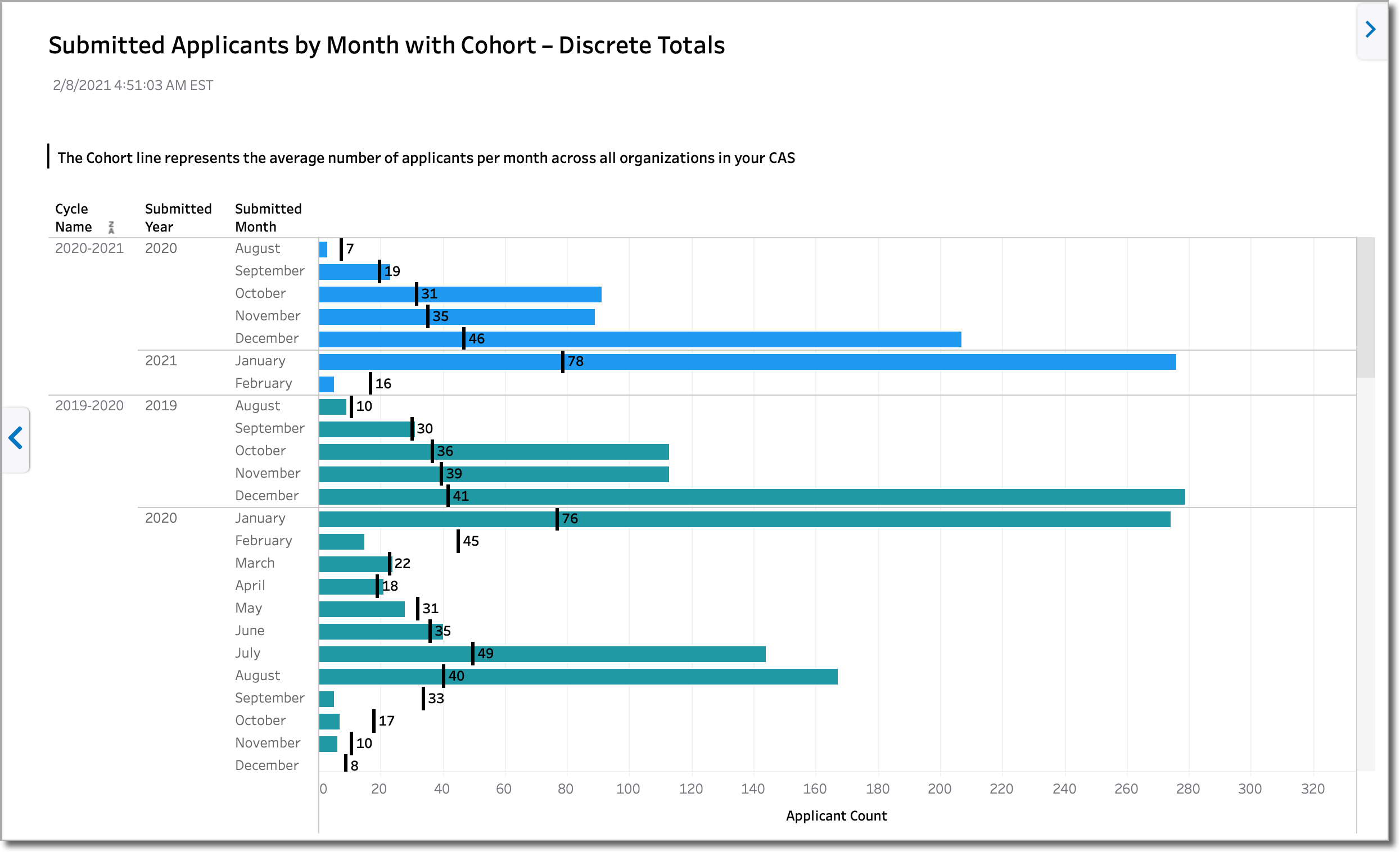
Submitted Applicants by Month with Cohort – Discrete Totals
This dashboard provides the same information as the Submitted Applicants by Month – Discrete Totals dashboard, but the data is visualized a bit differently and includes a cohort line. The cohort line represents the average number of submitted applicants per month across all organizations in the CAS, allowing you to benchmark your program. In the example below, we can see that this organization is performing better than the CAS average for monthly submissions.
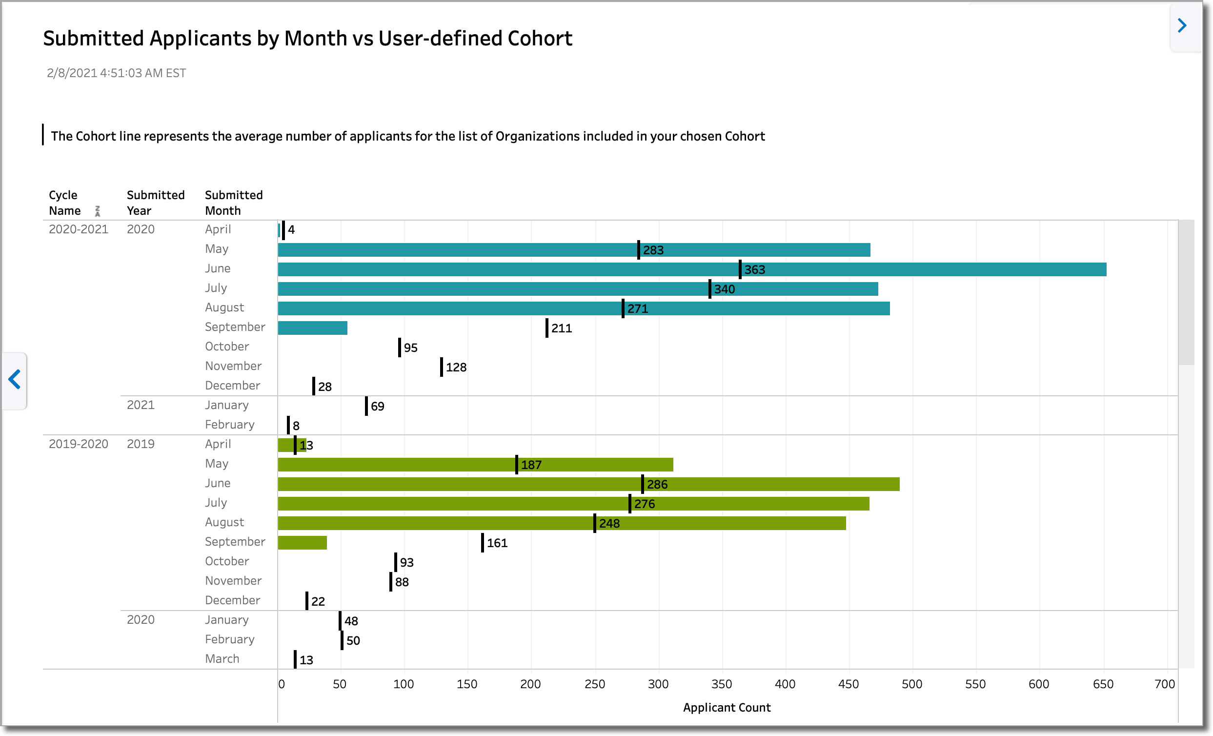
Submitted Applicants by Month vs User–defined Cohort
This dashboard is similar to the Submitted Applicants by Month with Cohort – Discrete Totals dashboard, except that it allows you to select a custom cohort of five to ten organizations for benchmarking purposes (e.g., you may create cohorts for top competitors, schools with similar populations, private vs. public, etc.). In this dashboard, the cohort line represents the average number of submitted applicants per month across the five selected organizations. In the example below, we can see that in some months, this organization is outperforming the cohort, while in other months, the organization is underperforming.
To populate this dashboard, configure your cohort settings using the Manage Cohorts button.
Submitted Applicants by Applicant Status (Association Users)
This dashboard is only available to Association Users.
This dashboard provides a breakdown of the total number of applicants in each application status. If an applicant has multiple applications, they are counted only once in the furthest application status. For example, if Aimee Applicant has 2 applications in the Received status and 2 in the Complete status, she is counted once in the Complete status.
Submitted Applicants and Designations by Organization – Running Total (Association Users)
This dashboard is only available to Association Users.
This dashboard provides a breakdown of the total number of applicants in each application status. If an applicant has multiple applications, they are counted only once in the furthest application status. For example, if Aimee Applicant has 2 applications in the Received status and 2 in the Complete status, she is counted once in the Complete status.
- The discrete number of applicants or designations for each month in the cycle.
- A running total of applicants or designations for each month in the cycle.
- A comparison of each month’s running total against the same month in the previous cycle.