Demographic Dashboards
Overview
Demographic Dashboards provide you with a visual representation of applicants’ demographic-related information. The dashboards reflect the information that the applicant self-reported in the application. Since the race and ethnicity question is a multiple choice question, applicants who provide more than one answer are grouped into the Two or More Races category (note that since it's possible for an applicant to report more than one ethnicity and race, these counts will not match those found in the Volume Dashboards). Applicants who did not respond are placed in the Did Not Report category.
Notes:
- Legal sex options vary by CAS. The examples below use a binary answer set.
- Age and age group are calculated based on the difference between the date of birth and the CAS application cycle start date (i.e., the cycle launch date).
Working with and Downloading Data
As you review the following dashboards, refer to the Working with Dashboard Data page for specific information on:
- Using filters to narrow your data.
- Viewing tooltips to better understand your data.
- Viewing and downloading the raw data so you can work with it outside of Analytics by Liaison.
Demographic Dashboard Example Scenario
Underrepresented Minorities
Andrea, the Admissions Director, wishes to benchmark the office’s success in attracting underrepresented minority applicants for the current cycle. She opens the Age Group, Race and Ethnicity dashboard and finds that there was a higher number of underrepresented minorities in the previous cycle. She then views the data for the current cycle and applies filters to dig deeper. She notices that one particular program, which traditionally sees a large number of applicants who self-report as an underrepresented minorities, is seeing a strong increase in the number of applicants who self-report as White. She saves this information for an upcoming team meeting in which she plans to gain more insight from her team so she can begin to develop an admissions recruitment strategy to correct this trend.
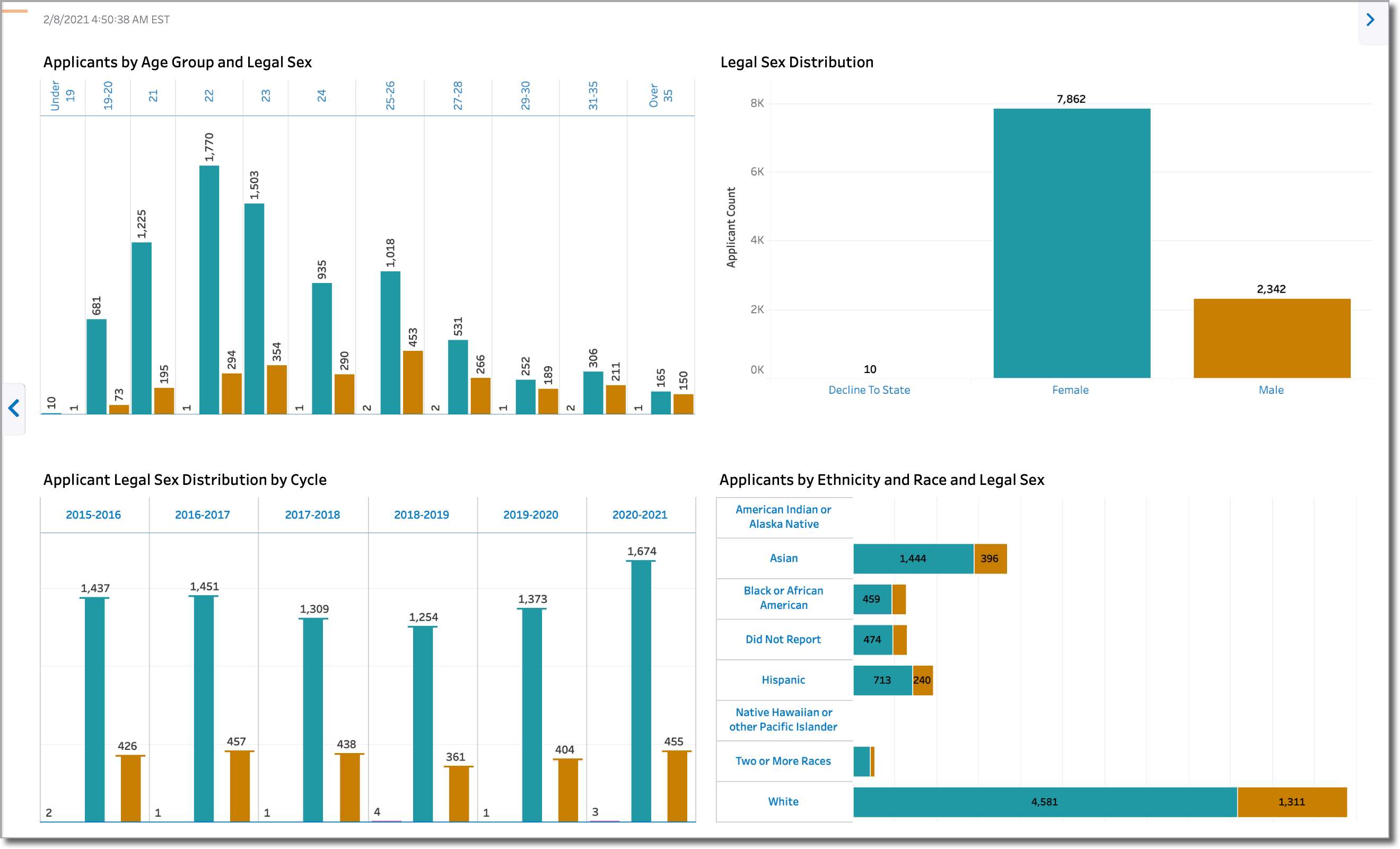
Applicant Legal Sex Distribution by Race and Ethnicity
This dashboard provides visualizations for:
- Applicants by Age Group and Legal Sex
- Legal Sex Distribution
- Applicant Legal Sex Distribution by Cycle
- Applicants by Ethnicity and Race and Legal Sex
Using this dashboard, you can identify the composition of your applicant pool by:
- Age groups according to legal sex
- Legal sex
- Legal sex by cycle
- Ethnicities and races according legal sex
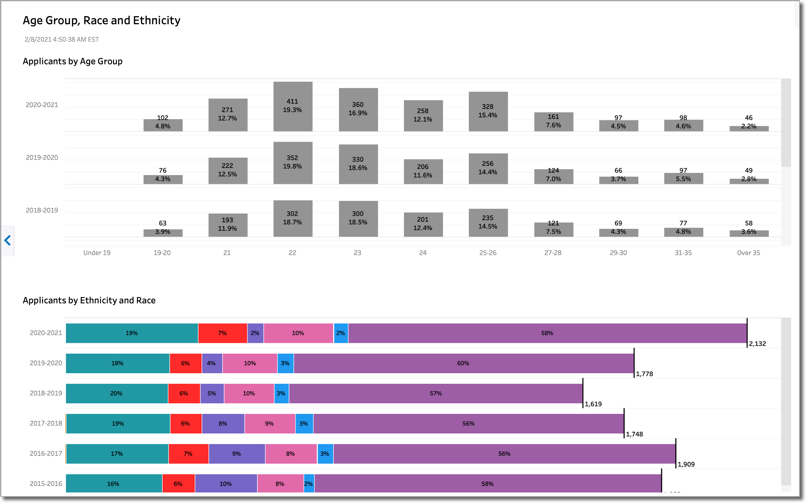
Age Group, Race and Ethnicity
This dashboard provides visualizations for:
- Applicants by Age Group
- Applicants by Ethnicity and Race
It's similar to the Applicant Legal Sex Distribution by Race and Ethnicity dashboard, except that it doesn't include legal sex as a variable. Using this dashboard, you can identify the composition of your applicant pool by:
- Age Groups
- Ethnicities and Races
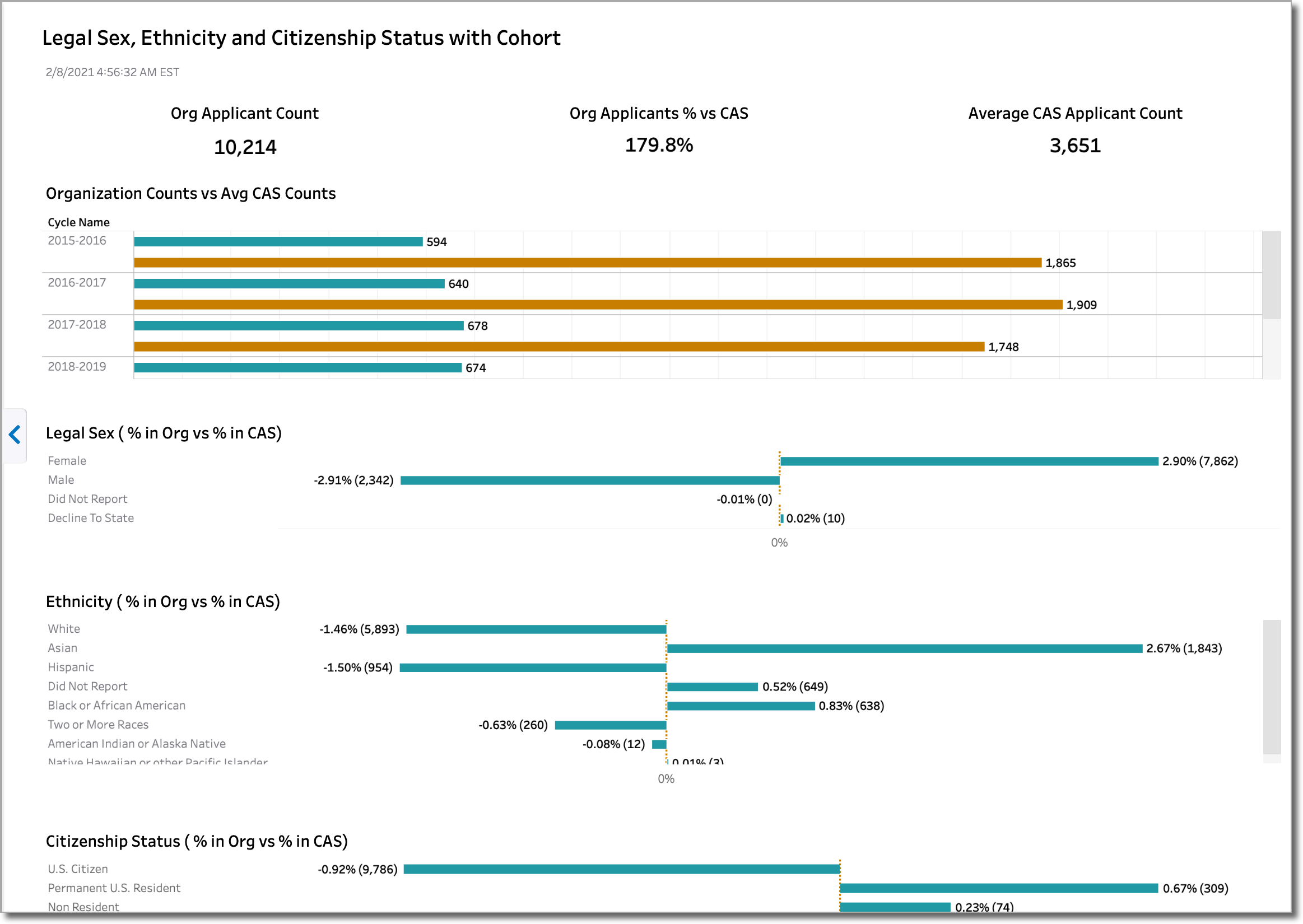
Legal Sex, Ethnicity and Citizenship Status with Cohort
This dashboard provides demographic information with a cohort representation. The cohort represents the average number of submitted applicants per cycle across all organizations in the CAS, allowing you to benchmark your program. You can hover your mouse over an element of the visualization for more information. In the example below, we can see that this organization is generally performing above the CAS average in a number of areas. For example, their application counts far exceed the CAS averages. In another example, the number of Asian applicants is above the CAS average by 2.67%.
The dashboard includes visualizations for:
- Organization Counts vs. Average CAS Counts
- Legal Sex ( % in Org vs % in CAS)
- Ethnicity ( % in Org vs % in CAS)
- Citizenship Status ( % in Org vs % in CAS)
- Top 5 Citizenships (Org)
- Top 5 Citizenships (Avg for CAS)
When reading the % in Org vs % in CAS visualizations, note that bars to the left of the cohort line indicate values below the CAS average, while bars to the right indicate values above the CAS average.