Residency Dashboards
Overview
Residency Dashboards provide you with a visual representation of applicants’ residency-related information, both in and outside of the United States. These dashboards are helpful in identifying where your applicants are coming from and can be used to adjust your recruitment strategies. Shades of orange indicate areas in which a higher number of applicants reside, while shades of blue indicate areas in which a lower number of applicants reside.
Working with and Downloading Data
As you review the following dashboards, refer to the Working with Dashboard Data page for specific information on:
- Using filters to narrow your data.
- Viewing tooltips to better understand your data.
- Viewing and downloading the raw data so you can work with it outside of Liaison Analytics.
Residency Dashboard Example Scenario
Travel Ban
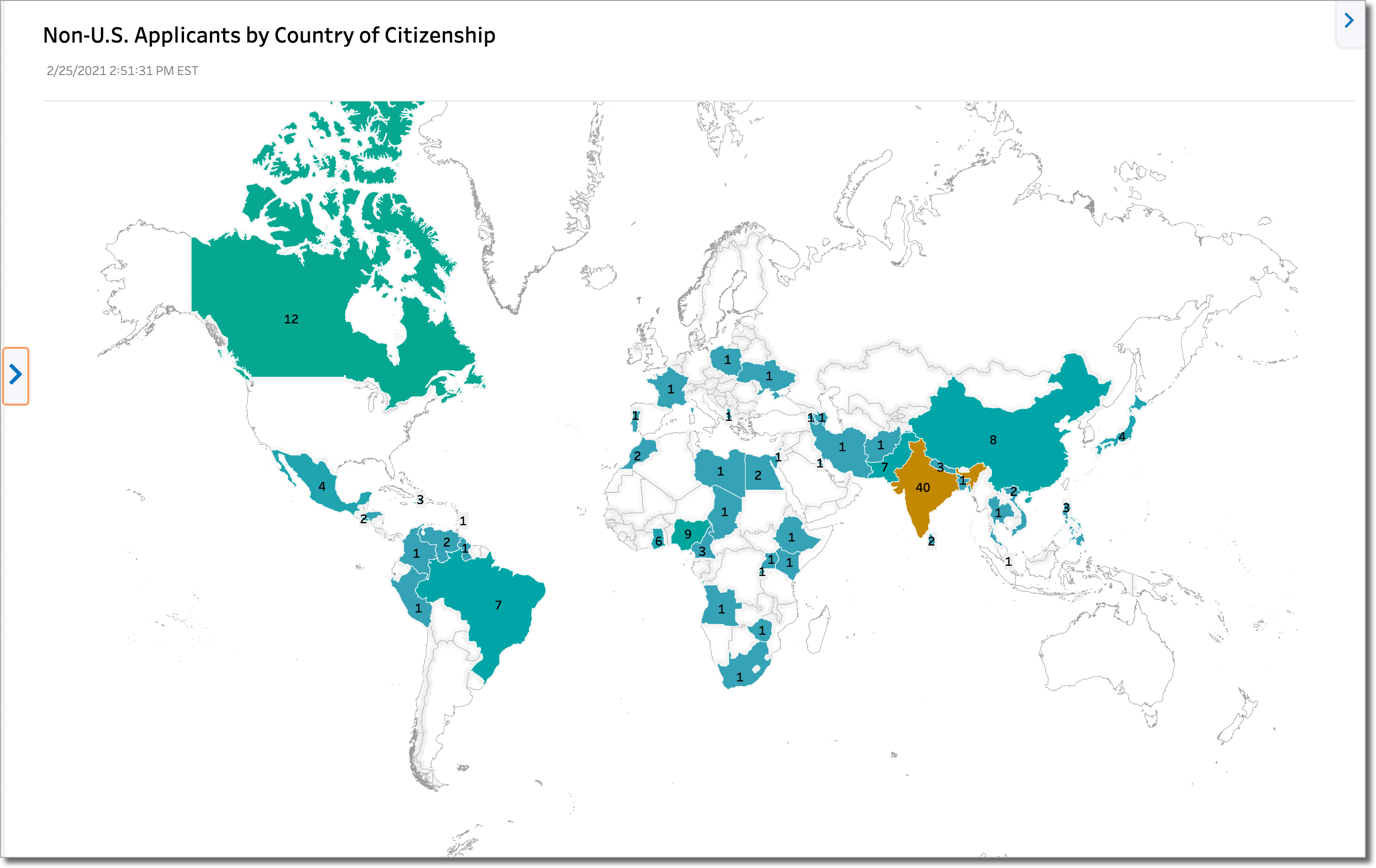
Andrea, the Admissions Director, has just learned of a travel ban that will prevent citizens of certain countries from entry into the United States. She wants to determine how many applicants this might impact, so she takes a look at the Non-US Applicants by Country of Citizenship – Map dashboard. Using this information, she identifies that approximately 275 applicants will be affected. She decides to:
- Work with her institution’s website developer to add a special section about the travel ban and how it will affect applicants.
- Work with an advisor who will field applicants’ travel-ban specific questions.
- Prepare communications that will be sent to the affected applicants.
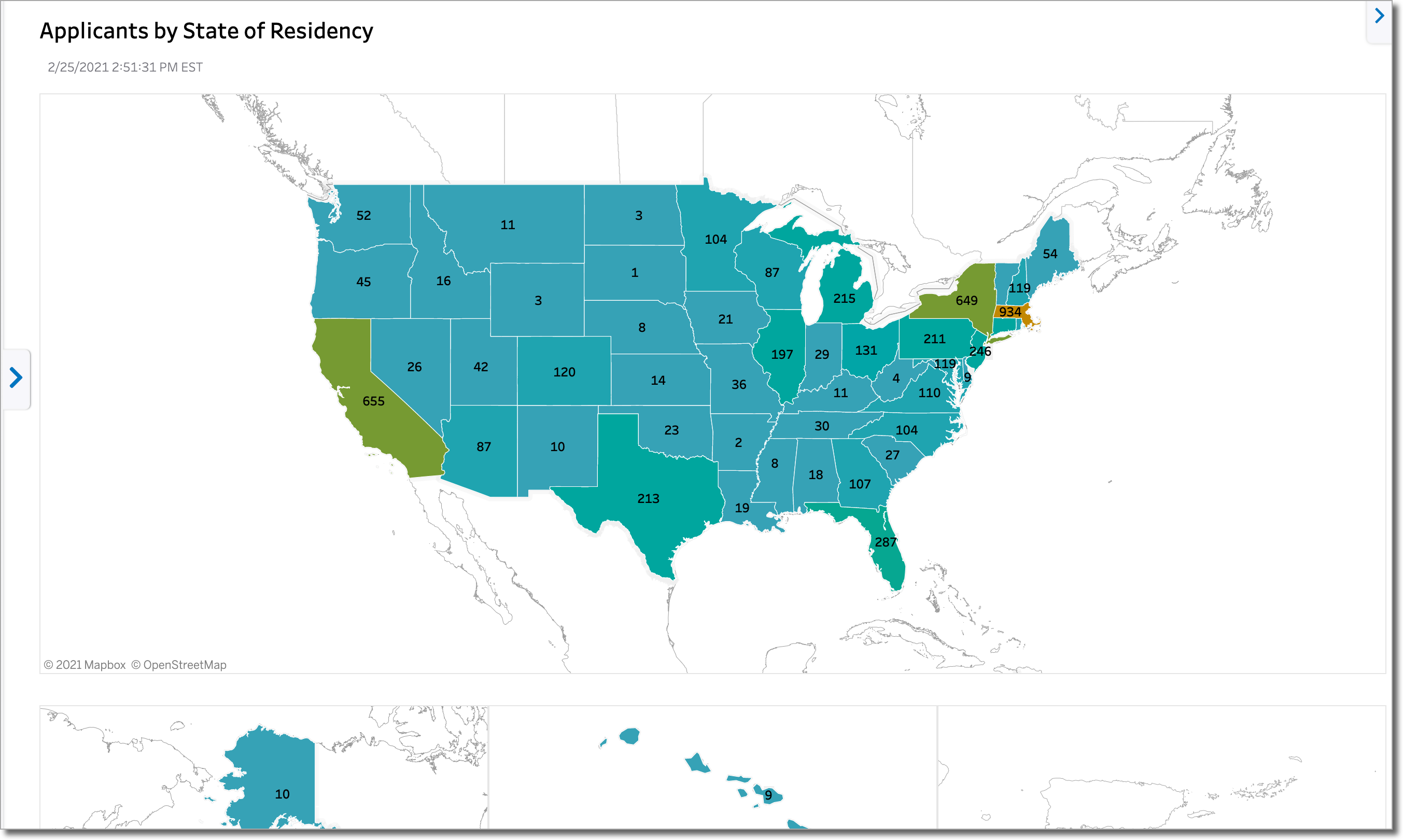
Applicants by State of Residency
This dashboard shows you the permanent state of residency that applicants self-reported in the application via the Residency Information question.
Non-US Applicants by Country of Citizenship – Map
This dashboard provides a more targeted view of your non-US applicants. It reflects the non-US country of citizenship that applicants self-reported in the application via the United States Citizenship Details question.
Notes:
- This dashboard is based on country of citizenship, not on citizenship status.
- When an applicant indicates they have dual citizenship, only the first country of citizenship they enter into the application is reflected in the dashboard.
- An applicant can submit their application in more than once cycle and is therefore counted in each of the cycles.
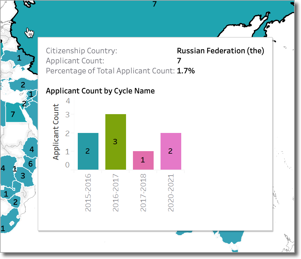
- The tooltip in this dashboard includes a bar chart to display the breakdown of applicants by application cycle. The sum of counts for all cycles may not match the total for the country due to applicants applying in more than 1 cycle. For example, in the following map view of Russia, we see an applicant count of 7, but the tooltip shows us a breakdown of 8 applicants, indicating an applicant applied in more than one cycle:
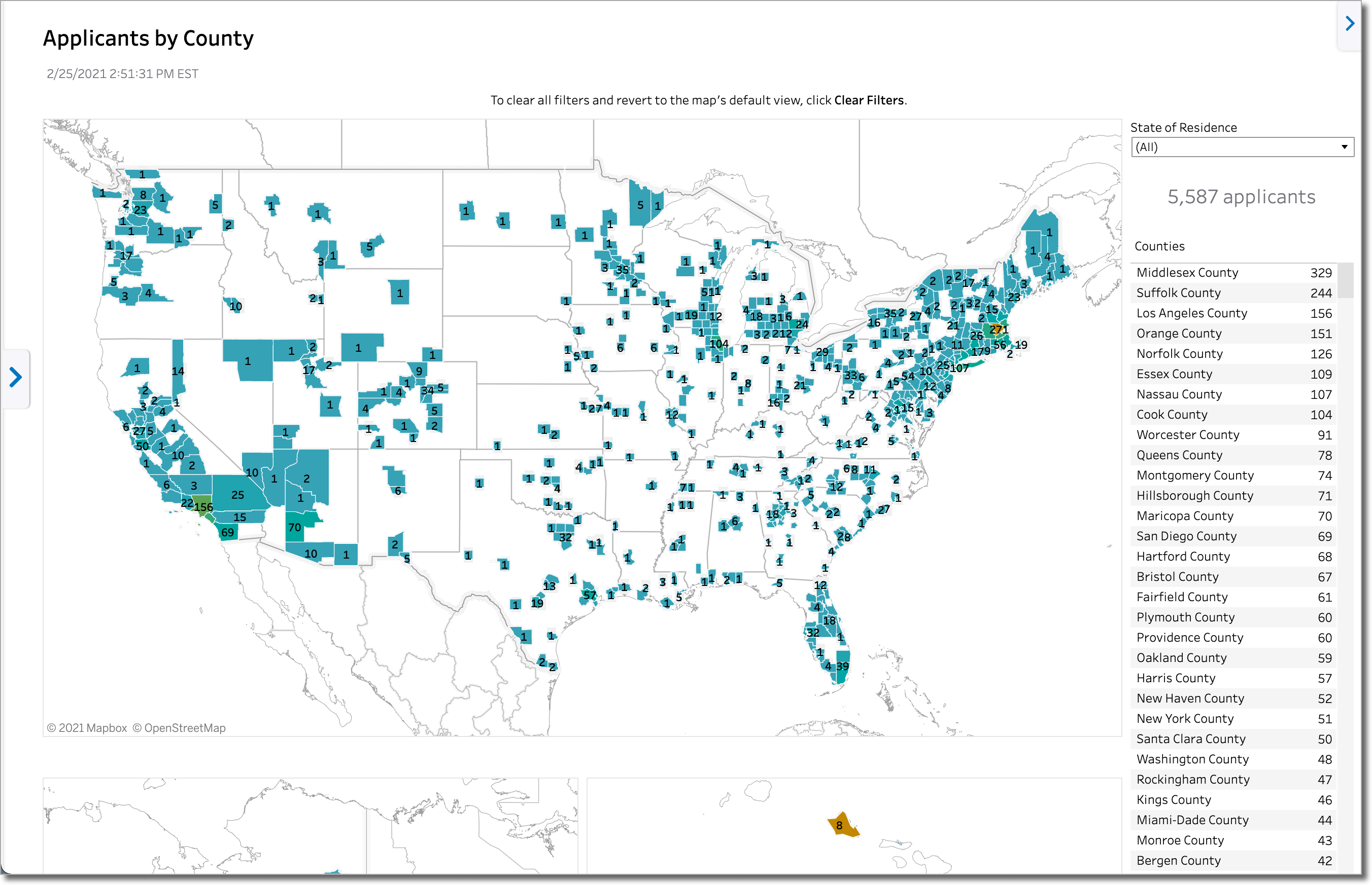
Applicants by County
This dashboard shows you the permanent county of residence that applicants self-reported in the application via the Residency Information question.
Notes:
- Not all CASs include a county question in the application. If county data is not available, is it assigned the Unknown value.
- State and county information is unavailable for CASs that do not use the standard residency information question. A future enhancement is planned and development efforts are underway to ensure this information is available to those CASs.