Analyzing Subpopulations
Overview
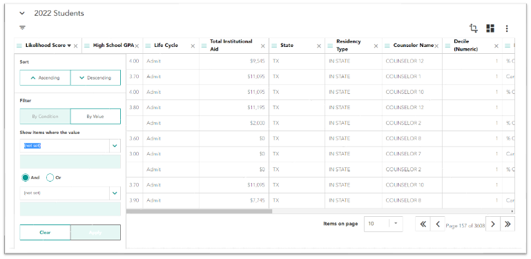
Othot provides several tools to help you explore the data in the Analyze tab of the Insights section.
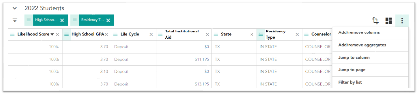
Adding and Removing Columns
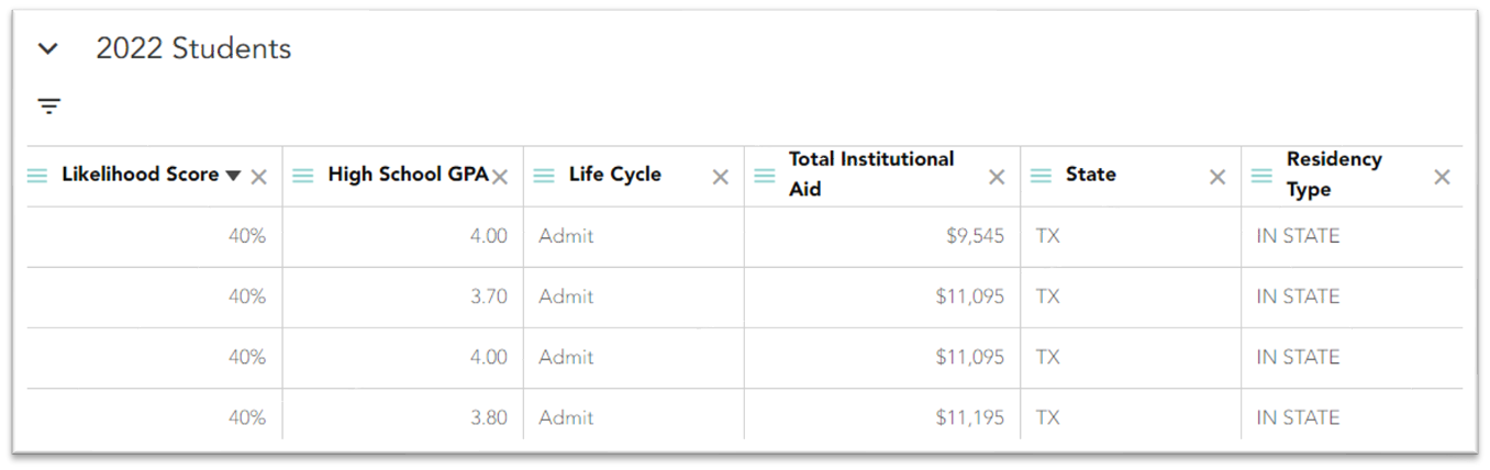
As you analyze your data, you'll find that there are many variables, and that some may or may not be useful to you as part of your analysis. With just a few clicks, you can choose which columns appear in your View.
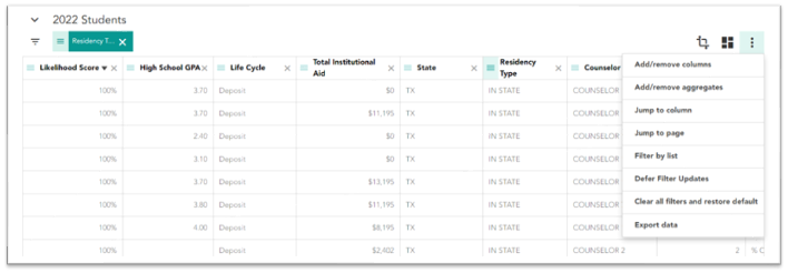
- Click the ⠇icon just above the grid, then select Add/remove columns from the drop-down menu.
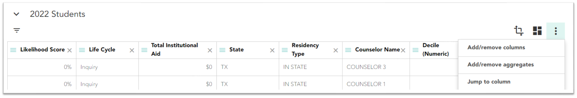
- Select the columns you want to see. You can use the search field to quickly find columns.
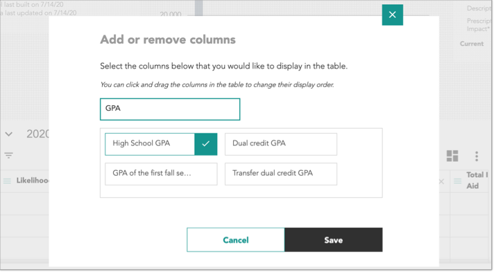
- Click Save to update the grid.
Note: you can quickly remove a column by clicking the X icon in any header.
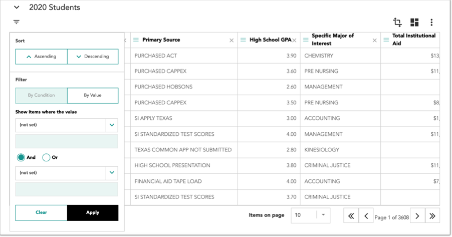
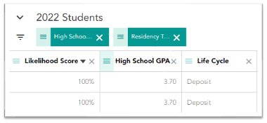
Filtering Columns
Use filters to narrow and display the data you want to analyze. Once you've filtered the data, you can view updated charts and perform more targeted What-if and Sensitivity Analyses.
Filtering Categorical Variables
- Click the hamburger icon (
 ) next to any column header in the grid that is a categorical variable (e.g., State).
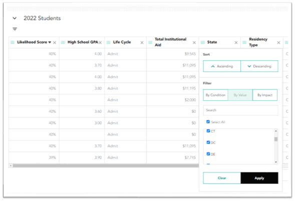
- Click the By Value filter, then select the variables.
- Click Apply.
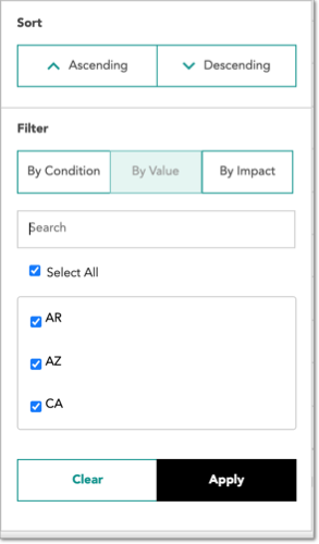
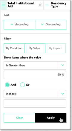
Filtering Numerical Variables
- Click the hamburger icon next to any column header in the grid that is a numerical variable (e.g., Likelihood Score).
- Click the By Condition filter to select values by comparison operators (e.g., equal to, greater than, less than or equal to, etc.). Choose your comparison operator and enter a value.
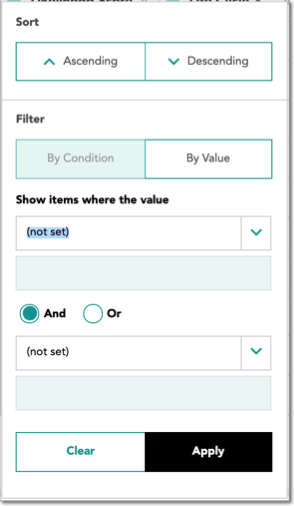
- Click Apply.
Filtering by Impact
- Click the hamburger icon next to any column in the grid.
- If the column is for a variable that is used in the model, you can use the By Impact to filter to only show individuals where that variable has a specific level of influence (positive or negative) on their Likelihood Score.
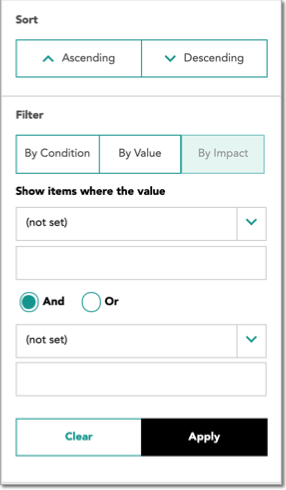
- Choose your comparison operator and enter a value.
- Click Apply.
Viewing Calculations of Column Data
It can be useful to quickly view summary statistics of quantitative variables. For instance, you may want to know the predicted amount of financial aid dollars to be disbursed without needing to export your data to Excel. For columns with numeric values, measures like sum, average, and count can be easily populated as rows at the bottom of the grid.
- In the Analyze section of the Insights page, click the ⠇icon, then select Add/remove aggregates from the drop-down menu.
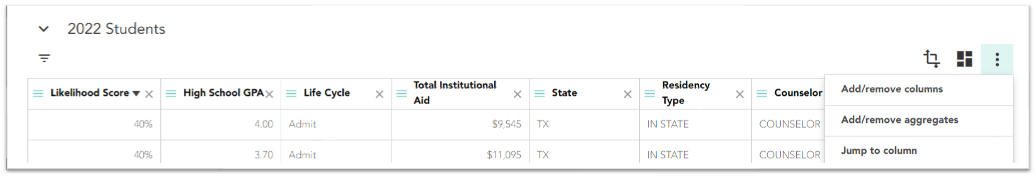
- Select the aggregate rows you want to see.
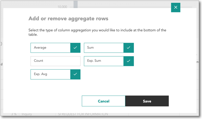
- Click Save.
Saving and Sharing a View
Rather than repeatedly applying the same filters or adding the same columns, you can save yourself time by saving view configurations.
- Configure your by adding any columns and applying filters.
- Click the
 icon to open the View/Task menu.
- Click the + icon in to add a new View/Task.
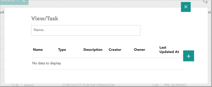
- Enter a Name and Description. Once saved, this information will appear in both the Apply View drop-down selection menu and the View/Task menu.
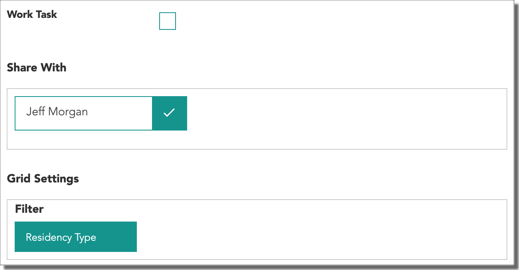
- If you're assigning this view to another individual, check the Work Task box, then under Share With, select the names of the other users who need access to this View/Task.
Note: other users who have access to your view will be able to select it within their own accounts but will not be able to save over it.
- Click Save. You can now quickly populate the view by clicking the icon and selecting it from the list.
Exporting Data
While the majority of your analysis can be completed within the platform, you may choose to export data for use within Excel or other applications.
- Configure your view to include any important information to be exported (i.e., add/remove columns, set filters, select a saved view, etc.).
- Click the ⠇icon, then select Export data from the drop-down menu.
- Once the file has finished downloading, it will be available in your web browser's default folder for newly downloaded files.
Creating a Pivot Table
You can view summary statistics by arranging variables and values from your data in a customized table.
- Configure your view to include any important information to be exported (i.e., add/remove columns, set filters, select a saved view, etc.).
- Click the
 icon to initiate a Pivot.
 - Click the + icon to create a new Saved Pivot (this allows you to view updated data for the configuration at a later date).
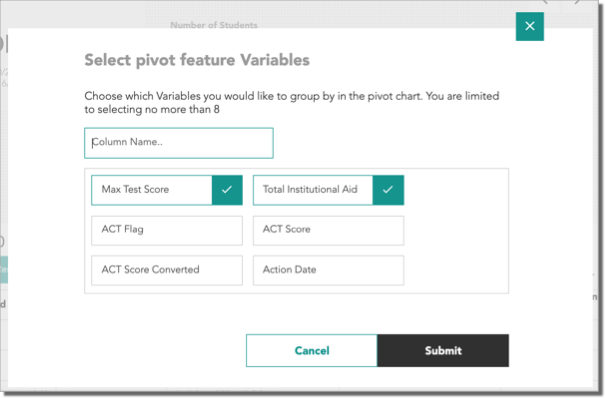
- Select up to 8 variables to be made available as Rows, Columns, Values, or Filters within your Pivot table, then click Submit.
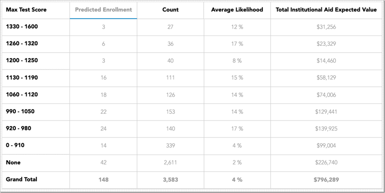
- In the Choose fields to add section, you'll find Likelihood and Count in addition to the variables that were selected in the previous step. The numerical variables you chose in the previous step will populate multiple fields to add. For example, a numerical variable like Total Institutional Aid will have the following available fields:
- Total Institutional Aid: to be used as a Row for grouping students by Total Institutional Aid.
- Total Institutional Aid Value: to be used as a Value, in this case to Sum or Average the total offered amount.
- Total Institutional Aid Expected Value: to be used as a Value, in this case to Sum the total predicted disbursed amount.
- Total Institutional Aid Expected Average: to be used as a Value, in this case to show the Average predicted disbursed amount.
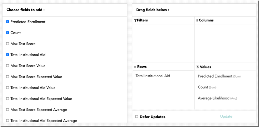
- Click and drag fields to the desired quadrants for Rows, Columns, Values, and Filters. By default, there are Values populated for Predicted Enrollment, Count, and Average Likelihood. To remove them, click and drag them back to the Choose fields to add section.
Tip: right-click on a field in the Values quadrant and select Field Settings for more display options and calculations.
- Click Export to save or share your Pivot table.
Using Groups
Many marketing activities are dependent on having a way to segment large populations into meaningful classifications. This feature takes a data science approach by clustering individuals together into similar Groups based on the variables most important to an outcome of enrollment or retention. These Groups can then be targeted in ways that are meaningful to who they are and their interests.
Groups are created using only historical data where the enrollment or retention outcome is known. Because of this, the criteria that determine a Group will not change unless the underlying model is rebuilt. Once Groups are built, all prior and current students are assigned to the Groups in the grid for analysis and to assist in your decision-making.
Students are first assigned a Groups label by Life Cycle Phase, then by a double-digit numerical value. This value is in ascending order of highest average Likelihood Score by Group. For example, students in the “Inquiry-00” Group will be more likely to enroll than students in the “Inquiry-03” Group on average.
A student’s Group value will update as they progress through the Life Cycle. Their Group value may also update if there is something that’s significant to their current Group value that changes in their data.
Viewing the Groups Breakdown Visualization
You can better understand the similarities of individuals in each Group by referencing the Groups Breakdown visualization. Groups are organized by Life Cycle Phase, which are then sorted by the Phases with the most records to the fewest that are currently present in the grid. Click the arrows next to Prediction Overview until the Groups Breakdown chart is visible.
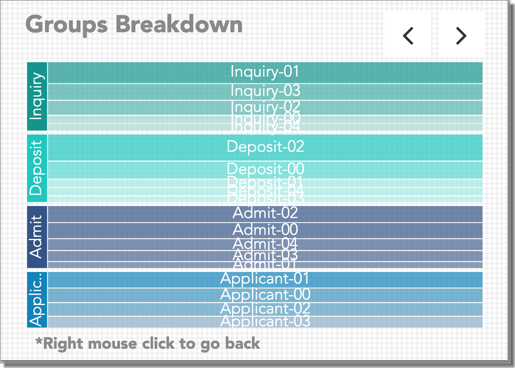
When viewing the breakdown, you can:
- Click on a Life Cycle Phase in the left-most column to only show its Groups.
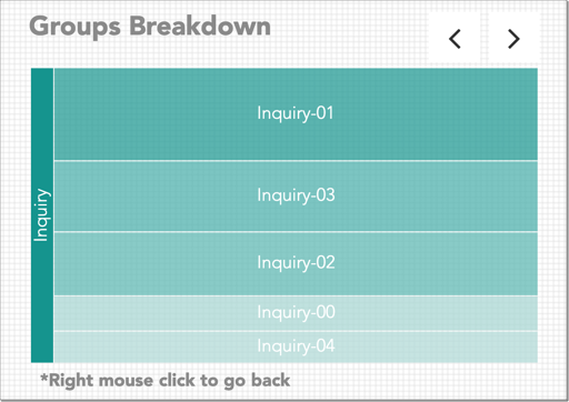
- Hover your cursor over a Group to see the percentage of historical students who were assigned this value for the selected Life Cycle Phase.
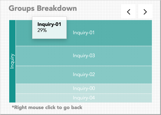
- Click on a Group to learn what makes the students within it similar.
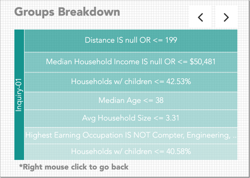
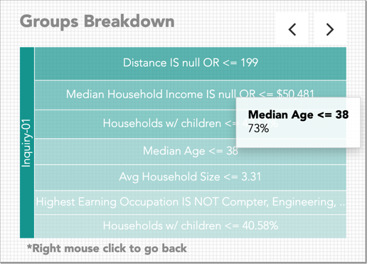
- Hover your cursor over any variable and value combination to see the percentage of historical students in that Group who meet the criteria.
- Right-click anywhere in the visualization to go back to the previous layer in the Groups Breakdown.
Group Column
After understanding the similarities of historical students that make up each group, you can see which current students meet the same criteria. This will enable you to make more targeted decisions, such as who to market to and with what message.
- Add the Group column to the grid.
- Filter to any Group.
- Use the Groups Breakdown visualization to understand the similarities between these individuals.