Configuring Dashboards & Running Reports
Overview
The Dashboard is the landing page where you arrive after logging in, offering a customizable view of key reports through interactive charts. You can click on these charts to explore specific groups of applicants.

Customizing Your Dashboard/Creating Reports
To customize your dashboard, use the pencil icon in the top-right area to add new charts or rearrange the layout. You can also navigate to the Reporting section in the left menu to create and view reports outside of the dashboard.
Add Columns
Charts are placed into columns. When editing a report, you can scroll to the bottom of the page to add new half-width or full-width columns. Selecting a half-width column allows you to create two columns side by side, while full-width columns span the width of the dashboard.

Add Charts
Columns can include one or more charts. To create a chart, click + Add Chart.
- Select a chart type. If necessary, you can change this later.

- Enter a name for the chart, then use the Choose field drop-down to select what data the report should be based on. For example, you can create a report based on your applicants’ statuses, states of residence, etc. Where applicable, you can choose to limit the report to the top 100, 50, 25 (etc.) results. For example, if you’re creating a report based on states of residence, selecting Top 10 isolates only the ten most common states to include in your report.

In this example, we'll look at the top 10 states of residence. 
Note: you can change the chart type using the chart icons to the right of the Choose field drop-down. Some chart types allow you to choose secondary data. For example, if you have a bar chart displaying the applicants' states of residence, you might add sex or gender as a secondary data point so that each bar also provides this information. Additionally, you can use the buttons to the right of the chart icons to segment by specific criteria, or view additional chart options.
- When you’re finished adding charts, click Save.
Rearrange Charts
When editing, the Rearrange button allows you to click and drag individual charts and groups of charts. Additionally, you can delete these items, rename them, and change how they appear (as half-width or full-width columns).


Managing Reports
After creating reports, you can see them in the Reporting section. From here, you can review, search, delete, copy, or categorize your existing reports. Categories help you better organize your reports. For example, you can have a category for reports that will be used as dashboards, a category for reports needed for annual reporting, etc.

Sharing Reports
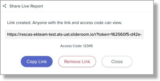
The software allows you to share reports with anyone. This includes anyone outside of your organization, and without a ResidencyCAS account. Sharing reports is an efficient way of providing report data to someone without giving them an account.
To share a report:
- Navigate to the Reporting page and open the report.
- Click the Share icon in the top right.

- Create an Access Code. This code serves as a password for your recipients to use when attempting to view your shared report.
- Click Create Share Link. You’re presented with a link that can be shared with your desired recipients. Anyone with this link and Access Code can view the shared report.
- If you ever need to stop sharing the report, click Remove Link.
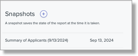
Creating Report Snapshots
Reports are dynamic, so they update in real time to reflect any changes. To capture a report in its current state, use the Snapshot feature. Snapshots can be useful for capturing weekly or monthly progress of a given data point, for example.
To create a snapshot:
- Navigate to the Reporting page and open the report.
- Click the Snapshot icon in the top right.

- Click the + icon, rename the snapshot (if desired), and click Create Snapshot.
- You can now return to this report at any time and review the snapshot (you can create as many snapshots as you'd like).
- When reviewing a snapshot, you can see a side-by-side comparison with the live report by clicking Compare with live report. You can also share the snapshot via the share icon in the top right (not pictured below).

Scheduling Recurring Snapshots
If you'd like to maintain a historical record of your report throughout the application cycle, you can schedule recurring snapshots. This process allows the snapshots to be taken automatically at your desired frequency, eliminating the need run them manually.
To create a recurring snapshot, follow the steps above to create a new snapshot, but instead of clicking the + icon, click + Schedule recurring snapshots, then select your desired frequency, day, and time.
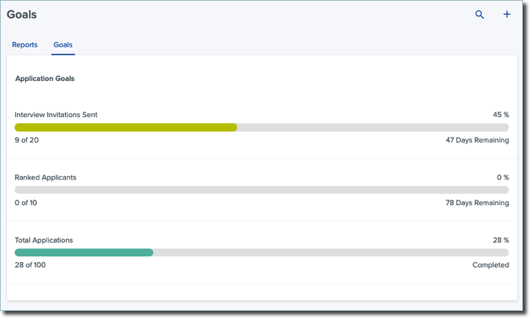
Creating Goals
Throughout the cycle, you may want to track specific targets, such as a specific number of applicants from a particular area. In the Reporting section, you can open the Goals tab to create a new goal and establish your target and completion date. Goals are based on segments.