Creating a TX Form: Step-by-Step Guide
Getting Started
- Navigate to TargetX Builder.
- Select the TX Forms icon.
- Choose the icon for the Type of TX Form: General, Application, or Event.
- Create a new form by clicking the “+” icon and entering a form name.
For more information on creating well-structured TX Forms, review the article Best Practices for TX Form Strategy.
Building the Public URL for Logo or Poster images
Logo and poster images for general and application forms utilize a publicly accessible URL that points to a static resource. This ensures that the images are consistently available and can be easily referenced across different platforms and applications. Note: Description, Logo, and Poster images for Event forms are defined in the Event record.
Follow these steps to build your Public URL:
Step 1: Create Static Resource for images
Once you create a Static Resource for your Logo and Poster images, you must copy the URL.
- Navigate to Setup and search for Static Resources. Click the link for Static Resources.
- Click New or click an existing Static Resource.
- Enter the following:
- Name – enter a name that does not include spaces, such as My_Logo.
- File – navigate to the location of the file you wish to use.
- Cache Control = Public
- Save the image.
- Click the View file link.
- Copy the URL.
Step 2: Copy the Link to your Site
- Navigate to Setup and search for Sites.
- Copy the Site URL for the Site you selected in the Public URL section.
Step 3: Create the Poster/Logo URL
Combine the Site Link from Step 2 and the Static Resource link from Step 1 (beginning with /resource).
Examples
- Link to Static Resource: https://myorg.force.com/resource/1652377062000/My_Logo?
- Link to Site: https://mysite/inquiry
- Poster/Logo URL = https://mysite/inquiry/resource/1652377062000/My_Logo?
Form Settings and Details
- Enter a Form Name and click Create.
- Complete the Details tab.
- Assign a clear Form Title and descriptive Description (which supports links and basic formatting). The Form Title will display in the left pane, along with your Description.
- Define form-specific settings like logos, Poster URL, Confirmation message, and any redirects:
- Logo URL: The public URL for your institution logo or the link to a Public static resource image file. This will be displayed in the top left of the form panel. See below for details on building the Public URL for Logo or Poster images.
- Recommended image size: 70 x 60 px.
- Poster URL: The public URL for the image or the link to a Public static resource image file. This will be displayed in the left pane, behind the Logo, Form Title, and Form Description. See above for details on building the Public URL for Logo or Poster images.
- Recommended image size: 768 x 1024 px.
- Confirmation Message: The message is displayed once the user submits the form.
- Redirect to Custom URL: This option allows you to enter a URL that the user should be directed to after they submit the form and select Done. When Redirect on embedded form is enabled, the system will redirect the student to the URL when the embedded version of the form is submitted.
TX Form Types Comparison
|
Feature/Focus |
Application Form |
Event Form |
General Form |
|---|---|---|---|
| Primary Object(s) | Contact and Application | Contact only | Contact only |
| Use Case | Collecting information for applications, essays, or related records. | Managing event registrations. | Basic inquiries, event sign-ups, simple forms. |
| Ideal For | Admissions forms, multi-record processes. | Campus visits, info sessions, open houses. | Inquiry forms, RSVP, basic information gathering. |
| Record Creation | Can create/update multiple related records. | Creates Event Attendee records for Contacts. | Creates/updates only the Contact record. |
Adding Structure and Content
- Sections and Repeatable Sections: group related questions and allow repeated entries where needed.
- Content Blocks: include static text, disclaimers, or instructions.
- Hidden Fields: capture metadata or pre-fill information using URL parameters.
- Dividers: add visual separation — these can be conditionally displayed.
- Click the Content tab.
- Update the Title for the first section by clicking the edit icon, entering your Title, and clicking Done.
- Expand or collapse the section by clicking the bar or the Chevron Up icon. The Section Name is displayed in Bold above the Section.
- Drag and drop or select Content Blocks from the Content tab.
- Note: If you click the Content tab before adding any sections, the system creates a Section automatically.
- Add additional Sections by clicking the Add Section button.
- Continue to add the appropriate Content Blocks by dragging and dropping blocks from the Content tab.
For more information, review the article Designing Form Sections and Content Blocks.
Questions and Field Configuration
- Add new questions using various field types (e.g. text, dropdown, address widget).
- Use Conditional Logic to display relevant fields based on prior responses.
- For contact-based objects, define the correct Object, Field, filters, and labels.
Advanced Features
- Option Groups: manage lists of selectable options.
- Version Control: create and manage multiple form versions; unpublish outdated ones.
- Contact matching: When users Submit a form, Contact matching is based on First Name, Last Name and Email. The system will look for an EXACT match on all three of these fields. For details on customizing Contact matching, see Managing TX Forms.
For more information, review the article Advanced Field Configurations in TX Forms.
Final Review and Launch
- Preview the form and test logic, layout, and data capture.
- Publish the finalized version for users.
- Sharing | Sites: This feature enables you to choose one of your Sites to display the form. For instance, if you have an Inquiry Site, select the Site from the list and then Copy the link to view it.
- The Public URL information is utilized to construct the URL dynamically, and the Embed Code Snippet is displayed. Please note that this information is NOT saved along with your form.
- When employing a new site for various form types, you must add permissions for the Inquiry, Org Event, or Application objects for the site guest user. You will require the list of all the fields added to your form. For further information on Permissions and TX Forms, please refer to Implementing TX Forms.
For more information, review the article Previewing, Publishing, and Sharing your TX Forms.
Key Considerations for Event Forms
Since Events forms establish a connection to Organization event records, there are numerous distinctions to consider when creating these forms. It is important to be aware of these differences to ensure accurate and effective form creation.
You can create TX forms for Events from several locations:
- Event Settings tab
- Organization Events tab (when creating, viewing, or editing an Event)
- Event Forms tab
- TargetX Builder(from TX Forms icon)
The Form Builder button allows the creation of a New TX Form that can be assigned to the Org Event. As a best practice, be sure to adopt standard naming conventions for your Forms that are shared organization-wide, so it's clear what function or business need your Form serves.
- Navigate to either Event Settings, Organization Events, or create a new Events TX form from TargetX Builder.
- Locate the Event Forms Options section.
- In the Event Form Type, select TargetX Forms.
- Select a Default TargetX Form by clicking the magnifying glass to search or click on the Form Builder button to create a NEW form.
- Click the + to create a new form.
- Enter a Form Name.
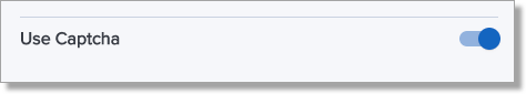
- Indicate if you want to use reCAPTCHA for your Event form.
- Click Save.
Note: Description, Logo, and Poster images are defined in the Event record.
- Click the Content tab to begin adding Sections to your form. A new Section will be automatically added.
- Add a Name to your Section:
- Click the Edit icon to enter a Section Name.
- Click Done to save the Section Name.
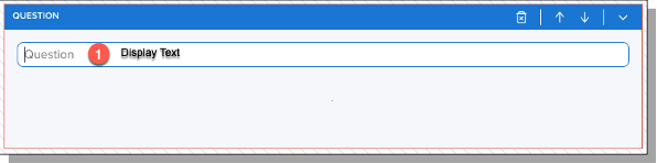
- Configure Content Blocks. A Content Block refers to the type of data you are collecting, such as Questions, Disclaimers, Hidden Fields, etc.
- From the Content tab, choose the type of Content Block you wish to use and click or drag it onto your form.
- Select the Object and Field where the data will be saved.
- Enter the Display Text (1) for the Content.
- Continue to add Content Blocks as needed.
Note: For Events forms, the left panel is defined by your Event setup
1 - Header Logo
2 - Header Text
3 - Event Name and Description
4 - Event Start and End Dates
5 - Event Poster Image

- Enter any Custom Questions.
- These questions are in addition to any Custom Questions configured on your Event and will display under Additional Information when users register.
- Depending on your selection, the user’s answers to TX Event Form Custom Questions will be displayed in the Inquiry or Contact record.
- Custom questions built into the Organization Event record will continue to store responses in Contact Schedule Item records. Only guest count and organization event custom questions will be presented when bypassing any registration form if configured.
Notes:
- Administrators MUST grant READ access to any fields included in your Custom Questions:
- Add READ access to the Profile of the person(s) creating the form.
- Add READ/WRITE to the Guest Site User profile.
-
When using a new site for Events form types, you must add permissions for the Org Event object for the Site Guest User. You will need the list of all the fields added to your form. For additional information on Permissions and TX Forms, see Implementing TX Forms.
- Contact Matching is based on first name, last name, and email address.
- Save your changes. The system will validate your form.
- Assign the form to your Event:
- Navigate to the Organization Events tab.
- Click on the Event that you wish to assign your form.
- Click Edit.
- Scroll to the TargetX Event Forms section.
- Click on the Search icon to search for your form.
- Click on the Form you wish to assign.
- Save your changes.
- Preview your form by clicking the Event Registration Link, or by selecting the Preview icon [
] from the Forms list or the form itself.
- If you wish to make changes after Preview, click on the Form Builder button in the TargetX Event Forms section, and you will be directed back to your form:

- Save your changes.