Understanding Your Predictions
Overview
The Analyze tab of the Insights section includes tools to help you better understand your predictions.
Prediction Overview
The Prediction Overview summarizes individual student-level predictions into two total predictions: historical and current.
- The Historical Prediction value is the expected enrollment based on your institution's observed enrollment yield or retention rates from the training data used to build the model.
- The Descriptive Impact represents how many more or fewer students are expected as attributed to variables that are not What-If variables, such as location, test scores, student type, etc.
- The Prescriptive Impact* represents how many more or fewer students are expected as a result of the values currently entered for What-If variables, such as aid offers, engagements, marketing, etc.
- The Current Prediction values represent the expected enrollment or retention totals based on your institution's data as it stands today. These values will likely be lower than the Historical Prediction values until your institution follows a strategy that is similar to or more effective than has been observed in data from prior years.
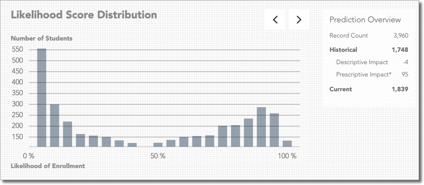
This section remains present for convenient reference as you scroll through the visualizations. The values update dynamically as filters and What-if scenarios are applied, allowing you to view predictions for any subset of students and simulated decisions.
Explaining the Current Prediction
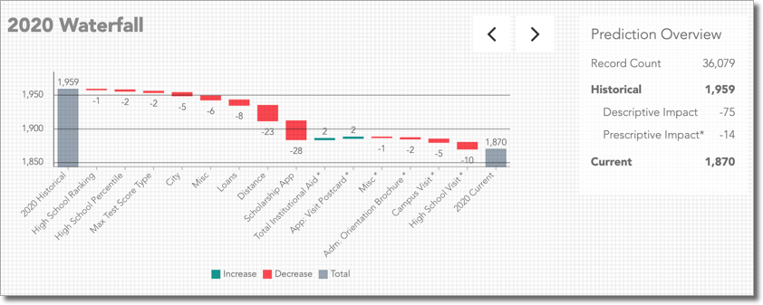
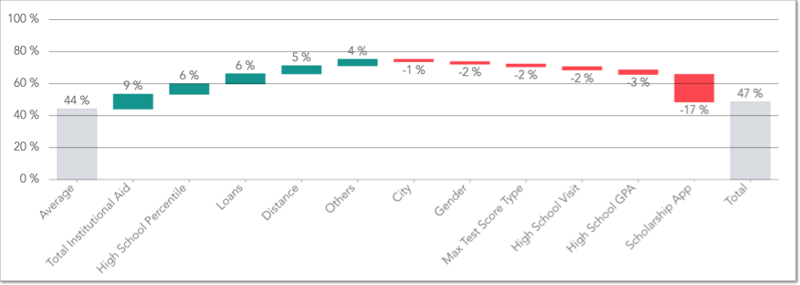
The Waterfall is a more detailed visual representation of the Historical Prediction, Current Prediction, Descriptive Impact, and Prescriptive Impacts that are found in the Prediction Overview. The chart displays how much each Descriptive and Prescriptive variable impacts the Historical Prediction resulting in the Current Prediction. This visualization is helpful when trying to understand what's driving predictions of populations and to what degree.
To view the Waterfall, click the Left or Right arrows next to Prediction Overview until the chart displays.
Hovering over the impact bar for any variable in the waterfall displays additional detail about what is causing that impact. Depending on the variable, there are 2 to 10 value buckets, the overall positive or negative impact that value is creating, and the count of students with that value.
Tip: you can choose which visualization displays on default after logging in by selecting a preference on your Profile page.
Understanding a Student's Likelihood Score
Each prospective student is unique, which results in hundreds or thousands of data points made available for predictive modeling. Othot's machine learning algorithms turn these data points into Likelihood Scores for each student. The Individual Page offers a glimpse of what's driving any student's current score, and also offers tools to learn how the current score could be improved.
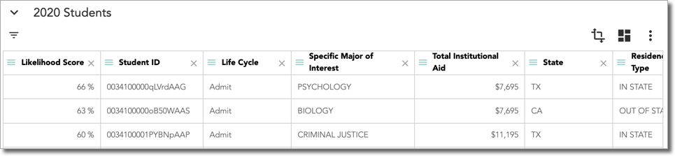
Click anywhere on a row to gain deeper insight into predictions, including:
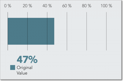
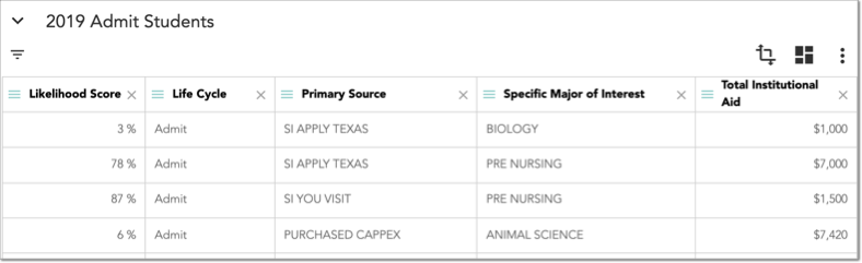
- Likelihood Score: the student's current probability is determined by Othot's machine learning models, which are applied to your historical data. The higher the value, the more likely the student is to enroll or be retained based on current conditions.
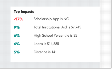
- Top Impacts: displays the variables that have the most significant positive or negative influence on the student. The percentages for each variable represent the expected increase or decrease in the student's likelihood score that can be attributed to the value of the variable.
- Lifecycle Phase Likelihood Scores: view how the student's Likelihood Score has trended as they've progressed through the matriculation process. Here, you can compare their Current (Original) Likelihood Score against the average score for each Lifecycle phase.
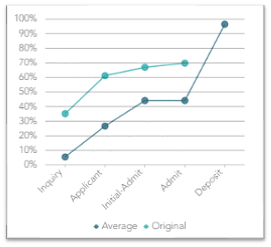
At the top of the page, you can also view the likelihood of the student at the different lifecycle stages they’ve passed through.
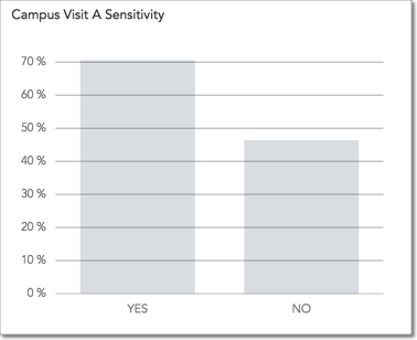
- Recommendation Sensitivity: quickly identify the single most influential action your team could take to increase the student's Likelihood Score, then see the expected results of that action. Depending on the student, this visual may show their Sensitivity to total aid offers, visit types, marketing activities, or other engagements that have been configured for your institution.
- Individual Score Impacts: understand which characteristics are increasing and decreasing the student's Likelihood Score in comparison to the average student. This visual is an extension of the Top Impacts section that shows more detail into how the student's Likelihood Score has been determined by Othot's modeling. The chart begins with the average Likelihood Score, then shows for this specific student which variables are increasing and decreasing their score until the final column that shows their Current Likelihood Score.
Analyzing Data from Historical Years and Points in Time
Take further advantage of the historical data your institution has provided to Othot with Rewind. With this feature, you can determine what could have been done better or what might have happened if you had tried different strategies. Your data can be rewound to a prior life cycle phase, a previous academic year, or both.
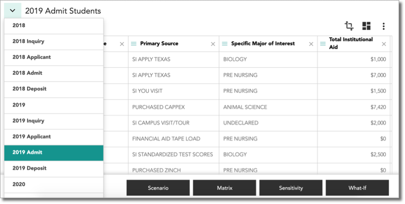
- In the Analyze section of the Insights page, click the drop-down next to the academic year, then select the academic year and Lifecycle Phase that will be the subject of your analysis. For example, you may consider selecting the Admit phase of a prior academic year if you'll be attempting to determine if financial aid was optimally disbursed to admitted students.
- The resulting view displays the rewound data.
Note: using Rewind in combination with Prescriptive Modules can help you to better understand which actions would have been predicted to yield the best results in order to inform your future strategy.
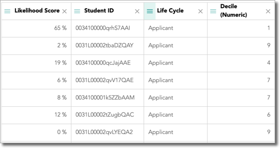
Deciles
Where Likelihood Scores help you decide which students to focus your resources towards, Deciles help to put those probabilities in context relative to other students. For each phase in your model's lifecycle, students are assigned a Decile value that is their ranking when split into ten equally sized subpopulations (1 equals most likely and 10 equals least likely). This column will be available by default in the Grid to help you make targeted decisions with your resources more quickly and effectively.