Using Signal
Overview
Signal is an automated event and reporting system that is also where Pivot Snapshots and Dashboard Snapshots are stored for future reference. Signal reports that you subscribe to run automatically at your desired frequency and provide important insight on your institutional goals. Email notifications provide a snapshot analysis of the state of your class, highlighting what has changed, and in some instances, why.
Enabling the Weekly Signal Report
The Weekly Signal Report is emailed to and viewable by users who belong to a Weekly Signal group. Admins can create and add users to this group as follows:
- Navigate to the Admin section from the Main Menu.
- Scroll to User Groups.
- Click the + icon to create the group. Title the group Weekly Signal (any other title will prevent users from receiving the report).
- Select the users to be included in the group.
- Click Save.
Viewing a Signal Report
By default, Othot emails the Weekly Signal Report every Monday at 12:00 PM ET. It contains visualizations that show the changes in predictions and counts from the past 7 days, as well as the totals prior to the past 7 days (note that for Retention product users, the report uses 30 days instead of 7).
To view the report in Othot:
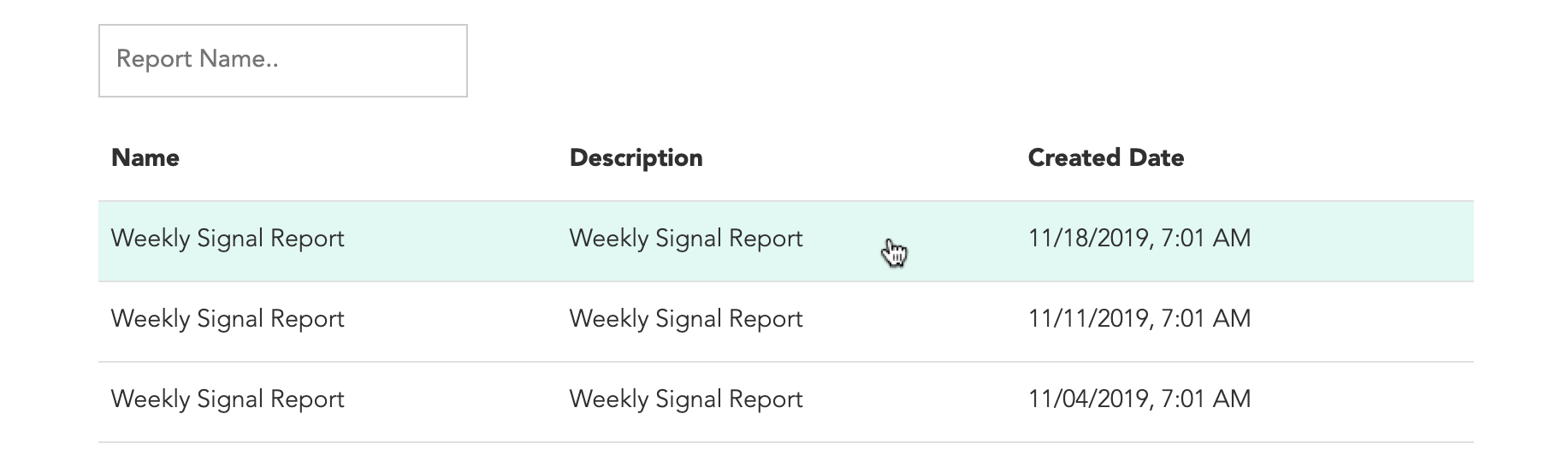
- Navigate to the Signal tab on the Insights page.

- Select any completed report.
Signal Report Visualizations
The default Weekly Signal Report contains the visualizations described below. Contact support@othot.com for any customization requests, such as:
- Report frequency.
- Date/time sent.
- Users who receive the reports.
- Visualizations.
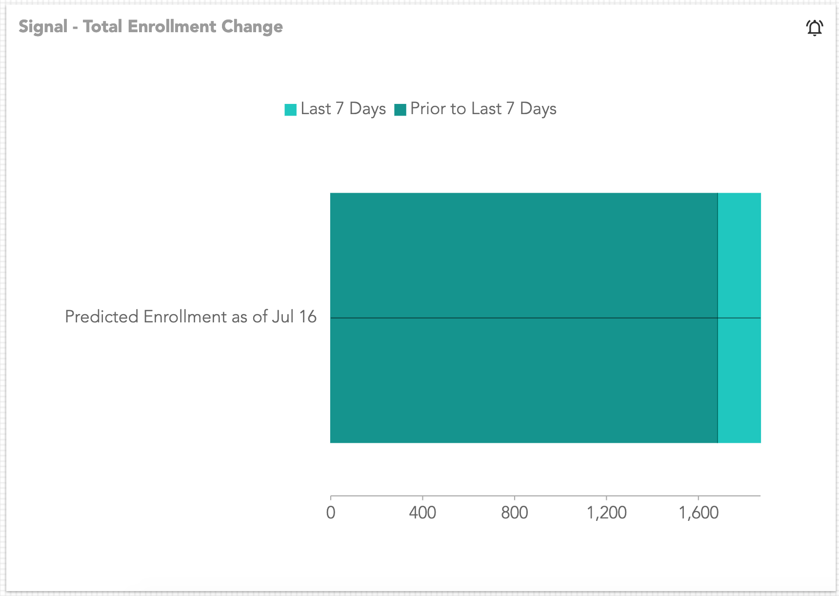
Total Enrollment Change
The total predicted enrollment to date (broken out by how many more or fewer students there are from and prior to the last 7 days).
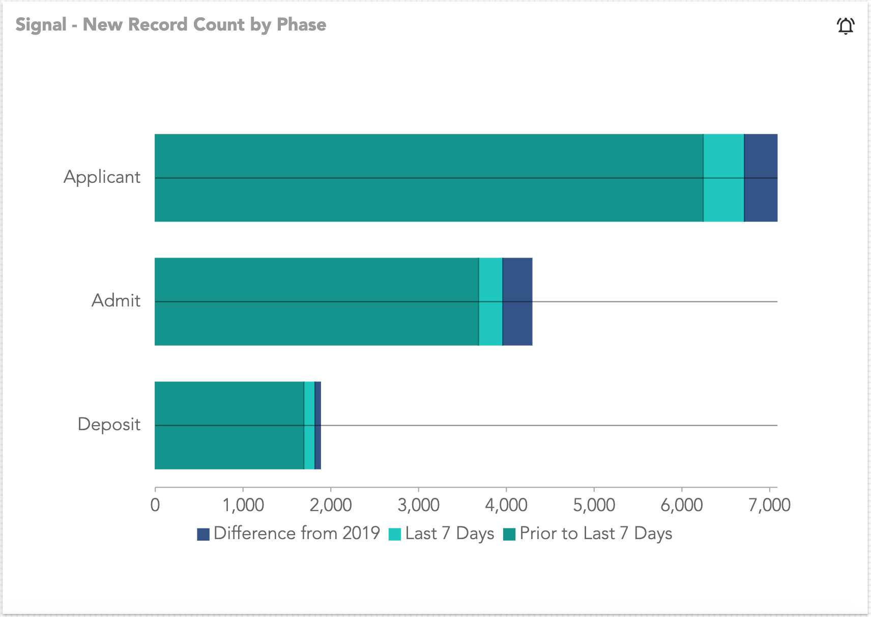
New Record Count by Phase
The total count of records for the current year by phase (broken out by how many more or fewer students there are from and prior to the last 7 days). Additionally, the visualization includes the difference remaining from the prior year's total quantity.
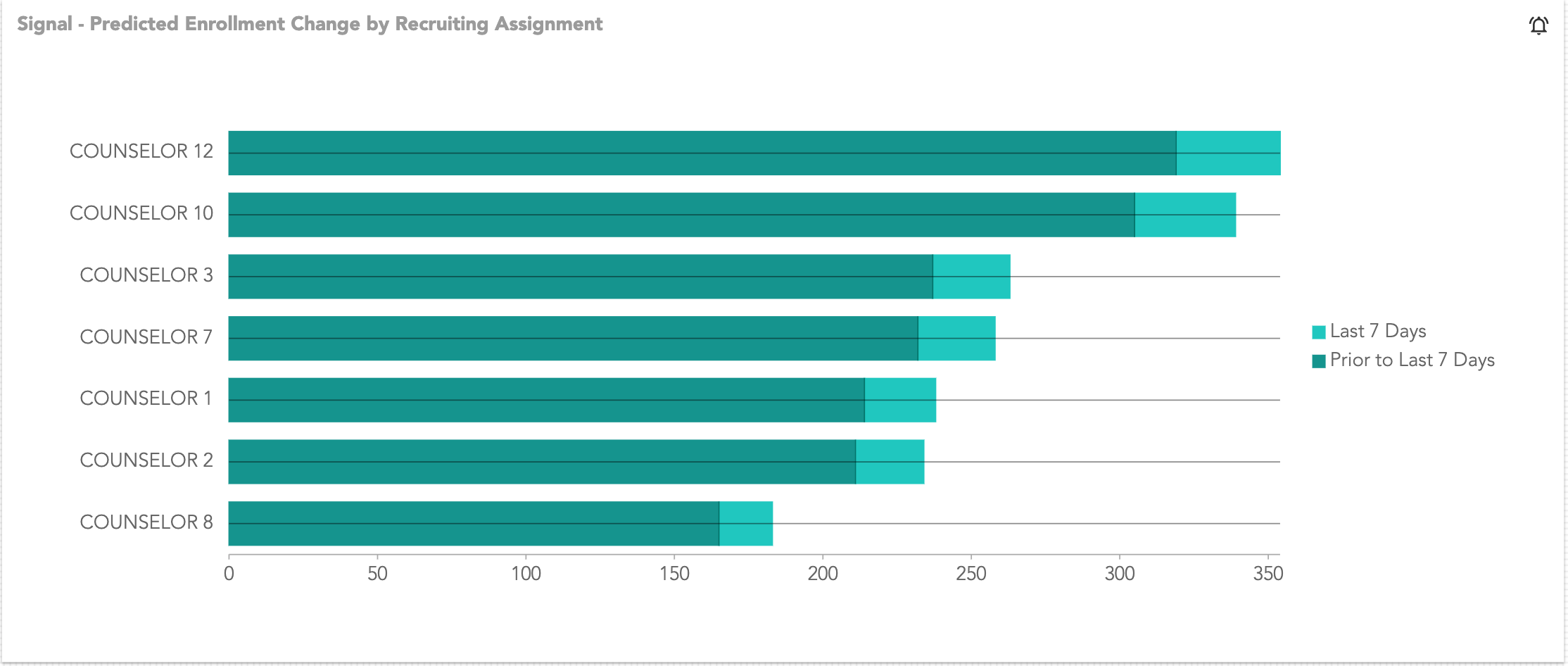
Predicted Enrollment Change by Recruiting Assignment
The total predicted enrollment by Recruiting Assignment (Counselor, Territory, etc.) to date (broken out by how many more or fewer students there are from and prior to the last 7 days).
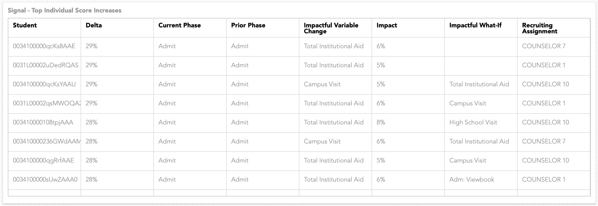
Top Individual Score Increases
The fifty individuals whose Likelihood Scores have increased the most, as well as their current/prior Lifecycle Phase, the variable and its impact value that attributed to the increase the most, their Recommendation (Impactful What-If), and the Recruiting Assignment.
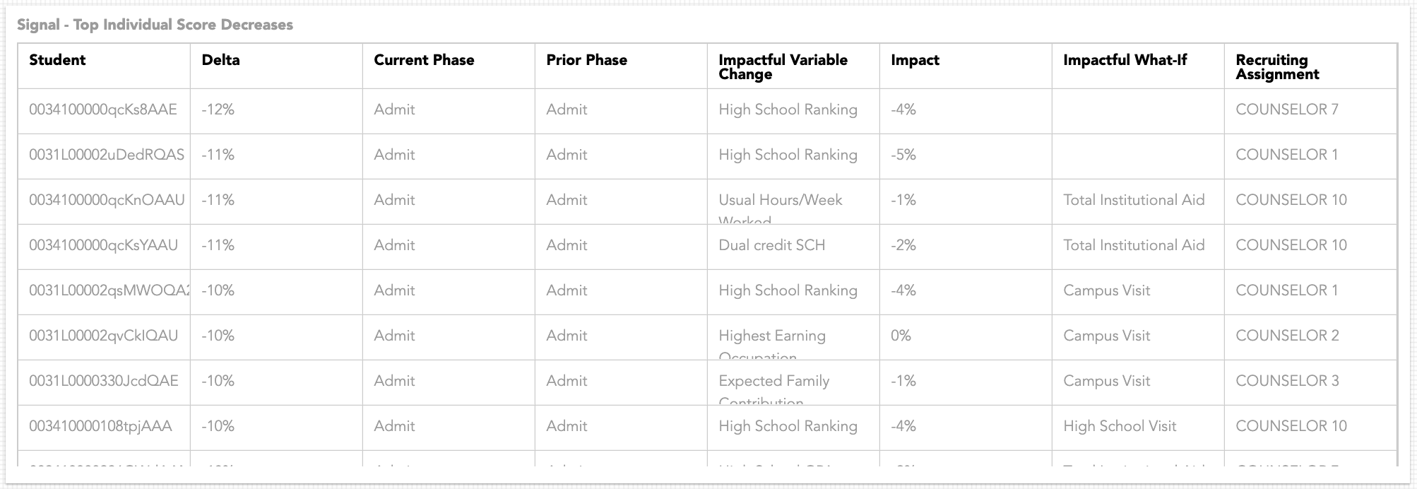
Top Individual Score Decreases
The fifty individuals whose Likelihood Scores have decreased the most, as well as their current/prior Lifecycle Phase, the variable and its impact value that attributed to the decrease the most, their Recommendation (Impactful What-If), and the Recruiting Assignment.
Taking Pivot and Dashboard Snapshots
Saving static versions of Pivot tables or Dashboards allows you to create a record of how or why decisions were made as compared to the data that's available today.
- In the Analyze tab of the Insights section, click the Pivot
 or Dashboard Anything
  icon.
icon. - Configure the pivot or dashboard, then click Snapshot.
To view the snapshot, navigate to the Signal tab in the Insights section.