NiCE KM: Style Specifications
Content Structure in Expert
To ensure content is structured in the best way possible in Expert, follow these guidelines:
- Follow Expert's Guided Content Framework when structuring help content.
- For guides, if you're only using the topic hierarchy, then under Page Settings, select Single for Guide listing display.
- Add page summaries under Page Settings for categories, guides, and topics. Make sure Dekiscript code is on the category and guide so that the page description appears on the main category/guide page.
- Content should live in articles (i.e., topics, references, how-to's).
- Expert's GenSearch and intelligent search algorithms depend on page titles, URLs, headers, page summaries, and tags. As users click a page, that page ranks higher in the search results. With this workflow in mind, use clear naming and add headers that may reflect common search terms.
- As a best practice, wait to add tags until internal users and external users have organically ranked pages via clicks in the search algorithm.
- Once a page is officially published (internally or externally), complete the Why are you making this edit? field if you make edits (a simple brief description). This helps you and others to identify major changes when looking at the revision log.
Naming Pages and URLs
- Do not add special characters to URL names, as this can break faceted search (i.e., keeping anonymous users' search queries within the top-level product category).
- Add a leading 0 (e.g., 01) when numbering the URLs with 1-9 in Expert to keep the order of pages consistent.
General Formatting Content
- Do not apply bolding to CXone Expert's default header styles.
- If you need to reset a header, paragraph, or link color back to the standard, highlight the text and select Remove color from the font color drop-down.
- Use collapsible content for definitions and FAQs, if desired. Don't place important information in collapsible content in case the user never opens it to view the information.
- Note that for tables that have sticky headers, the sticky headers don't work under the accordion collapsible content.
- Use banners to:
- Call attention to important links (e.g., release note links, featured webinars or courses, etc.). (the Banner – Release template)
- When differentiating user types or cycles (e.g., Time2Track users are listed in a banner for each page of content, a call-out to the DICAS 3.X versus 2.0 application is listed in a banner, etc.). (the Banner – T2T template)
- When differentiating mobile versus web app functionality. (the Banner – Platform Version template)
- Confirm links have only one href link. You can do this by editing a page in HTML and searching for href. If a link has multiple href links, then remove all links and relink to the appropriate page.
- Confirm correct span and font code. You can do this by editing a page in HTML and searching for span and font. Code may be inserted mid-word, or may accidentally replace other formatting.
- Example 1: some lines may look like a header, but in the HTML, it's actually a paragraph with span code. The line won't appear in the table of contents because the line doesn't have true header formatting.
- Example 2: a different font size than the default may be applied to content. When the page is resized, the default font size will resize appropriately but any hard-coded font size will stay at the same size.
- Remove ARIA labels – this can cloud screen readers. See section508.gov's page on Accessibility.
Formatting Content for Mobile Devices
Expert content automatically adapts for mobile devices. Here are some best practices for ensuring content adapts well for mobile devices:
- Edit a page in HTML and replace with a space (where appropriate). The formatting connects words so they don't separate from each other in a line break. This can cause strange line breaks, so be sure to edit this if Expert content will be primarily read on a mobile device (e.g., for products built with mobile formatting).
Copying and Pasting Existing Content
If you're copying and pasting content from Word or another source, be sure to remove any formatting so that the HMTL code is clean and no other formatting issues appear later. You can do this by pasting as plain text (on PCs, use CTRL+Shift+V; on Macs, use Command + Option + Shift + V).
Lists
For bulleted lists, use Expert's default formatting:
- Level one (disc)
- Level two (circle)
- Level three (square)
- Level two (circle)
For numeric lists, use the following formatting:
- Level one (decimal)
- Level two (lower alpha)
- Level three (lower Roman)
- Level two (lower alpha)
If you're combining numeric and bulleted lists, use a combo of the above, like so:
- Step 1
- Special note
- Step 2
- Sub-step for 2
- Next sub-step for 2
- Step 3
Hyperlinks
All hyperlinks must use clear and descriptive text to meet 508 compliance standards. Review this Section508.gov page for suggestions.
Expert offers several hyperlink options. Select the appropriate link option based on the hyperlinked source. Use Expert's default formatting for links.
- Highlight the text that will become the link.
- Under Elements, click Link or highlight the text and right-click to choose Link. You can also use Ctrl+K (for PC) or Cmd+K (for Mac).
- Under Link to, enter the source URL.
- Under Jump to anchor or section, select the header, if appropriate.
- Select:
- Default: for mailto: URLs and when linking to a header on the current page (i.e., "jumping" around the current page).
- Open in new window: for external URLs (i.e., outside of Expert) and document attachments. If adding an external link, be sure to add conditional text for Admins underneath the header where the link is listed and include the last date the link was checked. You can use the Conditional Content – Links Last Checked template.
- Open in contextual help overlay: for URLs within Expert (i.e., other articles or help centers).
Expert automatically truncates URLs. See Expert's help center if you want to remove truncation.
Graphic Elements
Font Colors
We added custom font colors to Expert to align with Liaison's branding.
| Admin Colors | BRD Colors | Liaison Colors | Expert's Colors |
|---|---|---|---|
|
|
|
|
Images
Size
Eyeball image size and save as maximum size before uploading to Expert. Text within an image should be easily readable. Learn how to set up quick effects in Snagit.
All images should have a border and shadow to offset them from the text:
- For PCs: using Snagit, add 1 pixel gray (#A4A4A4) border and lower right 15 pt shadow.
- For Macs: using Snagit, add 1 pt gray (#A4A4A4) border and shadow: offset 6 pts, blur 4 pts, color #A4A4A4.
All images must be responsive:
- Right-click on the image and select Image properties.
- Under Size, select the Responsive option.
- Click Save image.
Storage
You can store images on the page where you're using them or in the Media Repository.
You can also reuse an image across pages. This is sometimes beneficial because then you can update the image in the source location, and everywhere it's reused, it'll automatically update. To do so:
- Click the image icon from the ribbon bar.
- Under the Search tab, search for the source image's name.
- Click on the desired image.
- Click Save image.
Uploading New Images
You can upload new images over the existing image. This is sometimes beneficial because then you can update the image in the source location, and everywhere it's reused, it'll automatically update.
To upload a new image on the page where the image is stored:
- Go to the bottom of the page and find the Attachments section.
- Find the applicable image. You can do this in several ways:
- Edit the page and find the image name via HTML code or editing the image properties.
- Under Attachments, hover your mouse over the image icon next to the image name. A preview of the image appears.
- Hover your mouse over the image row and click the Upload new icon (the third icon).
- Click Choose File to upload the new image.
To upload a new image from the Media Manager:
- Find the image and click on it.
- Click Upload new to upload the new image.
Call-outs
If you need to call out a specific part of the image (e.g., focusing on a specific field), you can use Snagit to add a call-out. Learn how to set up quick styles in Snagit. We have a Liaison Branding theme (available at the bottom of this page under Attachments) that can be uploaded to Snagit, and you can select from Liaison's branded colors.
In general, we use rounded rectangles (typically 3 pixel width) and steps (i.e., numeric circles) to call out specific areas in a screenshot. Use a complementary color from Liaison's branded colors for these. Avoid arrows, highlighting, or text call-outs for external documentation.
Layout
When inserting images, indent 1x. If the image is in a list, single space (shift + enter) twice to add the image. Don't add an additional indent.
Image in paragraph context:
Lorem ipsum dolor sit amet, consectetur adipiscing elit, sed do eiusmod tempor incididunt ut labore et dolore magna aliqua. Ut enim ad minim veniam, quis nostrud exercitation ullamco laboris nisi ut aliquip ex ea commodo consequat.

Image in list context:
- Lorem ipsum dolor sit amet, consectetur adipiscing elit, sed do eiusmod tempor incididunt ut labore et dolore magna aliqua.
- Ut enim ad minim veniam, quis nostrud exercitation ullamco laboris nisi ut aliquip ex ea commodo consequat.
- Duis aute irure dolor in reprehenderit in voluptate velit esse cillum dolore eu fugiat nulla pariatur.
Alt Image Text
All images must have alt image text to meet 508 compliance standards. Review this Section508.gov page for alt text suggestions.
To add alt text from the page editor:
- Right-click on the image and select Image properties.
- Under Alt text, enter alt image text.
- Click Save image.
To add alt text from the Media Manager:
- Find the image and click on it.
- Click the edit icon next to File description and enter alt image text.
- Click Update.
Iconography
Sourcing
You can retrieve Marketing's icon library at the end of the company slide deck. If needed, you can also use You can also use The Noun Project for alternate icons. Ensure that icons align with Marketing's preferences (e.g., icon outline instead of fill).
Size
All icons should adhere to a standard size of 100px x 100px. While most downloads from The Noun Project aim to maximize pixel-by-pixel dimensions, occasionally, a download may contain extra white space around the icon, resulting in a reduction of its overall size. In such cases, it may be necessary to trim this excess white space to ensure uniform icon dimensions. However, as a best practice, try to select images that do not include extra white space.
Color
Icon color will match the product's/CAS's help center branding.
Videos
All videos available in the help center must be added to Vimeo first. See Vimeo Uploaded Video Settings for standards within Vimeo.
In Expert, store all videos in the Media Repository, Vimeo Videos pages.
- In the Media Repository, Vimeo Video page (for the appropriate product), add embed code via the HTML editor. Example embed code:
<h4>2021 - Release Notes Sprint 4</h4>


<div class="mt-video-widget"><iframe allow="autoplay; fullscreen; picture-in-picture" allowfullscreen="" frameborder="0" height="360" src="https://player.vimeo.com/video/547560862" width="640"></iframe></div> - Make sure the video adheres to these heights and widths: 360 height x 640 width.
- Add a conditional text note for the Admin group with a link to where the video is being reused. You can use the Conditional Content – Admin Group template.
On the page where the video is featured:
- Use content reuse to add the video.
- Add a conditional text note for the Admin group with a note "This video is reused from Media Repository." You can use the Conditional Content – Admin Group template.
Table Headers
All tables must have a table header and be responsive. You also have the option to freeze the header so that it stays at the top of the table as users scroll through the table rows. Make sure all table headers are left-aligned. You can use the Table – Fixed Header or Table – Standard templates.
- Right-click on the table and select Table properties.
- Under Headings, click First row.
- If you want to freeze the header as users scroll through the content, then under Stylesheet classes, enter stick-one.
- Select the Make table responsive checkbox.
- Click OK.
Conditional Text
Use conditional text to add internal notes for Liaison teams. For example, you can use conditional text for:
- Internal enhancements in release notes (the Conditional Content – Liaison Group template).
- Where content reuse is being used to and from (the Conditional Content – Admin Group template).
- When external links were last checked (the Conditional Content – Links Last Checked template).
- BRD activation instructions for Liaison teams.
- Additional internal notes to specific Liaison teams.
To add a preconfigured conditional text, use the stamp icon in the ribbon bar or under Elements, click Templates, then select the appropriate Conditional Content template.
To add a blank conditional text:
- Under Style, click Conditional text (group only).
- Enter your internal note and change the font color so that it's more obvious that this note is internal.
- Use red font color (HEX #ff0000) for notes to the Admin Group (aka the E&K team) or other internal teams.
- Use purple font color (HEX #9f2aa7) for internal enhancements in release notes and other internal comments.
- Click the conditional content header and select the group you want to share it with.
- Select Admin Group for the E&K team.
- Select Liaison-only Group for internal enhancements in release notes.
- Select other groups as appropriate (e.g., BRD Group (Liaison Internal) is used for the Activation Instructions stored within the BRD pages).
Content Reuse
The content reuse feature allows you to reuse the same content from one page to another. Review Expert's content reuse documentation for how-to's and best practices.
Some caveats:
- Expert currently doesn't have a report to identify where content reuse is being used to or from. For that reason, you must add conditional text to both the page/header content is being reused from and to.
- If you reuse content at a header level, you cannot use global variables in the source header.
Note: if you choose to copy instead of reuse content between pages, then add a conditional text with a note of where content is copied and reused to, so you know that you'll need to update it with any changes manually.
Global Variables
Proceed with Caution: a mistake in this section creates errors throughout the entire site. Contact Katie or Sarah if you need help adding/updating global variables.
Before creating global variables for a new help center, the new help center must be created first. Ensure all global variable commas, semicolons, curly brackets, and other punctuation are in the correct locations. Otherwise, an error will occur. Commas need to be at the end of every variable, except for the last one.
- Under Site tools, click Dashboard.
- Under Site Administration, click Global variables.
- Click Edit.
- Expand the Global Variables DekiScript block.
- Copy an entire block of variables from a similar help center (e.g., if building a new CAS, copy an existing CAS's global variables. If building a new product, copy an existing product's global variables).
- Paste the block in alphabetical order.
- Update all variables with any product-specific information, including the string path.
- Click Save.
Working with Code
Share Code with Users
There are two ways to share code with users:
- Add the code inline via the Code option in the Format menu. This option is best used when presenting a short snippet of code. For example:
System.assertEquals(ApexPages.getMessages()[0].getDetail(), 'Account Owner Missing Role');
- Add the code using the < pre > Format option in the Format --> Blocks menu. This option is best used when presenting multiple lines of code. For example:
if(source?.yourfieldkey1 != null){
    return source?.yourfieldkey1;
  }
  else if (source?.yourfieldkey2 != null){
    return source?.yourfieldkey2;
  }
  else if (source?.yourfieldkey3 != null){
    return source?.yourfieldkey3;
  }
  else if (source?.yourfieldkey4 != null){
    return source?.yourfieldkey4;
  }
  else if (source?.yourfieldkey5 != null){
    return source?.yourfieldkey5;
  }
  else if (source?.yourfieldkey6 != null){
    return source?.yourfieldkey6;
  }
In the example above, the syntax highlighter is set to none, and the reader can copy and paste the code. However, if you select a syntax highlighter, the reader must hover over the block and use the view source icon in the top-right corner to copy the code. In the following example, the syntax highlighter is set to JavaScript:
if(source?.yourfieldkey1 != null){
    return source?.yourfieldkey1;
  }
  else if (source?.yourfieldkey2 != null){
    return source?.yourfieldkey2;
  }
  else if (source?.yourfieldkey3 != null){
    return source?.yourfieldkey3;
  }
  else if (source?.yourfieldkey4 != null){
    return source?.yourfieldkey4;
  }
  else if (source?.yourfieldkey5 != null){
    return source?.yourfieldkey5;
  }
  else if (source?.yourfieldkey6 != null){
    return source?.yourfieldkey6;
  }
Use CSS for Customization
You can use CSS to customize and control a page's visual elements, including adding banners and hiding elements like the table of contents. Default CSS templates are accessible by clicking Templates under the Elements drop-down in the editor. Common CSS templates include the following:
|
Template Name (links to template page, accessible only to admins) |
Description |
|---|---|
| Accordion | A series of clickable buttons that expand to display more information. Can be customized as needed. |
| Banner – Blue Gradient (Transfer Planner Outcomes Audience) | Banner used in Transfer Planner (Outcomes) to clarify which portal the instructions apply. |
|
Banner used to clarify which platform version a set of instructions applies to (for example, with Time2Track). |
|
|
Banner – Red with Bolded Outline (Release/Global Announcement) |
Banner used to announce a new release or note an internal-only page. |
|
Banner mostly used in Time2Track to clarify who the instructions apply to (e.g., "This applies to Trainee, Supervisor, and Faculty"). |
|
|
A clickable button that can be programmed as needed. |
|
|
A clickable checkbox. |
|
| Conditional Content – Admin Group | A Conditional content section set to Group = Admin Group |
| Conditional Content – Liaison Group | A Conditional content section set to Group = Liaison-only Group |
| Conditonal Content – Links Last Checked | A Conditional content section for Admin group with the prompt "Link last checked on DATE." |
|
A drop-down that can be programmed as needed (mostly for quick access to items). |
|
|
Use to expand/collapse content. |
|
|
For use when clicking a link scrolls to another place on the page instead of going to another page. This occurs when the link is pointing to a page that is also being used as Content Reuse on the same page. The link is supposed to hyperlink to the content, but instead converts to an anchor link and scrolls because the content is already on the page through Content Reuse. |
|
|
Adds the banner block on the top-level category page. Moves the search bar within the banner block and includes 3 buttons for page links (typically Quick Start Guide, Customer Service, and Feedback Form). |
|
|
Hides the breadcrumb trail. |
|
| Hide Next and Previous Article | Hides the next and previous article link at the bottom of an article. |
| Hide Next Article |
Hides the next article link at the bottom of an article. This must be added to the last article in a public help center; this prevents navigation to internal pages and other help centers. |
|
Hides the previous article link at the bottom of an article. This must be added to the first article in a public help center; this prevents navigation to internal pages and other help centers. |
|
| Hide Recommended Articles | Hides Recommended Articles if they have been enabled in the Help Center. |
| Hide RingCentral Chat Button | When chat is added to Expert (via a conditional header template), use this template to hide chat on specific pages. |
|
Hides the search bar. |
|
| Hide TOC | Hides the table of contents. |
| List of Recently Updated Articles | Inserts DekiScript to display recently updated articles. Update default 'TargetX_Help_Center' to the Help Center you are using. |
|
Inserts four templates to control how search engines index help center pages. There are four DekiScript options below – delete the ones you don't need.
|
|
| Table – Add Search Bar | Inserts code and instructions for creating a searchable table. |
| Table – Borderless, No Hover | Removes highlighted row formatting when your mouse hovers over a row. |
| Table – CAS API GRE Codes | Table formatted for CAS Program and GRE Code. |
| Table – CAS API Participating Programs | Table formatted for CAS API Participating Programs |
|
Freezes the first row (or first two rows) of a table; this is helpful for longer tables that require scrolling. |
|
|
A standard, branded table. |
|
|
Hides all navigation elements on a page. Typically used when you want to present content but don't want the user to navigate anywhere else in Expert. |
|
| Tri-color Template |
Adds custom branding to each category. Used in most products and applied to all CASs with 3+ launch. For a list of help centers with custom branding, view the template itself. |
| Widget: Page Links and Total | Lists which pages link to the current page. Helpful to know the "start" pages that "end" with the current page. |
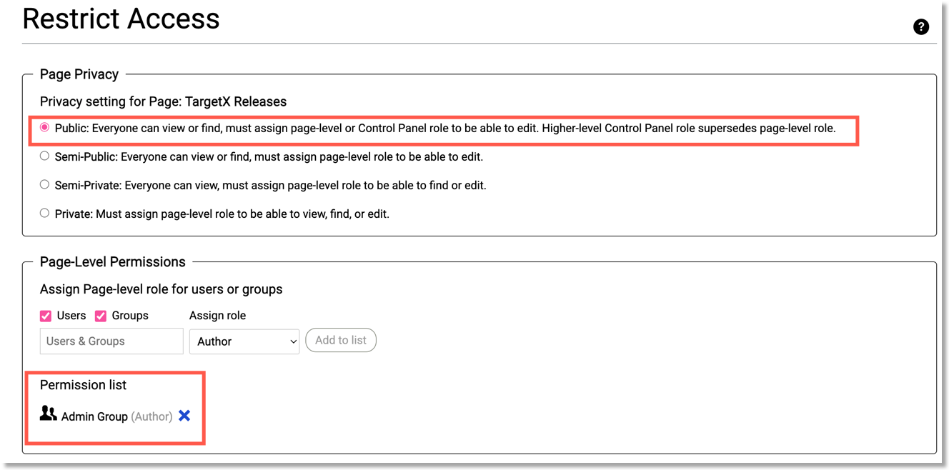
Permissions
About 80% of the content in Expert is public-facing. For the other 20%, we permission it out to Liaison staff, different groups within Ops, and for the BRDs, to clients. View the permission and privacy guidelines below.
CAS Applicant Help Centers and Product Help Centers
- AACOMAS Applicant Help Center
- Starting Your AACOMAS Application (and all subpages)
- Filling Out Your AACOMAS Application (and all subpages)
- Sending Your Official Transcripts and Test Scores to AACOMAS (and all subpages)
- Submitting and Monitoring Your AACOMAS Application (and all subpages)
- Product Help Centers

AACOMAS Internal Reference Information and Email Templates (and all subpages)

Education Team Documents

AACOMAS Help Center Feedback Form

AACOMAS BRD (and all subpages)

Liaison Release Notes
- Release Notes guide (by year)
- Release Notes page

TargetX Help Center
Upgrade Guides and Package Links

All other TargetX Categories/Guides
Hiding Content from Google/Search Engines
Because our Liaison Expert site is public, any public or semi-public pages will be indexed by Google, even if they are located under a semi-private or private category. To prevent Google or other search engines from indexing these pages, you must add this content to the header:
meta.robots("noindex,nofollow");