Designing Form Sections and Content Blocks
What are Sections?
TX Form Sections are containers used to organize your form into meaningful parts. Each section can contain one or more content blocks and usually represents a topic or stage in the form process.
Examples of Sections:
- Personal Information
- Academic Interests
- Emergency Contact
Note: Breaking forms into short, clear sections improves readability and completion rates.
The Section Header contains several components:
1 - Section Title displays as a Header on the form (new sections will default as New Title 0, New Title 1, etc).
2 – Edit allows you to update the Section Title.
3 – Delete deletes the Section.
4 – Move Section up/down can be used to move a Section up and down within a Form.
5– Expand/Collapse will expand or collapse the Section details.

Repeatable Sections allow you to set up a single section that can be shown multiple times to gather numerous records. For instance, you could utilize a repeatable section for Enrollment History, enabling students to input multiple educational records.
What are Content Blocks?
TX Form Content blocks are the elements you drag into a section to create the actual form fields and visual structure.
Types of Content Blocks:
|
Type |
Purpose |
|---|---|
| Address Widget | Pre-built address field group. |
| Display Text | Static HTML text, can include links or formatting. |
| Divider | Visual separator for better layout. |
| Question | User input tied to a Salesforce field. |
| Disclaimer | Text block to display terms, policies, etc. |
| Hidden Field | Pre-fill a field without displaying it to the user. |
| Upload | Enable file uploads for specific types of documents. |
Adding Sections
- Click the Add Section button at the bottom of the form.
- Click the Edit icon to enter a Section Name.
- Click Done to Save the Section Name.
- Proceed to configure your Content Blocks.
Adding Repeatable Sections
- Create or edit a form and add a Section.
- Select the Make this section repeating toggle.
- Specify the Object that all the questions will reference, such as Enrollment History.
- Indicate the minimum and maximum number of records. For example, you might indicate a minimum of one but a maximum of three if you require an entry but do not want the student to enter more than three enrollment histories.
- You can choose to specify the text for the button that will indicate more records can be added. By default, the button will read Add One More. To change this, enter different text.
- If you want to control when the section appears, enter Section Conditions. Only users who meet the conditions will see the repeatable Section.
- Add Content widgets by selecting the type of information being collected.
- The Object will default based on your earlier selection, and you must select a Field and any Conditions. Note: Conditions must be based on fields within the section.
Configuring Content Blocks
The Content Block header contains some of the same components as the Section Header:
1 – Content Block Type will display the Type of Content you selected.
2 – Delete will remove the Content Block.
3 – Move Content Block up/down can be used to move a Content Block up and down within a Section or into a different Section.
4– Expand/Collapse will expand or collapse the Content Block details.
Adding a Question Block
Questionscan be added to your form to gather specific information from users.
- Click or Drag the Question widget onto your form.
- Select the following:
- Object = Contact or Contact Child Objects.
- Field = <select an available field>
- Required = Click the toggle to ON if the field should be required.
- Add Display Text for the question, this is the label that will display to the user:

- Indicate if the question should be Used for Matching:
- First Name, Last Name, and Email will default to ON for Use for Matching.
- When users submit a form, Contact matching is based on the following:
- First Name
- Last Name
- The system will look for an EXACT match on all 3 of the above fields plus any additional fields you choose for Matching. For details on customizing Contact matching, see Managing TX Forms.
- Indicate any Conditions (condition sets) if applicable:
- Click the + to add conditions
- Select an Object, Field, Operator, and Value that must be met for the block to display. You can only select Objects/Fields that have already been added to your form.
- Click + to add additional conditions
- Save your changes.
- For additional information on TX Forms Condition Sets, see Adding Conditional Content.
- Add any Option Groups, if applicable.
- Save your changes.
- If errors occur during saving, a panel will display on the right, and the section with the error will be outlined in red. For additional information, see Validating your TX Form.
Note: If you include the Source field on the General form and the user does not answer questions related to the Inquiry fields, the system will still create an Inquiry record with the Source field data.
Notes about Field Types
Different options are available depending on the field type selected:
- Date Fields allow you to choose to Disallow future dates.
- Number fields allow you to indicate a Minimum and Maximum value for the field.
- If you are using the School Picker, you can limit the list of schools by selecting a School Type.
- Boolean fields – The labels for Yes/No questions can be updated, but you can NOT change the Integration Values.
- Radio buttons are not an option for yes/no fields.
- Refresh link—resets the Key and Value lists from SF. This is used if you recently added a value in SF but don’t see it on the list.
- Autocomplete fields - like School Name, allow you to select the School Type to filter out specific types of schools (optional).
Email fields include an option to Enable Email Validation. When enabled, the user is prompted to confirm their email address. The user must then retype their email address to proceed.
Address Widget
The Address widget ensures that address fields are standardized and properly mapped. The Address Widget includes:
- Street
- City
- State/Province
- Postal Code
- Country
Adding the Address Widget
The Address Widget allows you to add Mailing Address or Other Address fields to your form. The question will automatically default to 'What is your address?'
- Click or Drag the Address Widget content block onto your form.
- Select an Object (Contact or Inquiry) and Field (Mailing Address or Other Address).
- Indicate if the Address Widget is Required.
- Indicate any Conditions.
Note: If you don’t want to use the full address widget, you can select individual address fields instead or remove any Widget Fields you don't want to be displayed.

Disclaimers
The Disclaimer Content Block allows you to select a checkbox that a user can click to acknowledge any disclaimers or terms and conditions. For example, you can include a Terms and Conditions section indicating that the user acknowledges that they are allowing your institution to contact them:
You can only select a checkbox field (i.e., Boolean field) for a Disclaimer Content Block; the list of fields will automatically be limited to checkbox-type fields:
- Object = select either Contact or Inquiry
- Field = select an available checkbox field
- Required = indicate if the field is required
- Conditions = you can add conditions if the Disclaimer should only display to a specific set of users.
- Disclaimer content types will display your Text in ALL CAPS.
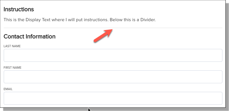
Display Text and Dividers
Use these non-interactive blocks to create a smoother experience:
- Display Text: Add descriptions, instructions, or formatted text between fields.
- Divider: Separate sections visually without adding a new section.
Adding a Divider
The Divider will display a dividing line on your form. You can add Conditions to a divider so that it only displays based on a user’s response to another question:
- Click or Drag the Divider widget onto your form.
Adding Display Text
Display Text can be used to display instructional text on the form. You can also define Conditions to display the text based on specific values. For example, you can add Display Text to a section that will display one set of instructions for In-State students vs Out-of-State students.
- Click or Drag the Display Text widget onto your form.
- Enter the text you want to display to users.
- Click the + in the Conditions section.
- Select an Object (Contact or Inquiry) and Field for the condition.
- Select the operator.
- Enter the Value for the condition.
- Repeat for any additional conditions.
- Save your changes.
Example Conditions:

Condition for Mailing State = PA

Condition for Mailing State != (not equal to) PA
File Uploads
The File Upload widget in TX Forms allows you to enable file uploads for specific types of documents.
- Click or drag the Upload widget onto your form.
- Select the following:
- Object
- File Types - indicate the allowed file types by entering the file type extension. Use a comma for multiple options. For example, doc, docx, pdf
- Indicate whether the upload is Required.
Notes:
- A batch job, TX Forms Upload Cleanup, is available in Base Custom Settings to clean up orphaned files; if a user uploads a file but does not submit the form, the batch job will remove it.
- The file size limit is 3MB.
Hidden Fields
Hidden fields are used for data you want to collect that isn't meant to be displayed to students. Add Hidden Fields to:
- Pass in Source codes
- Pre-fill user information from URLs
- Tag records with default values (e.g., “Web Inquiry”)
Click or Drag the Hidden Field widget onto your form. Set the Default value that will be used to populate the selected field, for example:
- Object = Inquiry
- Field = Source
- Indicate the Value in the form pane:

Note: When the option Enable URL Pre-fill is enabled, it is not necessary to input a Value for the Hidden field.
Best Practices
|
Goal |
Strategy |
|---|---|
| Keep forms short | Use multiple sections and hide unneeded fields. |
| Improve UX | Group related fields and use clear labels. |
| Reduce errors | Add instructional text. |
| Make forms dynamic | Use conditional logic where possible. |