Creating a Portal
Creating a new Portal
- Navigate to the TargetX Builder tab.
- Select the Portal Builder option.
- Click the + in the top right of the window. When you create a new Portal, you will need to define the following information:
- Name(required) will be displayed to your constituents when navigating the portal.
- Description(required) is for internal use to describe the purpose of the Portal.
- Category is a picklist of values that allow you to order and group your Portals into common categories.
- Community allows you to link to an existing Salesforce Community.
- Select Create to move to the next step in defining layout and content using widgets. Once your portal is created, you’ll see it in the list of available portals. Click the icon to delete
, copy
or edit
the portal.
Configuring your Portal Banner
Configure a banner to add branding to the portal. The banner is persistent across the Portal and cannot be removed. Select the Banner in the Canvas area on the left. Once selected, the Content tab on the right will list the information required:
- Navigate to the TargetX Builder tab.
- Select the Portal Builder option.
- Click to edit the Portal where you wish to configure the Banner.
- Click on the Title/Subtitle option at the top of the page.
- The Logo section displayed on the right side panel is where you configure the image that displays in the banner.
- Logo section displays File, Document, or URL radio buttons:
- File option displays an Image picklist of any images stored in Files.
- Manage Images button takes you to the Files folder in SF, where you can upload new images. Note: Portal only supports the use of Image files.
- Document option displays an Image picklist of any images stored in Documents.
- Manage Images button takes you to the Documents folder in SF, where you can upload new images.
- URL option displays the Source URL to specify an image URL.
- File option displays an Image picklist of any images stored in Files.
Notes:
- The File option won't display if the File Library 'TargetX Builder - Portal Images'does not exist.
- Uploading images to Salesforce is the preferred means of using images as the image is formatted to meet your needs and will always be available to the Portal.
- When saving files to Salesforce, be aware of file size and storage limitations. For more information, see Data and File Storage Limits.
- Alt Text is the text for your image that will be available to a screen reader.
- Navigation URL allows you to indicate a URL that, when clicked, will direct the user to another site.
- Open in New Tab toggle specifies whether to open a new tab when selecting the Navigation URL.
- The Text section allows you to define the Title and Colors for your Portal Banner.
- Title text entered here displays in top line of banner (limit of 45 characters).
- Title Color defines the color for the Title Text. Enter a color name (e.g., Black, Red) or a hexadecimal value for the color you want to use.
- Subtitle text displays under the Title (limit of 32 characters).
- Subtitle Color defines the color for the Subtitle Text. Enter a color name (e.g., Black, Red) or a hexadecimal value for the color you want to use.
Note: When defining colors, you can enter a color name(e.g., Black, Red) or a hexadecimal value for the color you want.
- Save your changes.
For details on recommended image dimensions, please see the article Recommended dimensions for images and graphics in TargetX Portal
Defining your Portal Layout
As you build your portal, there are two buttons near the top of the canvas area:
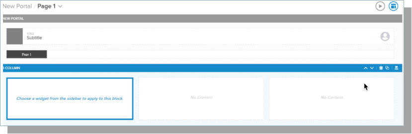
Each Portal includes a Banner, Pages, and Sections.
Defining Sections for your Portal
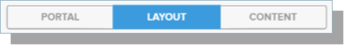
The Layout tab allows you to define sections and add widgets to your Portal.
Each Section of the Portal will display at the top of your Portal. To create a new page/section, select the Layout tab.
Define a section by choosing the layout:
- 1 column
- 2 columns
- 3 columns
- ¾ left column - creates a 2-column layout, with the left column taking ¾ of the page width
- ¾ right column - creates a 2-column layout, with the right column taking ¾ of the page width
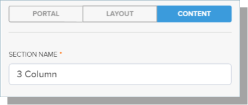
Once you’ve added a section, select the section header to define a Section Name.
The Section menu in the Canvas area allows you to move, delete, or clone a section of your Portal. You can also adjust the Section height by defining the Padding Top and Padding Bottom.
You can also set Conditions for the section.
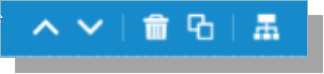
- Clicking the move up or down icon moves the section up or down the page relative to other sections.
- The delete icon deletes the section. You will receive a prompt indicating that all data in the section will be lost. Click the slider to indicate you are okay with losing the data, then click Delete.
- The copy icon duplicates the current section immediately below the current section.
- The condition sets icon allows you to indicate under what conditions the section is visible. Clicking the icon opens the Condition Sets tool.
Using Merge fields in Portal
Merge Fields allow you to personalize the portal content for users and are available in various locations in the Portal:
Merged fields will display data from the user’s Contact record.
Note: The portal can include filters from custom objects but can only include merge fields if the contact object has a lookup field compared to the custom object; this means you can only display merge fields from one child record.
To add a merge field:
- Select the Add Merge Field link.
- Choose a contact field or Lookup.
- Select Add.
Notes:
- As a Best Practice, treat merge fields as case-sensitive to prevent rendering issues in complex condition sets. Example:
Incorrect:
&tfa_63={{ ID }}
Correct: &tfa_63={{ Id }} - If any invalid merge fields exist, you will notice some merge fields won't display as expected.
Using Widgets in your Portal
Several types of widgets are available for use in your Portal. To add a widget, highlight the block in the Canvas to choose a widget:
Note: Once you select a particular widget, you are automatically navigated to the Content tab to enter additional information.
Image widget allows you to specify an image to display in a specified section. Select the section where you want to place an image and select the Image button. Content settings for an Image are:
- The Style options allow you to select a Block Color, which will be the color displayed in the background of an image. You can also choose the Fit to Block toggle to stretch your image to fit the entire section. You will only see the stretched image when you preview or publish it.
- Various attributes are available for the Image widget:
- File, Document, or URL radio buttons:
- File option displays an Image picklist of any items stored in Files.
- Manage Images button takes you to the Files folder in SF where you can upload new images. Note: Portal only supports the use of Image files.
- File option displays an Image picklist of any items stored in Files.
- File, Document, or URL radio buttons:
Please note: the file option is NOT an enhancement to portal functionality, rather this additional option allows for a different way to manage the images that are displayed in portal.
- Document option displays an Image picklistof any images stored in Documents.
- Manage Images button takes you to the Documents folder in SF where you can upload new images.
- URL option displays the Source URLto specify an image URL.
Notes:
- The File option won't display if the File Library 'TargetX Builder - Portal Images'does NOT exist.
- Uploading images to Salesforce is the preferred means of using images as the image is formatted to meet your needs, and will always be available to the Portal.
- Be aware of file size and storage limitations when saving files to Salesforce. See Data and File Storage Limits for more information.
- Name- The name you wish to associate with the image
- Alt- The text for your image will be available to a screen reader.
- Navigation URL- allows you to indicate a URL that, when clicked, will direct the user to another site.
- Open in New Tab- allows you to indicate a URL that, when clicked, will direct the user to another site.
- Add Merge Field allows you to select a Contact field to merge a user’s data into your text.
- Remove- button will remove the widget from the section.

- Text widget allows you to enter text onto your Portal. The Content settings for Text include a Text Editor and a Remove button to remove the widget from the section.
- Source - switches the content area from the visual editor to the underlying HTML code, so you can view and edit the raw HTML for the text and formatting.
- Disclaimer: any HTML code that you add to your Portal is not supported or maintained by TargetX. You are solely responsible for adding, updating, and troubleshooting any code you implement. If your HTML ever interferes with expected TargetX functionality, you should remove or modify the code to restore functionality.
- Video widget allows you to display a video. Enter a Title for the video and then enter a link into the Embed Code field. For example, if you are displaying a video fromYoutube.com- copy the Embed Link from Youtube.com. Paste that link into the Embed Code field. See Embed Videos & Playlists for instructions on embedding YouTube videos.
For more information, see Writing a condition set in Email, Portal or Group Assignment.
Troubleshooting tips if your image is not displaying
The following conditions can result in an empty widget and cause the image to be hidden:
- Button, code, or text widget with no content
- Image, and Image Gallery widget with no source URL
- Image Caption widget with either no source URL or no caption content
- Social widget with all social media links empty
Using 'Advanced Widgets' in your Portal
Advanced widgets allow you to connect to other TargetX products such as Events and Online Application.
- The Events widget will display My Events to the user if Events have been configured in your Community.
- Indicate an Events URL Override by entering a new URL on the Content tab, including /targetx_eventsb__events#/calendar.
- If you want to take the User outside the Community for Events, enter the URL here.
- Indicate an Events URL Override by entering a new URL on the Content tab, including /targetx_eventsb__events#/calendar.
- The App widget will display any existing Applications and provides a button to Start a New Application.
- You have the option to show the Start New Application button, by selecting the Content tab.
- You have the option to show Started On and Deadline dates, by selecting the Content tab.
Supplemental Forms
For a Supplemental Form to be displayed, the following conditions must be met:
- Application Stage = Submitted
- Supplemental Form field on Application contains an Application Form.
For more information on Supplemental Forms, see Supplemental Forms.
- TheApp/Checklistwidget displays the App list and the App Tracker.
- You can show the Start New Application button by selecting the Content tab.
- You can show Started On and Deadline dates by selecting the Content tab.
- You can show the Start New Application button.
Note:TheApp/Checklistwidget is ONLY available in a1-columnsection.
- When an Application is submitted, you can customize the text displayed by populating the Application Submitted Text field on the Application.
Note: you can create a Flow to update theApplication Submitted Textif you want to default a particular message.
Using the Recommendation widget
The REC widget lets you display requested Recommendations and associated Recommendation Forms to Recommenders within the Portal. You have the option to display the Application Snapshotas well as define In Progress Display Text and Submitted Display Text.
Warning: this widget can not be used on Student-facing Portals.
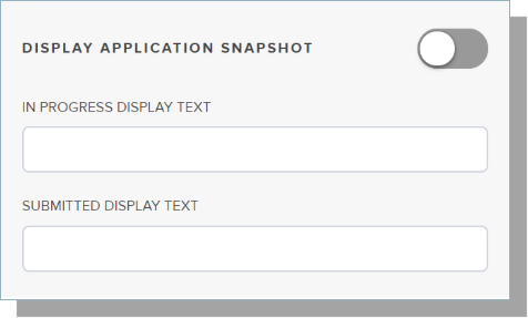
- Display Application Snapshot will display a link within the portal for a recommender to view a snapshot of the submitted application for the Applicant requesting recommendations.
- The REC widget will display “My Recommendations" to the recommender along with the status of the recommendation form: In Progress or Submitted. Previewing the REC widget within the Portal will display No Recommendations.
Note: the REC widget will only display if the Online Application package of 17.30011 or higher has been installed.