Creating TX Forms
TX Forms are a streamlined option for creating forms for Inquiries (using General forms), Applicants (using Application forms), or Event Registration (using Event forms). TX Forms can incorporate specific, predefined fields, Custom Questions, and the assignment of Source values. Additionally, you can configure Conditional questions, option groups, Disclaimers, and more.
Creating a new General TX form
Utilize General forms to generate an Inquiry or any form not associated with an Event or Application. As a recommended practice, ensure that you adopt standard naming conventions for forms shared across the organization. This will provide clarity regarding the function or business purpose that your form serves.
- Navigate to TargetX Builder.
- Select the TX Forms icon.
- Click on the General icon [
 ].
]. - Click the + to create a new form.
- Enter a Form Name and click Create.
- Complete the Details tab. Use the table below to understand the various options:
|
Field |
Description/Notes |
|---|---|
| Form Title | Title for your form. This will display in the left pane, along with your Description. |
| Description |
Description of the form. This will display in the left pane and should provide context for the user. You can include a link to a URL in the form description.
|
| Logo URL |
The public URL for your institution logo or the link to a Public static resource image file. This will be displayed in the top left of the form panel. See below for details on building the Public URL for Logo or Poster images.
|
| Poster URL |
The public URL for the image or the link to a Public static resource image file. This will be displayed in the left pane, behind the Logo, Form Title, and Form Description. See below for details on building the Public URL for Logo or Poster images.
|
| Confirmation Message | The message is displayed once the user submits the form. |
|
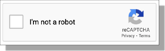
Use Captcha |
Enables the reCAPTCHA option to display at the end of the form: |
|
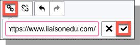
Redirect to Custom URL |
Allows you to enter a URL that the user should be directed to after they submit the form and select Done. When Redirect on embedded form is enabled, the system will redirect the student to the URL when the embedded version of the form is submitted. |
|
Sharing | Sites |
This feature enables you to choose one of your Sites to display the form. For instance, if you have an Inquiry Site, select the Site from the list and then Copy the link to view it.
When employing a new site for various form types, you must add permissions for the Inquiry, Org Event, or Application objects for the site guest user. You will require the list of all the fields added to your form. For further information on Permissions and TX Forms, please refer to Implementing TX Forms. |
- Click the Content tab.
- Update the Title for the first section by clicking the edit icon, entering your Title, and clicking Done. Expand or collapse the section by clicking the bar or the
icon. The Section Name is displayed in Bold above the Section.
- Drag and drop or select Content Blocks from the Content tab.
Note: if you click the Content tab before adding any sections, the system creates a Section automatically.
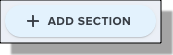
- Add additional Sections by clicking the Add Section button.
- Continue to add the appropriate Content Blocks by dragging and dropping blocks from the Content tab.
- You can Preview your TX form by selecting the Preview icon [
] from the Forms list or the form itself.
- Once you build your form, share it using the Action Menu.
Note: When users submit a form, Contact matching is based on the following:
- First Name
- Last Name
The system will look for an EXACT match on all 3 of the above fields. For details on customizing Contact matching, see Managing TX Forms.
Building the Public URL for Logo or Poster images
Logo and poster images for general forms utilize a publicly accessible URL that points to a static resource. This ensures that the images are consistently available and can be easily referenced across different platforms and applications.
Follow these steps to build your Public URL:
Step 1: Create Static Resource for images
Once you create a Static Resource for your Logo and Poster images, you must copy the URL.
- Navigate to Setup and search for Static Resources. Click the link for Static Resources.
- Click New or click an existing Static Resource.
- Enter the following:
- Name – enter a name that does not include spaces, such as My_Logo.
- File – navigate to the location of the file you wish to use.
- Cache Control = Public
- Save the image.
- Click the View file link.
- Copy the URL.
Step 2: Copy the Link to your Site
- Navigate to Setup and search for Sites.
- Copy the Site URL for the Site you selected in the Public URL section.
Step 3: Create the Poster/Logo URL
- Combine the Site Link from Step 2 and the Static Resource link from Step 1 (beginning with /resource).
Examples:
- Link to Static Resource:https://myorg.force.com/resource/1652377062000/My_Logo?
- Link to Site: https://mysite/inquiry
- Poster/Logo URL = https://mysite/inquiry/resource/1652377062000/My_Logo?
Creating a new Application TX Form
The Application Form type is a form that centers around a Contact and an Application (in contrast with the General form that is just Contact-focused). This allows you to create records linked to the Application, meaning you can have questions on the Contact level, on the Application level, and on an Essay record (for example) related to that application. As a best practice, be sure to adopt standard naming conventions for Forms that are shared organization-wide, so it's clear what function or business need your Form serves.
|
The object selector for Application Form types will display both Contact and Application related objects, as seen in the screenshot below:
|
Once selected, the objects collapse down and display as:
|


These options display in all places where the object selector exists. This includes the Visibility conditions and Option Groups.
- Navigate to TargetX Builder.
- Select the TX Forms icon.
- Click the Application icon [
 ].
]. - Click the + to create a new form.
- Enter a Form Name and click Create.
- Complete the Details tab.
-
- Click here to view the various options:
-
Field
Description/Notes
Form Title
Title for your form. This will display in the left pane, along with your Description.
Description
Description of the form. This will display in the left pane and should provide context for the user.
You can include a link to a URL in the form description.
- Highlight the field which should include a link and click the link icon.
- Click the Check to Save.
- Limitations:
- You cannot change font colors.
- If you include a numbered list in the Description, you can’t format the numbers to ‘restart’ or ‘continue’ if there is a break in the list of numbered items.
- If you choose to ‘indent’ a numbered item, the numbering will not change to a different format. For example, you cannot format a list as:
- Item A
- Item B
- Item A
Logo URL
The public URL for your institution logo or the link to a Public static resource image file. This will display in the top left of the form panel. See below for details on building the Public URL for Logo or Poster images.
- Recommended image size: 70 x 60 px.
Poster URL
The public URL for the image to display in the left pane.
- Recommended image size: 768 x1024 px.
Confirmation Message
The message displayed once the user submits the form.
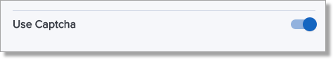
Use Captcha
Enables the captcha option to display at the end of the form:

Redirect to Custom URL
Allows you to enter a URL that the user should be directed to after they submit the form and select Done. When Redirect on embedded form is enabled, the system will redirect the student to the URL when the embedded version of the form is submitted.
Sharing | Sites
Allows you to select one of your Sites to display the form. For example, if you have an Inquiry Site, select the Site from the list and then Copy the link to view it.
- The Public URL information dynamically builds the URL and Embed Code Snippet displayed. This information is NOT saved along with your form.
When using a new site for application form types, you must add permissions for the application object for the site guest user. You will need the list of all the application fields added to the form:
- Navigate to Setup and search for Sites.
- Click your site, such as Inquiry.
- Click the Public Access Settings button.
- Click Object Settings.
- Select the Application object and click Edit.
- Assign READ and CREATE access to the Object.
- Assign READ access to any Application fields configured for your TX form.
-
- Click the Content tab.
- Update the Title for the first section by clicking the edit icon, entering your Title, and clicking Done. Expand or collapse the section by clicking the bar or the
 icon. The Section Name is displayed in Bold above the Section.
 - Drag and drop or select Content Blocks from the Content tab.
Note: If you click the Content tab before adding any sections, the system creates a Section automatically.
- Add additional Sections by clicking the Add Section button.
- Continue to add the appropriate Content Blocks by dragging and dropping Content Blocks from the Content tab.
- Preview your form.
- Once you build your form, you can Share using the Action Menu.
Note: When users submit a form, Contact matching is based on the following:
- First Name
- Last Name
The system will look for an EXACT match on all 3 of the above fields. For details on customizing Contact matching, see Managing TX Forms.
Creating a new Events TX Form
You can create TX forms for Events from several locations:
- Event Settings tab
- Organization Events tab (when creating, viewing, or editing an Event)
- Event Forms tab
- TargetX Builder (from TX Forms icon)
The Form Builder button allows the creation of a New TX Form that can be assigned to the Org Event. As a best practice, be sure to adopt standard naming conventions for your Forms that are shared organization-wide, so it's clear what function or business need your Form serves.
- Navigate to either Event Settings, Organization Events, or create a new Events TX form from TargetX Builder.
- Locate the Event Forms Options section.
- In the Event Form Type, select TargetX Forms.
- Select a Default TargetX Form by clicking the magnifying glass to search or click on the Form Builder button to create a NEW form.
- Click the + to create a new form.
- Enter a Form Name.
- Indicate if you want to use reCAPTCHA for your Event form.
- Click Save.
Note: Description, Logo, and Poster images are defined in the Event record.
- Click the Content tab to begin adding Sections to your form. A new Section will be automatically added.
- Add a Name to your Section:
- Click the Edit icon [
 ] to enter a Section Name.
 - Click Done to save the Section Name.
- Configure Content Blocks. A Content Block refers to the type of data you are collecting; such as Questions, Disclaimers, Hidden Fields, etc.):
- From the Content tab, choose the type of Content Block you wish to use: Question, Disclaimer, Hidden Field, Divider, Address Widget, or Display Text, and click or drag it onto your form.
- Select the Object and Field where the data will be saved.
- Enter the Display Text (1) for the Content.

- Continue to add Content Blocks as needed.
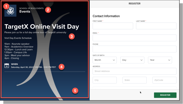
Note: For Events forms, the left panel is defined by your Event setup
1 - Header Logo
2 - Header Text
3 - Event Name and Description
4 - Event Start and End Dates
5 - Event Poster Image
- Enter any Custom Questions.
- These questions are in addition to any Custom Questions configured on your Event and will display under Additional Information when users register.
- Depending on your selection, the user’s answers to TX Event Form Custom Questions will be displayed in the Inquiry or Contact record.
- Custom questions built into the Organization Event record will continue to store responses in Contact Schedule Item records. Only guest count and organization event custom questions will be presented when bypassing any registration form if configured.
Notes:
- Administrators MUST grant READ access to any fields included in your Custom Questions:
- Add READ access to the Profile of the person(s) creating the form.
- Add READ/WRITE to the Guest Site User profile.
-
When using a new site for Events form types, you must add permissions for the Org Event object for the Site Guest User. You will need the list of all the fields added to your form. For additional information on Permissions and TX Forms, see Implementing TX Forms.
- Contact Matching is based on first name, last name, and email address.
- Save your changes. The system will validate your form.
- Assign the form to your Event:
- Navigate to the Organization Events tab.
- Click on the Event that you wish to assign your form.
- Click Edit.
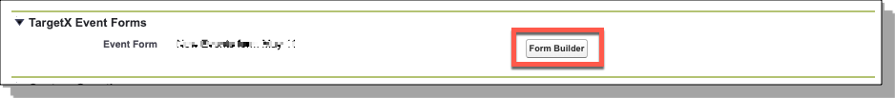
- Scroll to the TargetX Event Forms section.
- Click on the Search icon [
] to search for your form.
- Click on the Form you wish to assign.
- Save your changes.
- Preview your form by clicking the Event Registration Link, or by selecting the Preview icon [
- If you wish to make changes after Preview, click on the Form Builder button in the TargetX Event Forms section, and you will be directed back to your form:
- Save your changes.
Adding Sections
Sections define the different areas of your form. The Section Header contains several components:
1 - Section Title displays as a Header on the form (new sections will default as New Title 0, New Title 1, etc).
2 – Edit allows you to update the Section Title.
3 – Delete deletes the Section.
4 – Move Section up/down can be used to move a Section up and down within a Form.
5– Expand/Collapse will expand or collapse the Section details.

- Click the Add Section button at the bottom of the form:
- Click the Edit icon [
 ] to enter a Section Name.
 - Click Done to Save the Section Name.
- From the Content tab, drag the appropriate Content Block to your form.
- Select the Object and Field where the data will be saved.
- Enter the Display Text (1) for the Content.
- Save your changes.
Adding Repeatable Sections
Repeatable sections allow you to set up a single section that can be shown multiple times to gather numerous records. For instance, you could utilize a repeatable section for Enrollment History, enabling students to input multiple educational records.
- Create or edit a form and add a Section.
- Select the Make this section repeating toggle.
- Specify the Object that all the questions will reference, such as Enrollment History.
- Indicate the minimum and maximum number of records. For example, you might indicate a minimum of one but a maximum of three if you require an entry but do not want the student to enter more than three enrollment histories.
- You can choose to specify the text for the button that will indicate more records can be added. By default, the button will read Add One More. To change this, enter different text.
- If you want to control when the section appears, enter Section Conditions. Only users who meet the conditions will see the repeatable Section.
- Add Content widgets by selecting the type of information being collected.
- The Object will default based on your earlier selection, and you must select a Field and any Conditions. Note: Conditions must be based on fields within the section.
Configuring Content Blocks
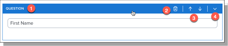
The Content Block header contains some of the same components as the Section Header:
1 – Content Block Type will display the Type of Content you selected (i.e., Question, Disclaimer, Hidden Field, Address Widget, Divider, Display Text, or Upload).
2 – Delete will remove the Content Block.
3 – Move Content Block up/down can be used to move a Content Block up and down within a Section or into a different Section.
4– Expand/Collapse will expand or collapse the Content Block details.
Notes about Field Types
Different options are available depending on the field type selected:
- Date Fields allow you to choose to Disallow future dates.
- Number fields allow you to indicate a Minimum and Maximum value for the field.
- If you are using the School Picker, you can limit the list of schools by selecting a School Type.
- Boolean fields – The labels for Yes/No questions can be updated, but you can NOT change the Integration Values.
- Radio buttons are not an option for yes/no fields.
- Refresh link—resets the Key and Value lists from SF. This is used if you recently added a value in SF but don’t see it on the list.
- Autocomplete fields - like School Name, allow you to select the School Type to filter out specific types of schools (optional).
- Email fields include an option to Enable Email Validation. When enabled, the user is prompted to confirm their email address. The user must then retype their email address to proceed.
Adding a Question
Questions can be added to your form to gather specific information from users.
- Click or Drag the Question widget onto your form.
- Select the following:
- Object = Contact or Contact Child Objects.
- Field = <select an available field>
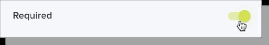
- Required = Click the toggle to ON if the field should be required:
- Indicate if the question should be Used for Matching:
- First Name, Last Name, and Email will default to ON for Use for Matching.
- When users submit a form, Contact matching is based on the following:
- First Name
- Last Name
- The system will look for an EXACT match on all 3 of the above fields plus any additional fields you choose for Matching. For details on customizing Contact matching, see Managing TX Forms.
- Indicate any Conditions (condition sets) if applicable:
- Click
to add conditions
- Select an Object, Field, Operator, and Value that must be met for the block to display. You can only select Objects/Fields that have already been added to your form.
- Click
- Save your changes.
- For additional information on TX Forms Condition Sets, see Adding Conditional Content.
- Add any Option Groups, if applicable.
- Save your changes.
- If errors occur during saving, a panel will display on the right, and the section with the error will be outlined in red. For additional information, see Validating your TX Form.
Note: If you include the Source field on the General form and the user does not answer questions related to the Inquiry fields, the system will still create an Inquiry record with the Source field data.
Notes on Objects with a Connection to Contact
- Contact [Student] child objects are available in the picklist AFTER the Contact [Student] object.
- Child objects display with the Lookup field Label in ( ). For example, Inquiry (Contact).
- EDA objects have the same name as TargetX objects and can be distinguished by referencing the Lookup field Label in ( ).
- Child records are only created if the student enters data in the fields for that object.
- Hidden fields or conditionally hidden fields do not count as being completed if the student does not complete the visible fields.
Note: Administrators MUST grant READ access to Site Guest Users for all fields configured on your TX Forms.
Linking to Application or Contact
When generating records associated with an Application, you have the option to connect these records either to the Contact or directly to the Application. This linkage is crucial for incorporating them into record matching processes and for preventing the creation of duplicate records.
To illustrate, you can incorporate fields related to enrollment history that are connected to the Contact. Subsequently, you can add a Hidden field that establishes a link between the Contact's data and the Application. Should a matching enrollment history already exist, the system will refrain from generating a new enrollment history record. In the scenario outlined below, the system will search for corresponding Enrollment History records pertaining to the Contact. In the event that a new record is necessitated, it will be affiliated with the corresponding Application:
|
Content Type |
Object |
Field |
Options |
|---|---|---|---|
|
Question |
Enrollment History (Contact) |
School Name |
|
|
Hidden Field |
Enrollment History (Contact) |
Application |
Link to Application = Enabled Used for Matching = Enabled |
Working with Read-Only fields
You can include Read-Only fields on your form to flag them for matching, or to reference in option groups, or visibility conditions. For example, you can include fields for the Contact ID and Application ID populated via a URL pre-fill. These fields will then be used to match a Contact/Application record when the form is submitted.
Working with Picklist Values
Picklist fields will automatically populate with the values configured in Salesforce within a text field. You can remove or rename any of these values according to their preferences. However, it is important to note that users are unable to add new values to the picklist. The formatting of these values adheres to the following guidelines:
Label, Integration Value
- A single value without a comma may be used if the label and integration value are the same.
- You must use double quotes if you have a value that includes an apostrophe. For example,
- "Master's Program", "Master's"
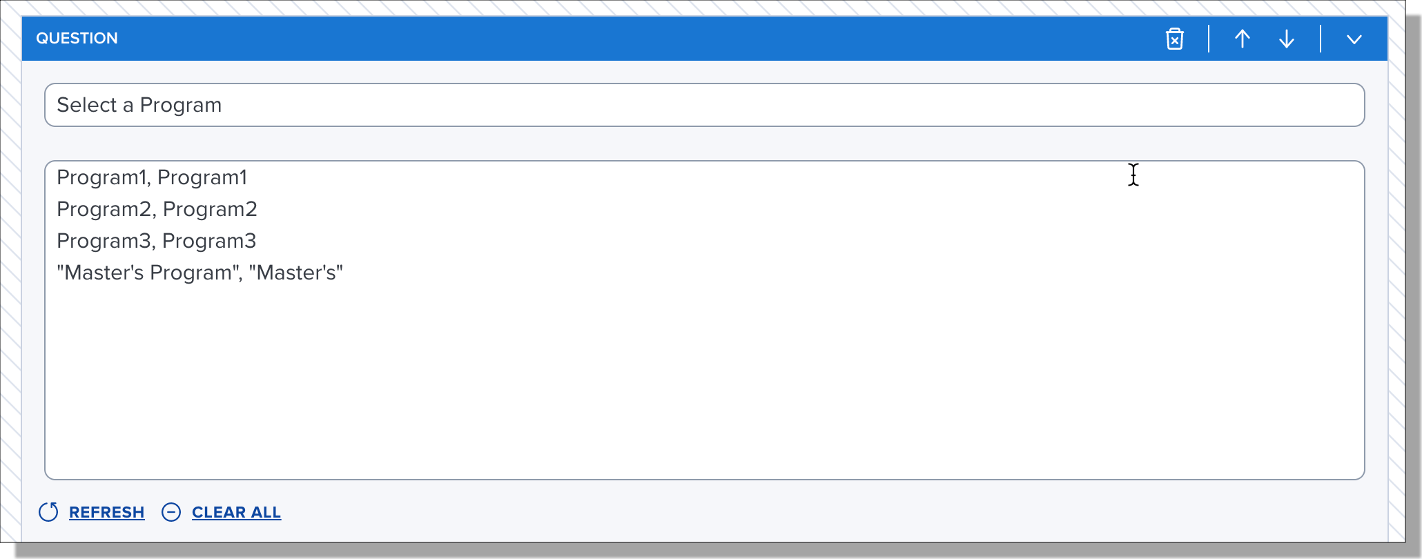
- Select Clear All to remove all the values in the list or Refresh to set the list back to the initially defaulted values.
Working with Autocomplete Fields
When an Autocomplete field is selected, such as School Name, users can specify an Answer List, a Filter Field, and a Filter Value to display.
You can enter multiple values for the Filter Value by separating each value with a semicolon. An option will display if it contains at least one of the values listed.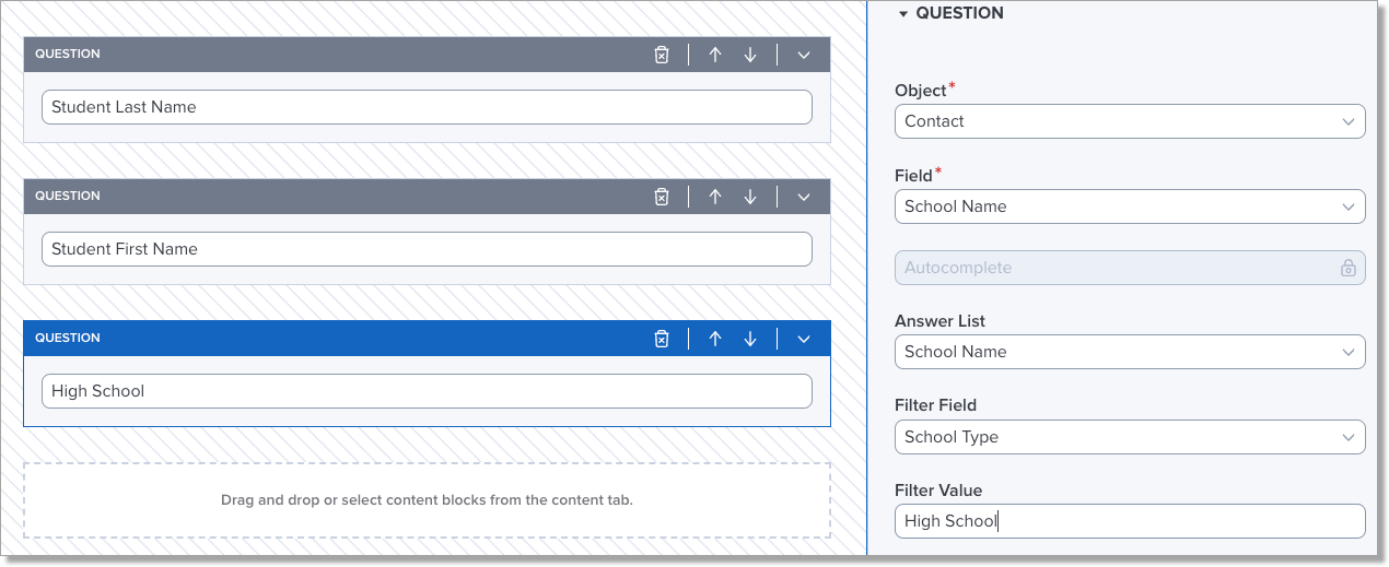
Note: The Site Guest User will need Read/Edit access to the Autocomplete (lookup) field, Read access to the lookup object, Read access to the Answer List and Filter Field fields on the lookup object, and a Sharing Rule will need to be created that grants Read access to the object for the Site Guest User for any records that need to be searched.
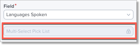
Working with Multi-Select Picklist Values
When a Multi-select picklist field is selected as a field, it will display as such in the Details window:
The question will default the Salesforce configured Values in a text field, and users can remove/rename any they wish. Users can't add new values to the picklist. Values are formatted as follows:
Label, Integration Value
- A single value without a comma may be used if the label and integration value is the same.
- You must use double quotes if you have a value that includes a comma. For example,
- "Master's Program", "Master's"
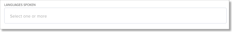
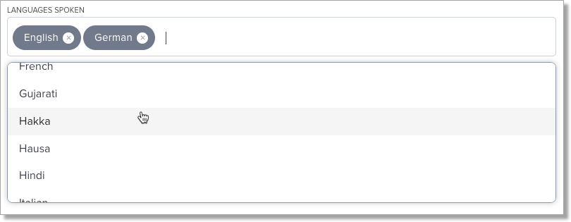
- The student-facing form will display 'Select one or more' in the field:
- Users will be able to add/remove fields as needed:
- Picklist fields include Conditions and Option Groups options.
Working with Record Types
You can define a Salesforce record type when creating records using a TX Form. This is accomplished by configuring a question or setting up a hidden field. For example, to allow users to enter Advising information such as Kudos or Alerts, configure the following:
|
Sample Label |
Object |
Field |
Sample Values |
|---|---|---|---|
| Type of Advising record? | Advising (Student) | Record Type ID |
|
| Category? | Advising (Student) | Category |
|
| Type? | Advising (Student) | Type |
|
| What is this Alert/Kudo about? | Advising (Student) | Notes/Log | <text area field> |
|
Hidden Field (optional) |
Advising (Student) |
Public? |
The value must be set to True to ensure newly created records appear in Student Success Center. |
Note: When using URL Pre-fill on a Record Type ID field, use the Label in the URL, not the ID. For example: txf1=Kudos
Your form would then present this to the user:

For details on submitting Faculty Early Alerts with TX Forms, see Submitting Faculty Early Alerts with TX Forms.
Working with Checkbox fields
Question fields that are checkboxes will display the options:
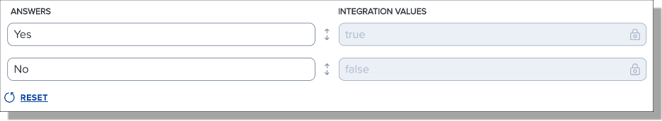
You can change the text for Answers, but you can NOT update the Integration Values. If you change the text, the Reset icon will reset the values to default. Radio buttons are NOT an option for Checkbox fields.
Adding a School Picker Field
The School Picker is an autocomplete field used to enter a School Name. When a user types a School Name, the system autocompletes to find the institution name.
- Create a new General TX form, or Events TX form.
- Add a new Question to your form.
- Enter the following:
- Object = Contact
- Field = Account ID
- Answer List = Account Name
- Filter Field = optional; specify a Filter Field such as School Level. For more information, see Working with Autocomplete fields.
- Filter Value = the value from the Filter field to be used to limit the list. For example, High School.
- Enter the Question label, such as 'What School did you last attend?'
- Indicate if the question is Required.
Note: Separate the values with a semicolon to add multiple Filter Values. For example, High School;College
Adding an Unknown School Text Field
You can configure your form to display a text field for students to enter a School Name if Unknown School is selected for the School Name.
- Create a new General TX form or Events TX form.
- Add a new Question to your form.
- Enter the following:
- Object = Contact
- Field = Account ID
- Answer List = Account Name
- Filter Field = optional; specify a Filter Field such as School Level.
- Filter Value = the value from the Filter field to be used to limit the list. For example, High School.
- Enter a Label for the question.
- Add a new Question to your form.
- Enter the following:
- Object = Contact
- Field = <custom field to store School Name>
- Enter Conditions:
- Contact. School Name = <18-digit Salesforce Id for your ‘Unknown School’ record>
- Enter a Label for the question.
- Save your changes.
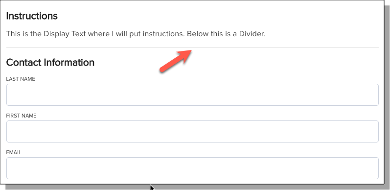
Adding a Divider
The Divider will display a dividing line on your form. You can add Conditions to a divider so that it only displays based on a user’s response to another question:
- Create a new General TX form or Events TX form.
- Add a new Divider to your form.
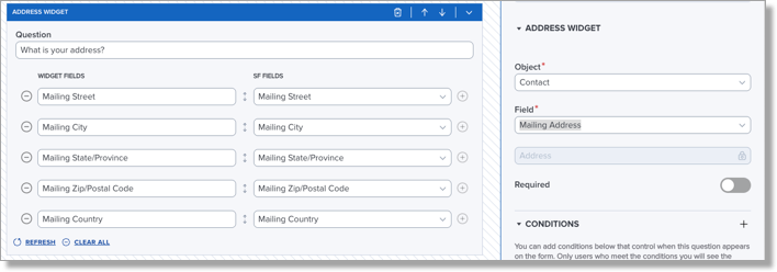
Adding the Address Widget
The Address Widget allows you to add Mailing Address or Other Address fields to your form. The question will automatically default to 'What is your address?'
- Create a new General TX form or Events TX form.
- Add a Section and add the Address Widget to your form.
- Select an Object (Contact or Inquiry) and Field (Mailing Address or Other Address).
- Indicate if the Address Widget is Required.
- Indicate any Conditions.
Note: If you don’t want to use the full address widget, you can select individual address fields instead or remove any Widget Fields you don't want to be displayed.
Adding Conditional Content
Conditional Content allows you to display certain sections of your form to a specific group of users.
- Add a Content Block to your form.
- From the Content tab, select an Object and Field.
Notes on TX Forms Conditional Content:
- You can use multiple objects in your Conditions.
- Only operators that are relevant to the selected field will display.
- Any question that includes a Condition MUST include the related field on the form. For example, if you create a Condition of State = PA, then the State field MUST be included on the form; otherwise, the condition will be considered False.
- Multiple conditions are AND conditions; so, all criteria must be met for the condition to be True.
- To use a condition where a field is not blank, choose the not equal tooperator [ != ] and leave the Value field blank.
- Indicate if the Question is Required.
- Click the + next to Conditions.
- Select an Object, Field, Operator and Value that must be met for the block to display.
- Click
if you wish to add additional conditions.
- Save your changes.
Note: Any fields used in your conditions MUST be on the form. For example: If you create a Content Block to display only for PA residents, then you MUST have the State field on your form.
Adding a File Upload
The File Upload widget in TX Forms allows you to enable file uploads for specific types of documents.
- Click or drag the Upload widget onto your form.
- Select the following:
- Object
- File Types - indicate the allowed file types by entering the file type extension. Use a comma for multiple options. For example, doc, docx, pdf
- Indicate whether the upload is Required.
Notes:
- A batch job, TX Forms Upload Cleanup, is available in Base Custom Settings to clean up orphaned files; if a user uploads a file but does not submit the form, the batch job will remove it.
- The file size limit is 3MB.
Adding Disclaimers
The Disclaimer Content Block allows you to select a checkbox that a user can click to acknowledge any disclaimers or terms and conditions. For example, you can include a Terms and Conditions section indicating that the user acknowledges that they are allowing your institution to contact them:
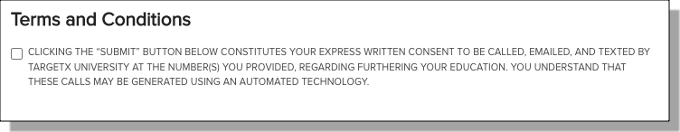
You can only select a checkbox field (i.e., Boolean field) for a Disclaimer Content Block; the list of fields will automatically be limited to checkbox-type fields:
- Object = select either Contact or Inquiry
- Field = select an available checkbox field
- Required = indicate if the field is required
- Conditions = you can add conditions if the Disclaimer should only display to a specific set of users.
- Disclaimer content types will display your Text in ALL CAPS.
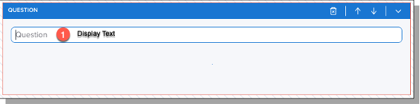
Adding Display Text
Display Text can be used to display instructional text on the form. You can also define Conditions to display the text based on specific values. For example, you can add Display Text to a section that will display one set of instructions for In-State students vs Out-of-State students.
- Create a General TX form, or Events TX form.
- Add a new Display Text to your form.
- Enter the text you want to display to users.
- Click the + in the Conditions section.
- Select an Object (Contact or Inquiry) and Field for the condition.
- Select the operator.
- Enter the Value for the condition.
- Repeat for any additional conditions.
- Save your changes.
Example Conditions:
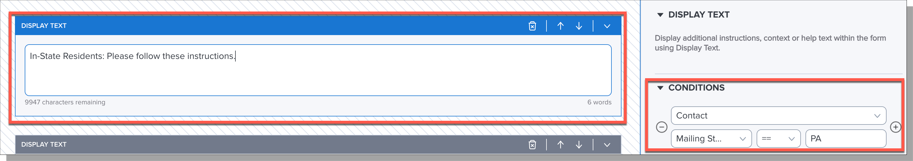
Condition for Mailing State = PA
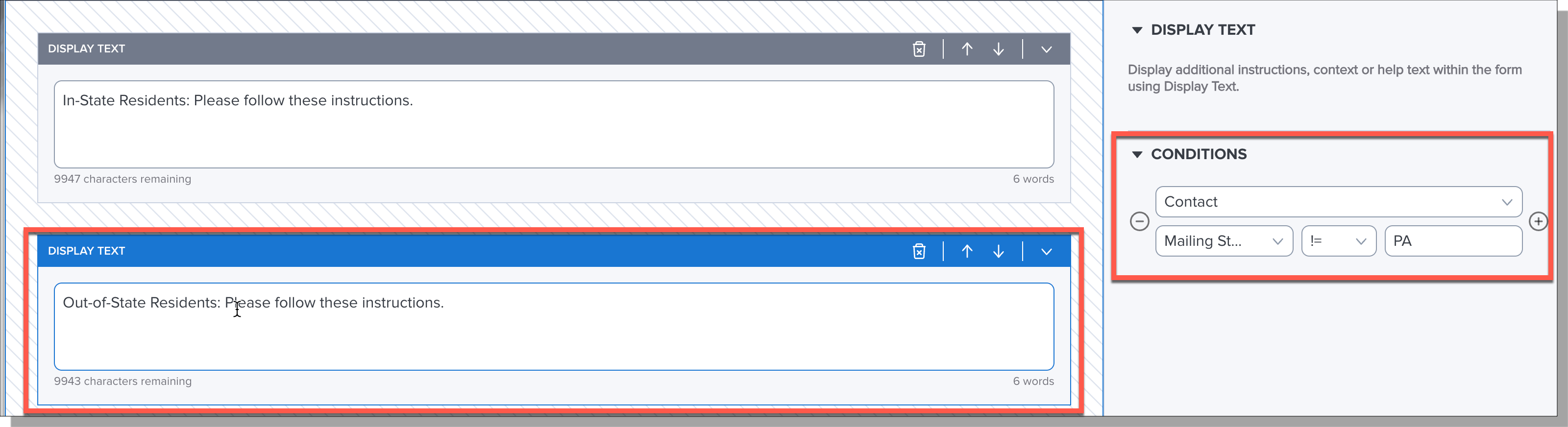
Condition for Mailing State != (not equal to) PA
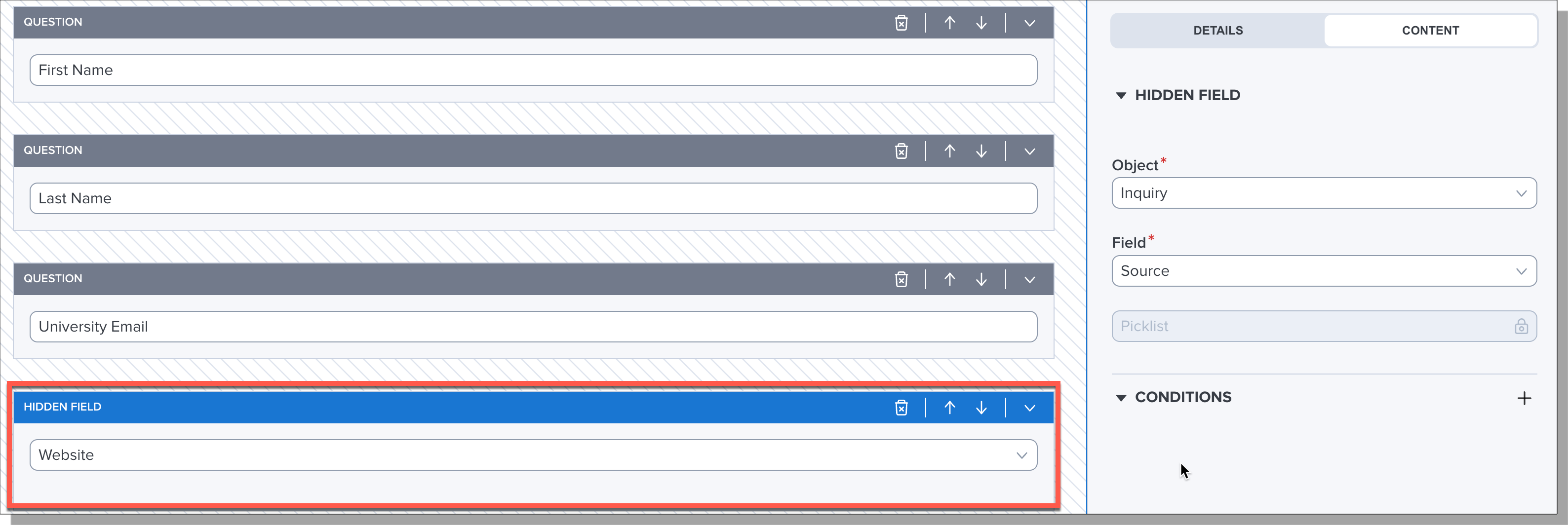
Adding Hidden Fields
Hidden fields, such as Source, are used for data you want to collect that isn't meant to be displayed to students. Set the Default value that will be used to populate the selected field, for example:
- Object = Inquiry
- Field = Source
- Indicate the Value in the form pane:
Using Pre-fill URLs
The URL Pre-fill option adds a Pre-fill key that can be populated and shared to Pre-fill certain fields on your form. There is a limit of five Pre-fill fields per form.
- Add a Question or Hidden Field to your form.
- Click the Enable URL Pre-fill toggle. The Pre-fill key will display below, such as txf1. Note: The Pre-fill key will be referenced in the URL when you add the prefilled value.
- Save the form.
- Click the Details tab and navigate to the Sharing section.
- Select your Site.
- Copy the Public URL or Embed Code Snippet, depending on your needs.
- Add the Pre-fill value or your choice after the Pre-fill key. For example, if your Pre-fill key was txf1, your URL would include
txf1=as part of the URL. Add the value after the equal sign.
Example Pre-fill URL:
https://yourdomain.my.salesforce-sites.com/Inquiry/TargetX_Base__InquiryForm#?formId=b1MDa55555XW99MAG&formType=general&txf1=<PREFILL VALUE>
Notes:
- When using URL Pre-fill on a Record Type ID field, use the Label in the URL, not the ID. For example:
txf1=Kudos - To include multiple values, separate them with a semi-colon. Example:
txf1=<PREFILL VALUE 1>; <PREFILL VALUE 2> - For Events forms, Pre-fill parameters will only work for Event-specific links. Pre-fill URLs do NOT work on the Event Calendar.
- Multi-picklist fields can be pre-filled with single or multiple values.
- When using some special characters to pre-fill data on your form, you must use the HTML Encoded value.
- For example, to add a + symbol as a prefill value, you must use
%2Bto pass the + character correctly. Or%26for an ampersand (&). - Dashes, like those in a phone number, do not require the HTML encoded characters.
- For example, to add a + symbol as a prefill value, you must use
-
Test your pre-fill code on exposed fields when using special characters to ensure the pre-fill data populates correctly. This is especially important for hidden fields since you cannot see whether the field is pre-filled.
Adding Option Groups
Option Groups display if you've selected a picklist field:
- Add a Content Block to your form.
- From the Content tab, select an Object and a picklist Field.
- Click the + next to Option Groups.
- Click the
icon to expand the group and display the fields that must be completed.
- Enter a Group Name.
- Select an Object, Field, Operator, and Value that must be met for the Option Group.
- With your Option Group selected, update the list of Values in the form pane.
- Click the + next to Option Groups to add another Option Group.
- Select an Object, Field, Operator, and Value that must be met for the Option Group.
- With your Option Group selected, update the list of Values in the form pane.
- Save your changes.
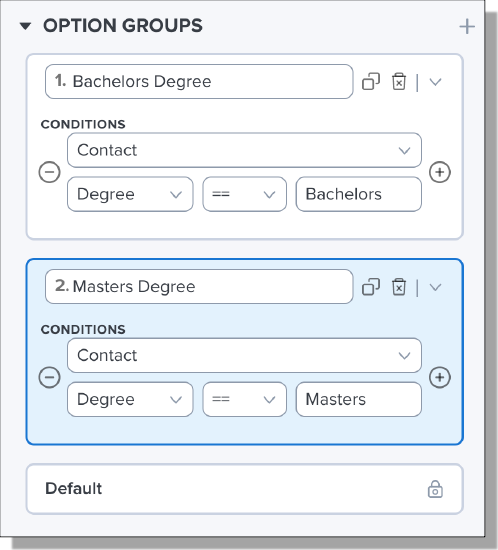
Notes:
- Any fields referenced in your Option Groups MUST be on the form. For example, If you create an Option Group to display specific Majors for Master’s students, you MUST have the Degree field on your form.
- Option groups are evaluated based on the order listed. The system will use the first Option Group that evaluates to True. The DEFAULT will always be last on the list.
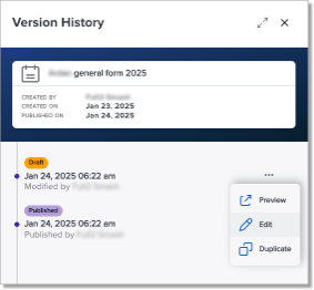
Form Versioning
Form Versioning allows you to create draft versions without affecting the active version of your forms. You can view the versions of a TX Form from the list view by selecting Version History from the action menu:

- All forms will have a draft with the draft version appearing first, followed by published versions, listed in descending order by date.

- Only published versions are saved as versions (i.e., If you create a new draft, the old draft disappears since it was never published).
- When a draft already exists, saving changes to a form will replace the current draft version.
- Changing the name of the draft or published version's name changes all versions' names and does not create a new version.
- You can choose to Preview, Edit, or duplicate a draft. Duplicate does not duplicate the history, only the fields.
- For Published versions, you can either Save edits or Save as Draft.
Note: the draft version never goes away. If you publish the draft, it still displays at the top of Version History.
Editing Versions
You can’t edit a Published version, you must first unpublish the version, then choose Save as Draft to make changes.
To edit a Draft version:
- From the form list, click the Action Menu and choose Version History.
- In the Version History window, choose the Action Menu for the Draft and select Edit.
Unpublishing a TX Form
You can ‘unpublish’ a form by toggling the Publish Form field. You’ll need to confirm this process, as it will make the form unavailable to all users until a new version is published. Enable the Publish Form toggle to ‘publish’ a form and Save. This makes the form publicly available.
- Navigate to TX Forms.
- Edit the form you want to unpublish.
- On the Details tab, toggle Off the Publish Form setting.
- Save your changes.
- Confirm the unpublish.
Saved Responses
Saved responses allow you to view responses collected on your form(s). When a form has received responses, you will see a count in the Form list with a number to indicate how many responses have been collected:

Click Responses from the Action Menu to view the details:
Viewing Saved Responses
The Responses list will display the count of responses at the top, a list of Contacts, and the date and time the response was recorded. The count of responses from the list view includes counts from ALL versions of the form. Select the version you want to view from the picklist to view those specific responses:

If an error is encountered while submitting the form, an error icon will appear:

When a user registers for an event that uses a TX Form, a saved response record is created to store the original information from the form submission. Custom questions continue to display on the Student Detail and Contact Schedule Item detail pages.
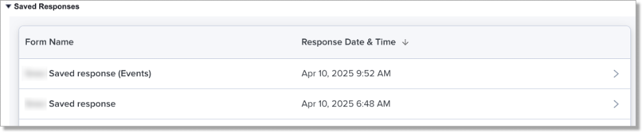
Viewing Saved Responses on a Contact record
You can view a Student’s saved responses from their Contact record. Your Administrator must add the SavedResponseView visualforce page to the Page Layout:
Notes:
- For Event type forms, the Related Id in the FormResponse object is the ID of the of the Event.
- For Application type forms, the Related Id in the FormResponse object is the ID of Application.
If the form encounters an error BEFORE the contact record is matched OR created, a response can’t be saved.
Resubmitting Responses
If a user encounters an error while submitting, you have the option to resubmit the form. From the Responses panel, click the ellipses and choose Resubmit. Make any necessary edits, then choose Submit.
If you resubmit an Event form, it will not capture any Custom Questions. We recommend you use the Registration link on the Organization Event record and register the student manually.